Grouped vs stacked bar charts: which one answers your question
Both draw one bar per category with several series inside it, but they answer different questions.
Use side by side (a grouped bar chart, or double bar graph when there are two series) to compare individual values. Say you have test scores for two classes in four subjects. Side by side shows at once that Class B beat Class A in science but not in math, because every bar starts at zero next to its rival.
Use stacked to show a total and the parts that make it up. Website visits per month split by source works well: the full height of each bar is total traffic, and each colored segment is one source. The catch is that only the bottom segment starts at zero, so the segments above it are hard to compare exactly.
Use 100% when the shares matter more than the totals. Every bar is the same height, so you can see how survey answers split by age group even when the groups differ in size.
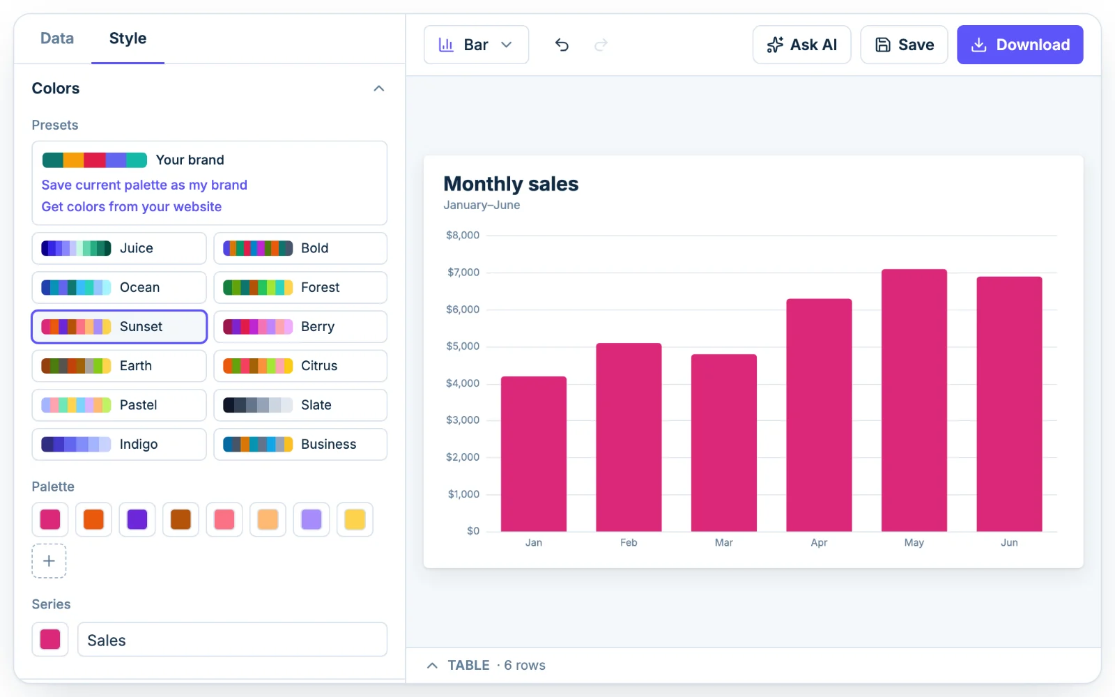
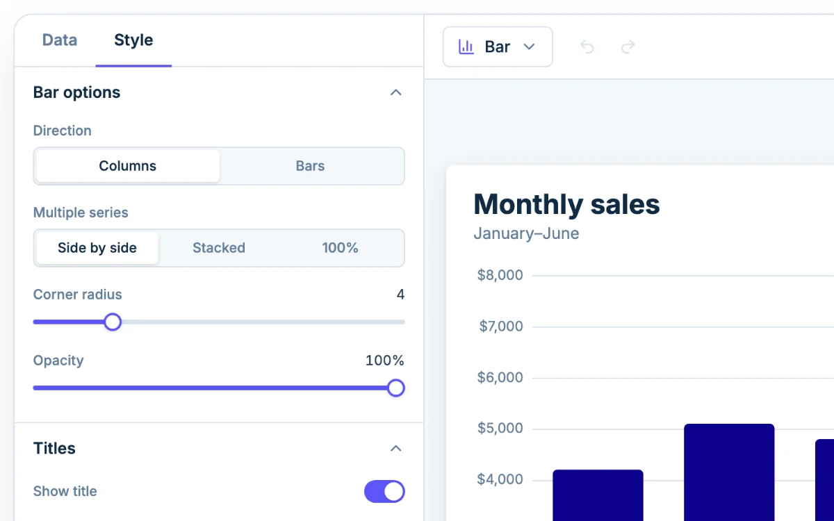
You pick all three in the Style tab, under Bar options, with Multiple series set to Side by side, Stacked or 100%.
When to go horizontal
Switch Direction to Bars when:
- your category names are long, like survey answers, so they don't get squeezed or rotated;
- you have more than about eight categories;
- you're showing a ranked list, largest at the top;
- the chart will end up on a narrow phone screen.
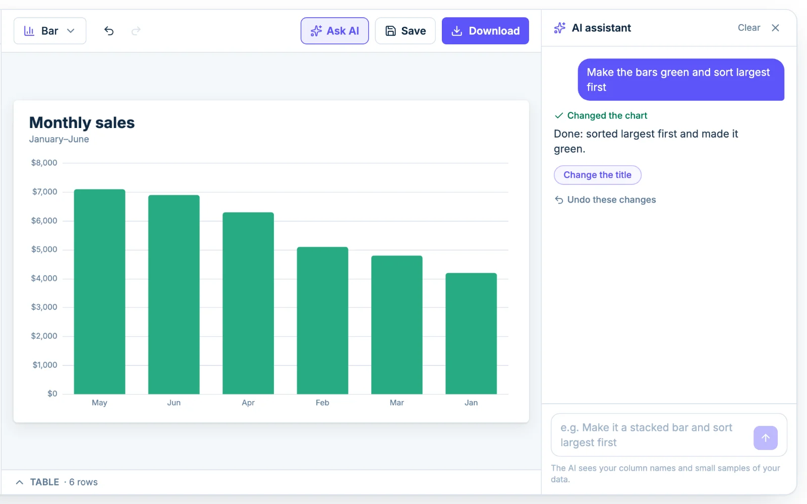
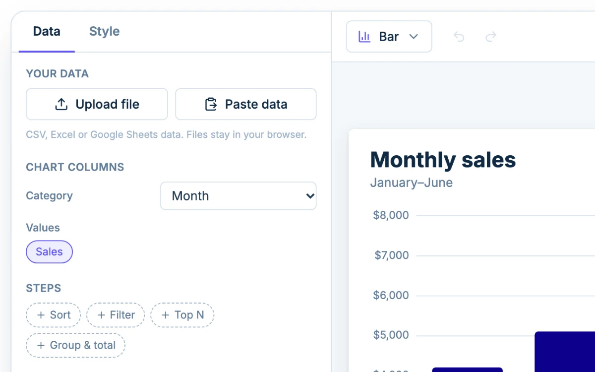
For a ranked list, add a Sort step on the Data tab so the longest bar comes first. The step only changes the chart, not your original data. If you have a long tail of small categories, use Top N to keep the biggest few and add the rest up as "Other".
Keep columns when the categories run in order, like months or grades, because people read left to right as time passing.
Bar graph vs histogram
A bar graph compares separate categories, like favorite pizza toppings. The bars have gaps between them, and you can reorder them freely. A histogram shows how one numeric variable is spread out: the bars are bins of values, such as quiz scores from 60 to 70, and they touch because the scale is continuous.
A quick test from 6th grade statistics: if the labels under the bars are names, make a bar graph. If they're number ranges, you want a histogram. To make one from a single column of raw numbers, use the histogram maker. It sorts the numbers into bins for you.
How to lay out your data
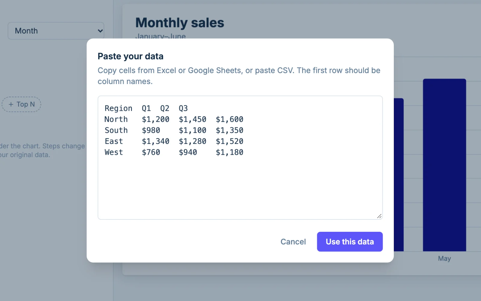
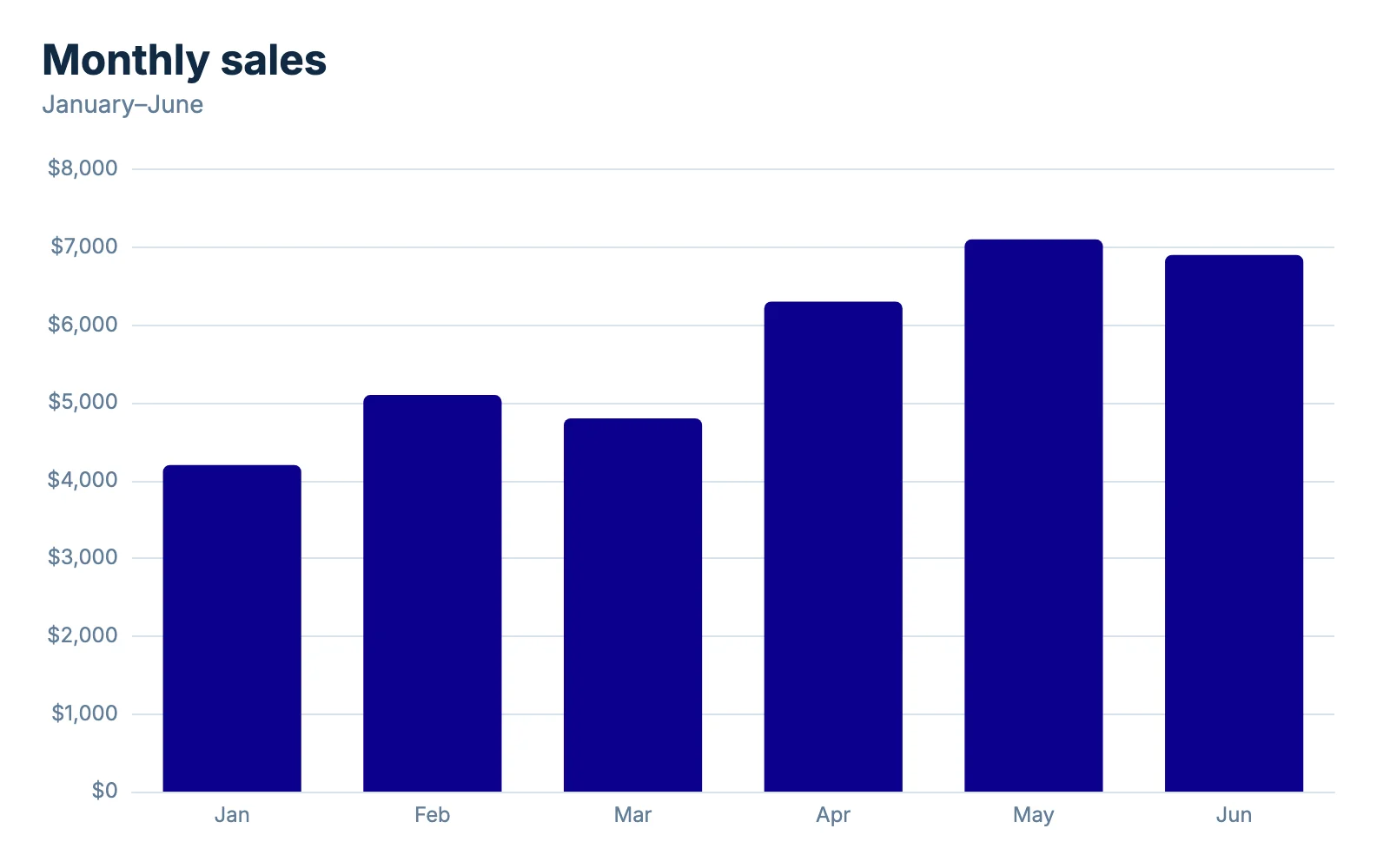
A simple bar chart needs two columns: labels in the first (Month) and numbers in the second (Sales). Chart columns shows them as Category and Values. For grouped or stacked bars, use one label column and then one column per series (Quarter, Basic, Plus, Pro). Each extra column becomes a series with its own color, and the short name at the top of the column becomes its legend entry.
Pasted values like $1,200, 12% and (200) are read as numbers. A column that stays text usually holds a note like "TBD". Past five or six series the chart gets hard to read, so pick only the columns that matter under Chart columns. The limit is 5,000 rows and 50 columns per chart.
Let the AI draft it
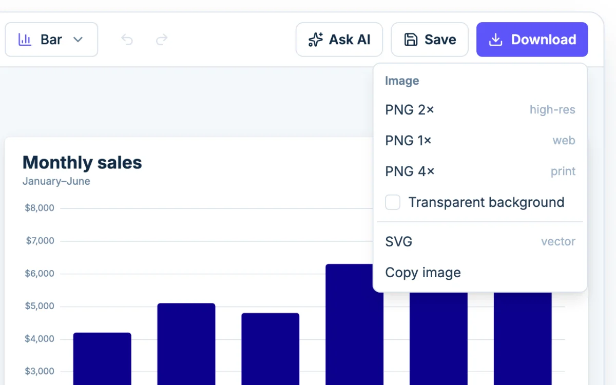
Click Ask AI and type something like "make it stacked and sort largest first". The assistant makes the changes, and you can still adjust anything by hand. It only sees your column names and small samples of the data, not your whole file.
Bar graphs for class assignments
Teachers usually grade the same things: a title, labeled axes with units, an even scale and a graph that is easy to read. In the Style tab, set Titles for the title, then Horizontal axis and Vertical axis for the axis titles. Set the vertical axis Min to 0 so bar lengths stay honest.
For a double bar graph, enter two columns of data and keep Multiple series on Side by side. Download a 2x or 4x PNG so it stays sharp on a printed worksheet or a projected slide. Use SVG if you plan to resize it in a design tool.
If your data is a trend over time, a line graph often tells the story better than bars. If it's parts of one whole, try a pie chart.