What this histogram maker needs from your data
A histogram shows how a set of numbers is spread out. It sorts the values into equal-width ranges called bins, then draws one bar per bin. The taller the bar, the more values landed in that range.
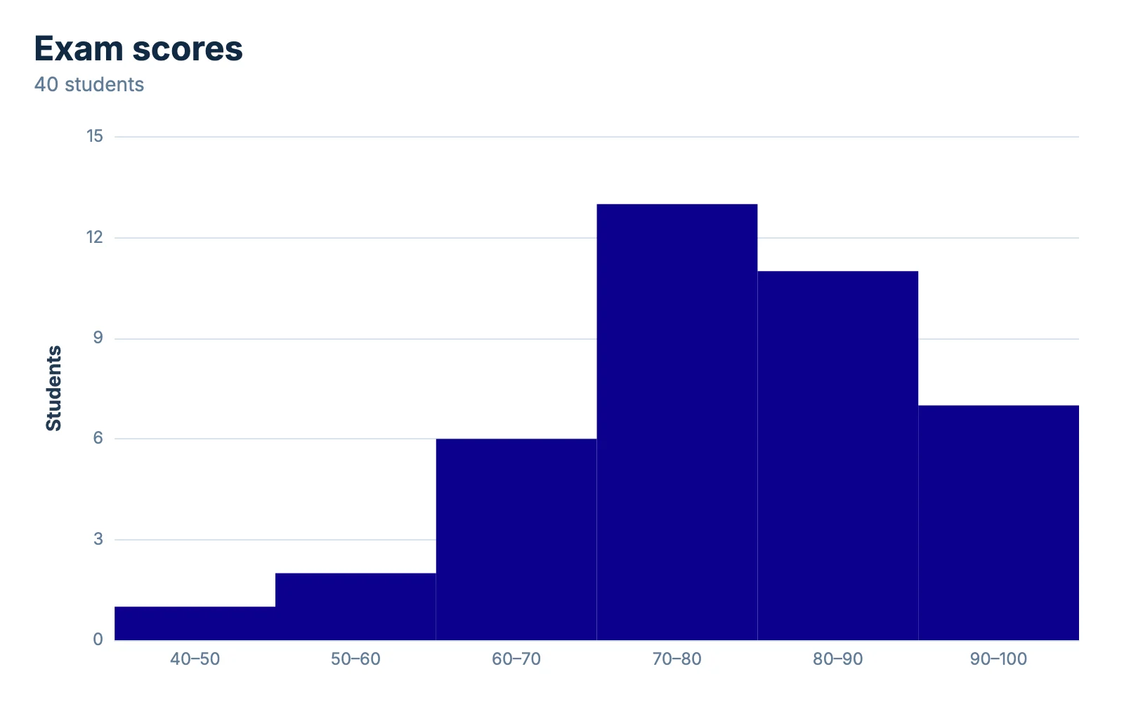
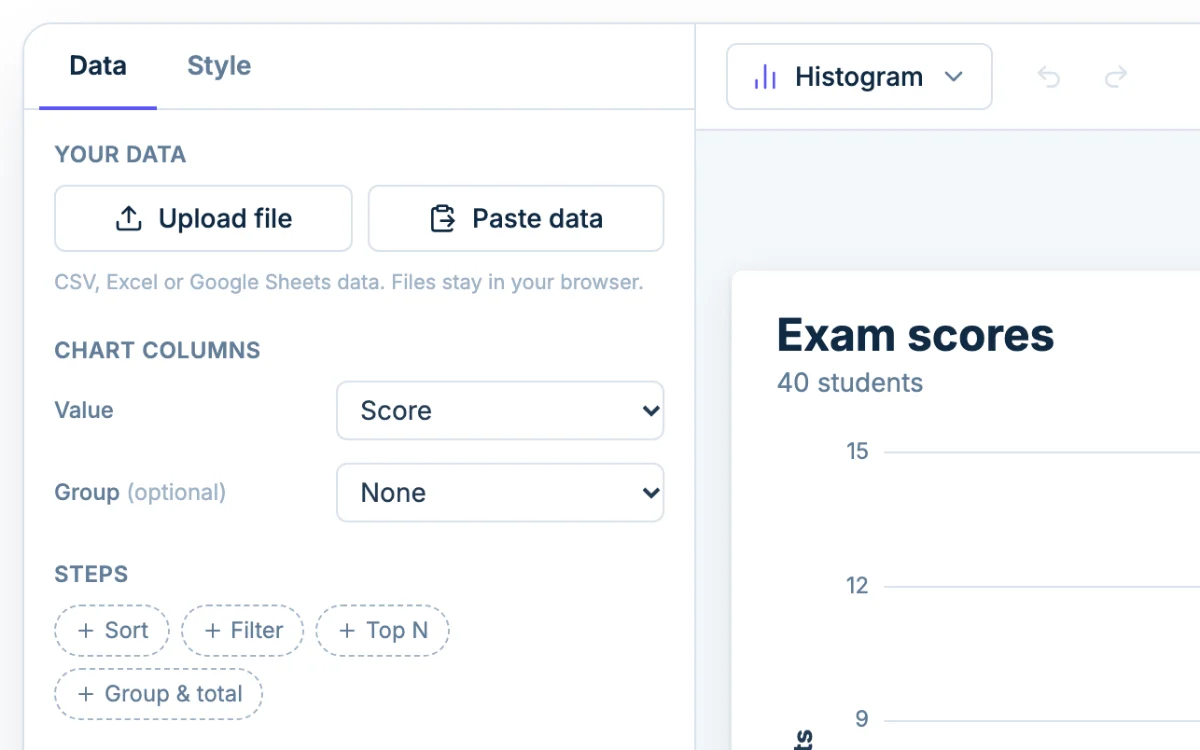
Give it raw values, one per row: 40 exam scores, 200 page load times, 1,000 order totals. Do not give it counts you tallied yourself, because the tool does the counting. The example above is 40 scores between 48 and 99, grouped into bins of 10. A chart holds up to 5,000 rows.
Your numbers can come from the Upload file or Paste data buttons, or you can type and paste into the table under the chart. Fix a typo or add a row and the bars update. If numbers are being treated as text, set the column's kind to Number from its header.
Choosing the number of bins
The bin setting changes what a histogram seems to say. Here is the same set of 40 exam scores drawn three ways:
- Bins of 20 (3 bars): 3, 19 and 18 students. It looks like a plateau, and it hides the fact that most scores sit in the 70s and 80s.
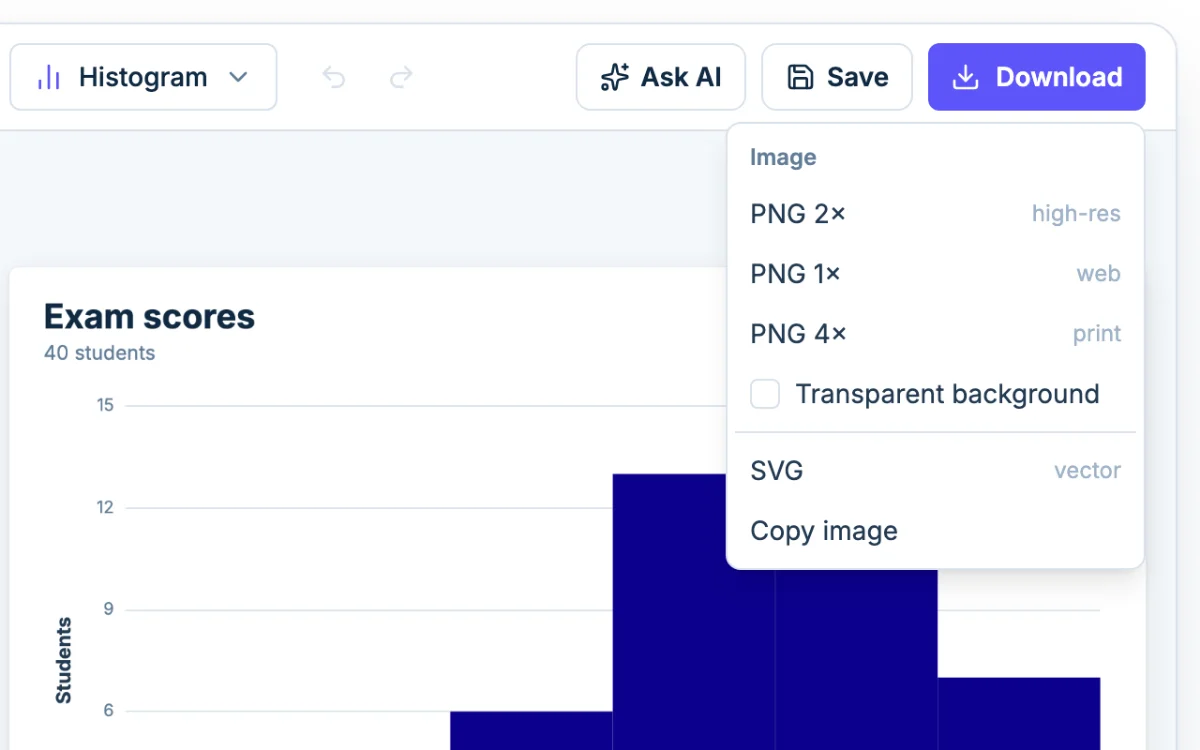
- Bins of 10 (6 bars): 1, 2, 6, 13, 11 and 7 students. A clear peak in the 70s, a shorter climb on the left and a tail of low scores.
- Bins of 2 (about 25 bars): no bar taller than 3. Every bar is a few students, so the chart is jagged and you start reading patterns into luck.
Too few bins flatten the data and too many add noise. Aim for the main shape without treating every bump as important.
Set bins by count or by width
The Bins setting in Histogram options has three modes:
- Auto uses the Freedman-Diaconis rule, which sets the bin width to 2 × IQR ÷ the cube root of the number of values. Chartjuice rounds that to a tidy number and keeps the chart between 5 and 50 bins. It is a sensible place to start.
- Count gives you exactly that many equal bins, from your smallest value to your largest. Use it for a quick overview or when a worksheet says "use 8 bins". The catch is odd edges. Five bins across 48 to 99 are 10.2 points wide, so the edges land on 58.2, 68.4 and so on.
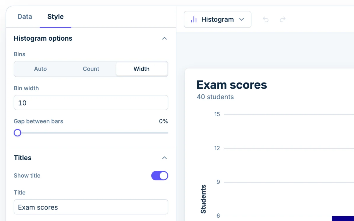
- Width sets the size of each bin in your own units, like 10-point score bands or $5 price steps. Bins start on multiples of the width, so the edges read 40, 50, 60, 70 and so on. Use it when you want the axis to make sense at a glance.
If your teacher gives a class width, use Width. If they give a number of classes, use Count.
Which bin an edge value lands in
A score of exactly 80 has to go somewhere. Each bin includes its lower edge and excludes its upper edge, so 80 counts in the 80 to 90 bar and 79 counts in 70 to 80. The one exception is the last bin, which includes both edges. If the top score were exactly 100, it would sit in the final bar rather than needing a bar of its own.
If your answer differs from a textbook's, compare the edge rule first.
Reading the shape of a histogram
Read the shape first, then the numbers. Look for where the peak is, which side has the longer tail, and how many peaks there are.
- Symmetric: the two sides roughly mirror each other around a single peak. The mean and median are close, so the mean is a fine summary.
- Skewed right: a peak on the left with a long tail of large values. The customer wait times in the gallery are an example. A few large values pull the mean above the median, so the median describes a typical value better. Load the Right-skewed data example to see it.
- Skewed left: a peak on the right with a tail of small values. An easy exam does this. The mean falls below the median.
- Bimodal: two separate peaks. This usually means two groups are mixed in one column, like bus riders and drivers in commute times. Open the Bimodal distribution example.
- Uniform: bars of about equal height, like many rolls of a fair die.
The exam scores in the example are roughly symmetric, peaking in the 70s, with a thin tail toward the low scores. The mean is 77.6 and the median is 78, so either one works.
Spot outliers and gaps
An isolated bar far from the rest is worth a look. It could be a real extreme value or a typo, like 950 instead of 95. Gaps (empty bins between bars) can mean the same thing. Check the row in the table before deciding anything.
To see the chart without a suspect value, add a Filter step on the Data tab. Steps never change your original data, so you can remove the filter and compare. For a second opinion, make a box plot from the same column. It draws values beyond 1.5 × IQR from the box as dots.
Test whether the shape holds
Before you describe a shape in a report, change the bin width and see if it survives. A real pattern stays recognizable at a wider and a narrower setting. If a second peak vanishes when you widen the bins a little, or a skew shows up at only one setting, it was a bin artifact.
In the example above, the peak in the 70s shows up with bins of 5 and bins of 10, and melts into a plateau at 20. Switch widths in Histogram options, or tell Ask AI "try bins of 5 instead" and compare.
Histogram vs bar graph
They look alike but answer different questions.
- A histogram bins one numeric variable (scores, minutes, dollars). The bars touch because the bins are consecutive ranges on a number line, with nothing between them. The order is fixed, and a bar's width means something.
- A bar graph compares separate categories (car, bus, bike). The bars have gaps because the categories are separate, and you can sort them any way you like.
The test: if you could rearrange the bars without breaking the meaning, you want a bar chart. If the x-axis is a number line, you want a histogram.
A histogram is not the only way to show a distribution. A dot plot keeps every value visible, which suits small sets of whole numbers. A box plot boils the data down to five numbers and compares groups well, but it cannot show a second peak.