What a stacked bar chart shows
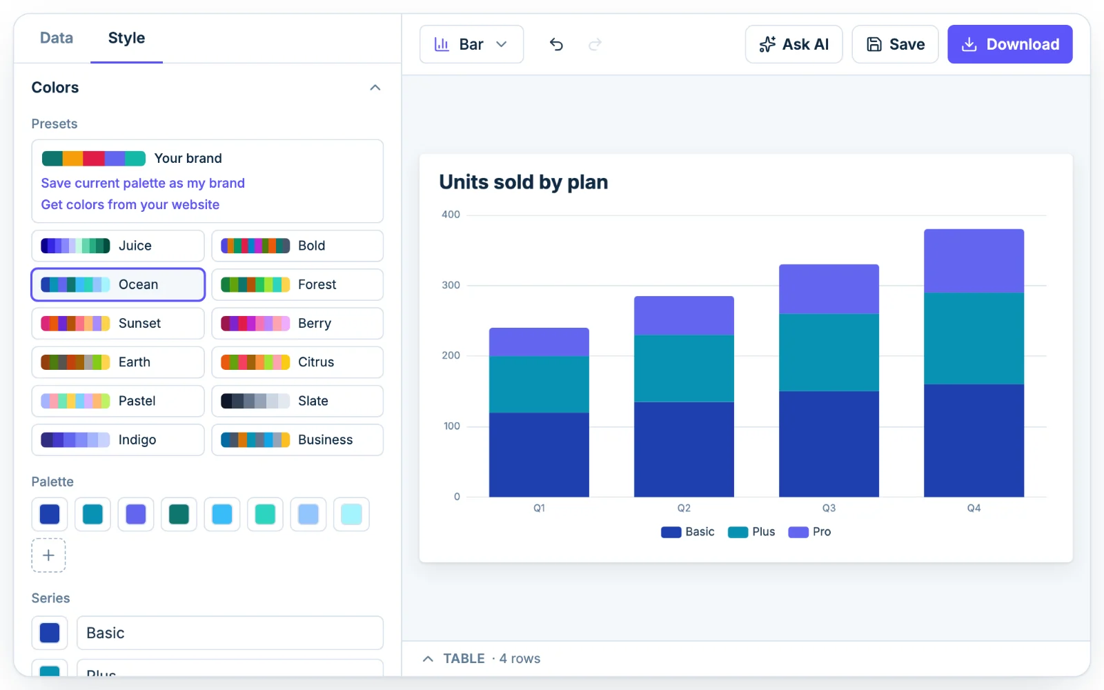
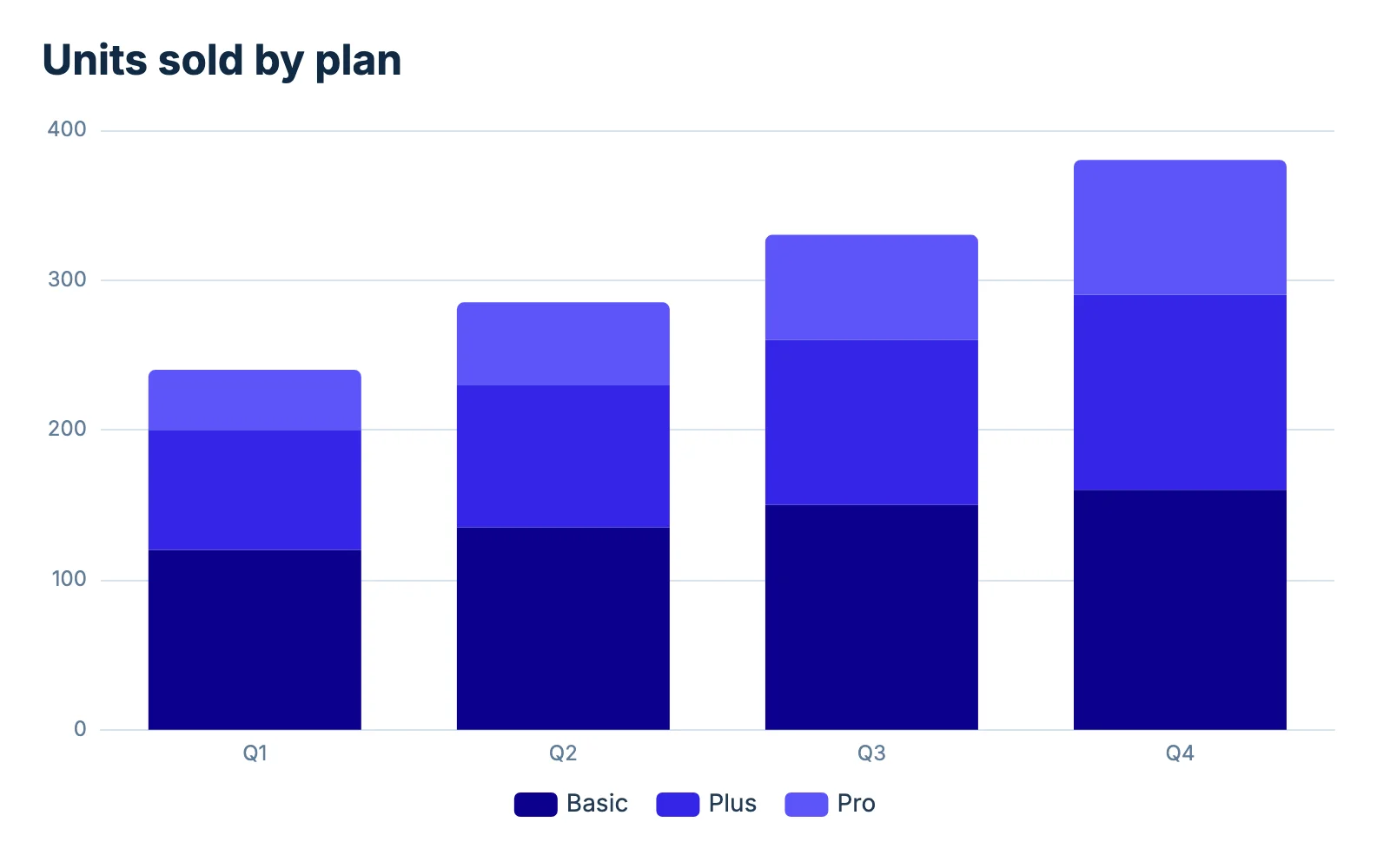
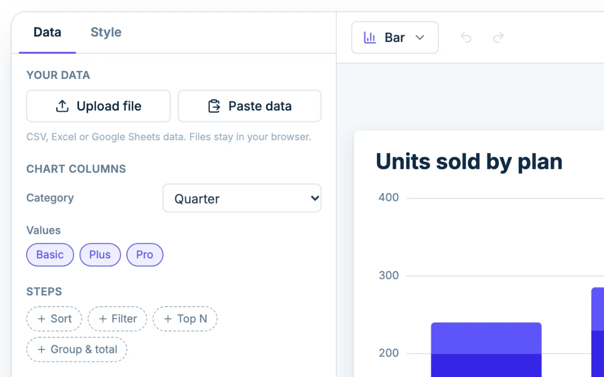
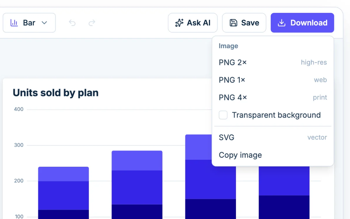
A stacked bar chart answers two questions with one bar: how much in total, and how much from each part. The sample counts units sold per quarter on three plans. The Q1 bar is 240 units tall, made of 120 Basic, 80 Plus and 40 Pro. By Q4 the bar reaches 380.
Totals are easy to compare, because every bar starts at zero. So is the bottom segment, Basic. Plus and Pro float on top of whatever is under them, so their sizes are harder to compare from bar to bar.
This page is the Chartjuice bar graph maker opened on a stack. It is the same designer with the same options.
Stacked or 100% stacked?
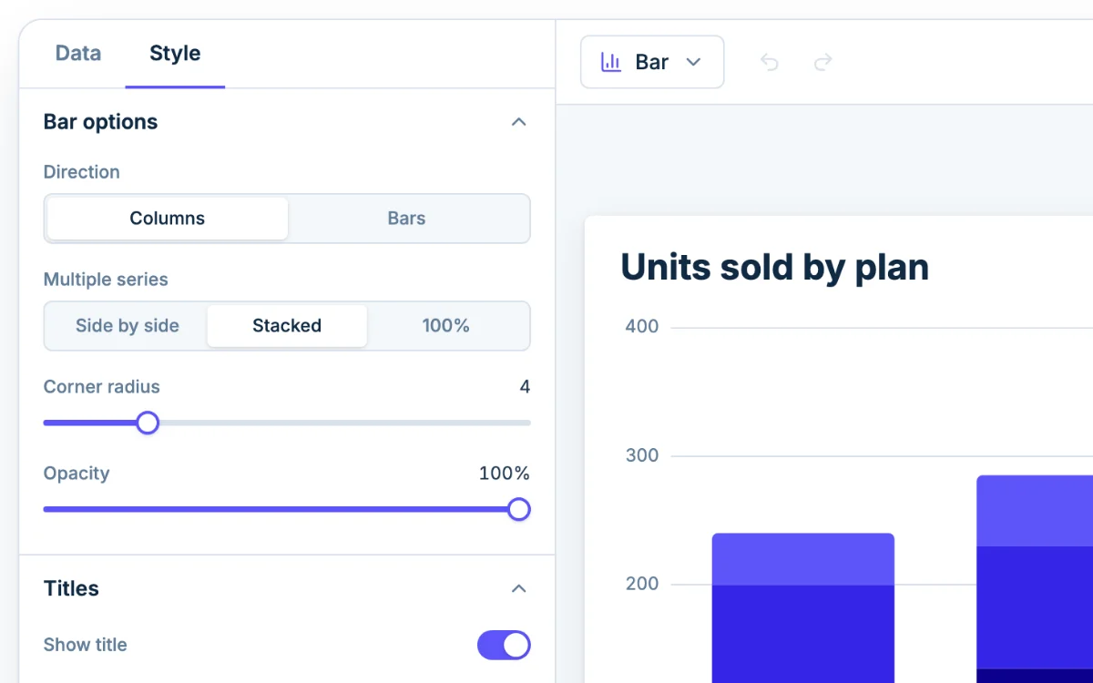
Multiple series, under Bar options in the Style tab, decides it:
| Setting | Bar height | Question it answers |
|---|---|---|
| Stacked | The total | Did the total grow, and which part grew it? |
| 100% | Always the same | Did the mix change? |
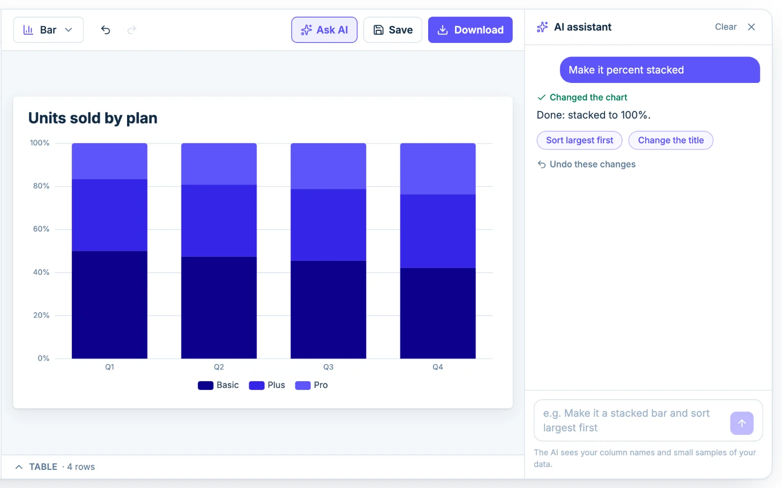
The sample shows why the choice matters. On Stacked, Basic grows every quarter, from 120 units to 160. On 100%, its share falls from 50% to 42%, while Pro climbs from 17% to 24%. Both are true. One chart shows growth and the other shows a shift toward Pro.
To print the numbers, expand Value labels and turn on Show values on the chart, then set Position to Inside so each number sits in its own segment. Two things need fixing after that:
- Label color. The labels are dark, and so are the first two default colors, so the numbers in the Basic and Plus segments are hard to read. Change the color under Text to white, or pick a lighter palette under Colors.
- Room. In a test at the default size, with the axis running to 400, a 14-unit segment just held its number and a 6-unit segment was thinner than its label.
On 100% the labels are percentages and can run to three decimals (47.368%), so set the decimals under Number format to 0 dp. There is no label for the total on top of a bar.
Order the stack
Segments stack in the order of your number columns. The first column sits on the axis and the last is at the top. With Direction on Bars, the first is at the left. The key lists them in the same order.
Put the series you most want compared in the first number column, since it is the only one with a flat baseline. If the parts have a natural order, like Basic, Plus, Pro, keep it. Chartjuice follows your column order and has no setting to reorder the series, so arrange the columns in your spreadsheet before you paste.
To reorder the bars, add a Sort step on the Data tab. It sorts by one column, high to low or low to high. Leave quarters and months in date order.
When grouped bars read better
Stacking suits parts that add up to something. Skip it when:
- the series are not parts of one total, such as this year and last year. Their sum means nothing, so draw them side by side with the double bar graph maker;
- readers need to compare the middle segments exactly;
- there are more than five or six segments, and the small ones shrink to slivers.
For a single series there is nothing to stack. The column chart maker opens on plain bars.
Ask AI to set it up
Click Ask AI and type something like "make it 100% stacked and show the values". The assistant changes the same settings you would by hand, so you can adjust anything afterward. It sees your column names and a small sample of the rows, not the whole file.