How to read a box and whisker plot
A box plot squeezes a list of numbers into five landmarks, called the five-number summary: the minimum, the first quartile (Q1), the median, the third quartile (Q3) and the maximum.
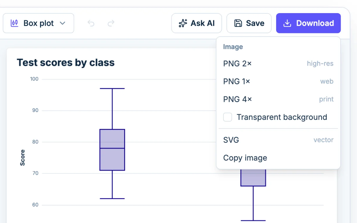
- The box runs from Q1 to Q3. It holds the middle half of your data.
- The line inside the box is the median.
- The whiskers reach out to the lowest and highest values that are not outliers.
- Any dots beyond the whiskers are outliers.
The width of the box, Q3 minus Q1, is the interquartile range (IQR). It tells you how spread out the middle half is.
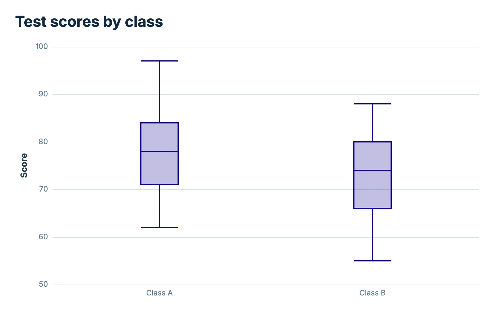
On the chart above, Class A has a median of 78 and a box from 71 to 84. Class B has a median of 74 and a box from 66 to 80. The boxes are about the same size, so the classes are about equally spread out, but Class A sits roughly 4 points higher.
Each section of the plot holds about a quarter of the values, whatever its length. A short stretch means the values are packed tightly. A long whisker or an off-center median means the data stretches toward that side.
Plotting several groups side by side
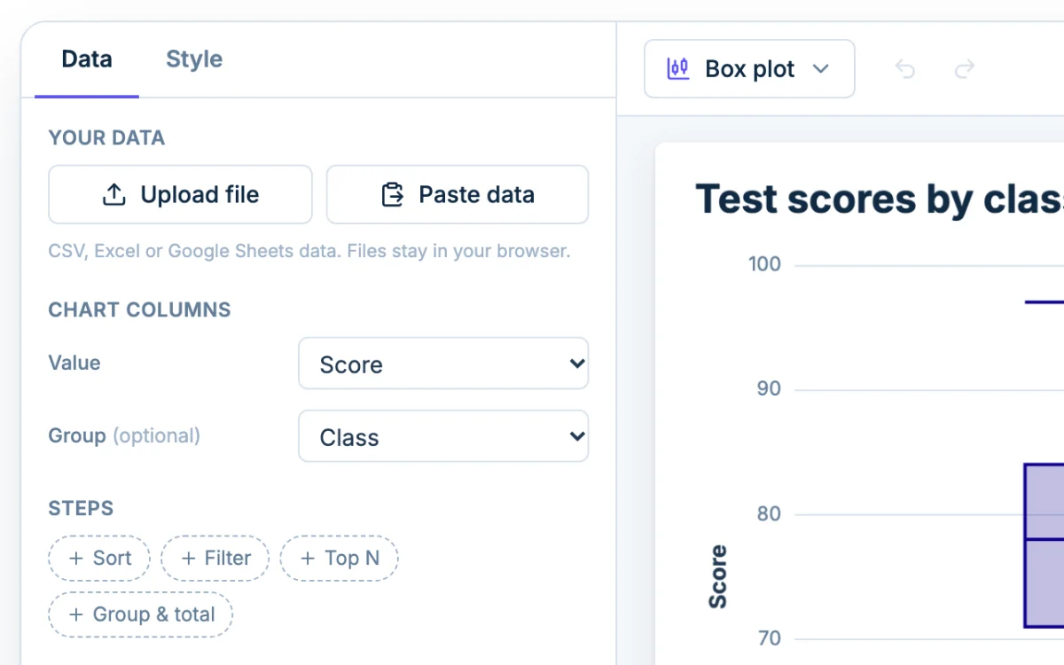
Keep every value in one column and the group names in another, like the Class and Score columns in the example. Under Chart columns, set Value to the scores and Group to the class. Each group gets its own box on a shared axis, so you can compare medians and spread at a glance.
Finding quartiles step by step
The Textbook method below is the default in Chartjuice. Most US textbooks and TI graphing calculators use it.
- Sort the values from smallest to largest.
- Find the median, the middle value (or the average of the two middle values).
- Split the list into a lower half and an upper half. If you have an odd number of values, leave the median out of both halves.
- Q1 is the median of the lower half. Q3 is the median of the upper half.
- Subtract to get the IQR: Q3 − Q1.
An odd number of values
Minutes of homework for nine students, already sorted: 4, 6, 7, 9, 10, 12, 13, 15, 31.
- The median is the 5th of 9 values: 10.
- Leave the 10 out. The lower half is 4, 6, 7, 9. The upper half is 12, 13, 15, 31.
- Q1 is the middle of 4, 6, 7, 9: (6 + 7) ÷ 2 = 6.5.
- Q3 is the middle of 12, 13, 15, 31: (13 + 15) ÷ 2 = 14.
- IQR = 14 − 6.5 = 7.5.
The five-number summary is 4, 6.5, 10, 14, 31.
An even number of values
Ten test scores, sorted: 52, 55, 58, 60, 63, 65, 68, 70, 74, 79.
- The median is the average of the 5th and 6th values: (63 + 65) ÷ 2 = 64.
- The list splits cleanly into two halves of five, so nothing is left out. The lower half is 52, 55, 58, 60, 63. The upper half is 65, 68, 70, 74, 79.
- Q1 is the middle of the lower half: 58.
- Q3 is the middle of the upper half: 70.
- IQR = 70 − 58 = 12.
The five-number summary is 52, 58, 64, 70, 79.
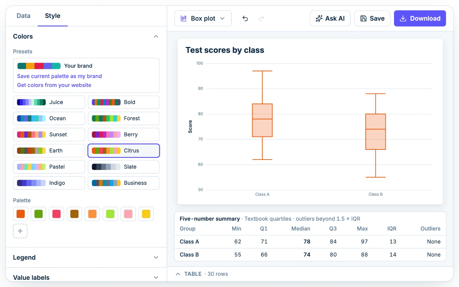
To check your own work, type the numbers into the table under the chart. The Five-number summary under the box plot lists the min, Q1, median, Q3, max, IQR and any outliers for each group.
Why the Excel setting gives different quartiles
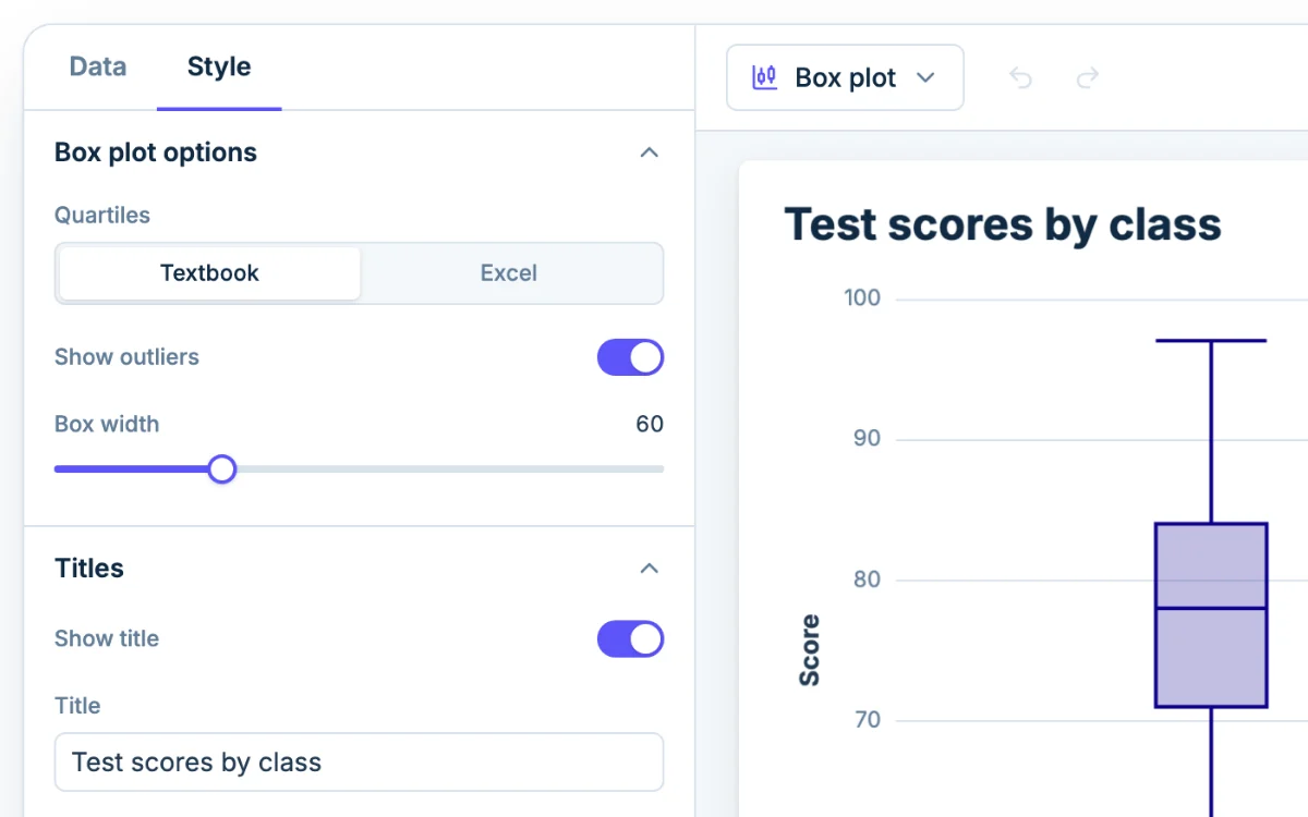
There is no single agreed definition of a quartile, and the methods can disagree a little on small data sets. Under Style, Box plot options, the Quartiles setting lets you pick the one your class or spreadsheet uses.
- Textbook takes the median of each half, as in the examples above.
- Excel matches Excel's QUARTILE.INC. It treats the sorted list as a ruler, puts Q1 a quarter of the way along it, and blends the two neighboring values when that spot falls between them.
For the nine homework times, Excel puts Q1 at the 3rd value and Q3 at the 7th, so it reports 7 and 13. The Textbook method gives 6.5 and 14.
For the ten test scores, Excel puts Q1 at position 3.25. That is a quarter of the way from 58 to 60, which is 58.5. Q3 lands at position 7.75, three quarters of the way from 68 to 70, which is 69.5. The Textbook method gives 58 and 70.
The median is the same under both settings, and the gap shrinks as you add data. Neither is wrong, so match your teacher or answer key. If the key says "median of each half," choose Textbook. If it came from a spreadsheet, try Excel.
Spotting outliers with the 1.5 × IQR rule
A value counts as an outlier if it falls more than 1.5 × IQR below Q1 or above Q3. The two cutoffs are called fences:
- Lower fence = Q1 − 1.5 × IQR
- Upper fence = Q3 + 1.5 × IQR
Take the nine homework times (Textbook quartiles). The IQR is 7.5, and 1.5 × 7.5 = 11.25.
- Lower fence: 6.5 − 11.25 = −4.75. Nothing is that low.
- Upper fence: 14 + 11.25 = 25.25. The value 31 is above it, so 31 is an outlier.
Chartjuice draws 31 as a dot. The upper whisker stops at 15, the largest value inside the fences, and the lower whisker stops at 4. For the ten test scores, the fences are 40 and 88, so nothing is flagged and the whiskers run to 52 and 79.
With Quartiles set to Excel, the nine times give an IQR of 6 and fences of −2 and 22. The 31 is still an outlier, but a value near a fence can change sides between methods.
Turn off Show outliers and the whiskers stretch to the minimum and maximum instead. An outlier is not automatically a mistake. Check that it was entered correctly before you leave it out of an analysis.
Box plot vs histogram
A box plot summarizes. It shows the median, the spread and any outliers, and it compares many groups in a small space. What it hides is shape: a data set with two peaks can produce the same box as one with a single peak.
A histogram shows that shape, including where values pile up and where the gaps are. Use a box plot to compare groups, and the histogram maker when you want to see how one set of values is distributed.
For a small set of whole numbers, a dot plot shows every value.