What a dot plot shows
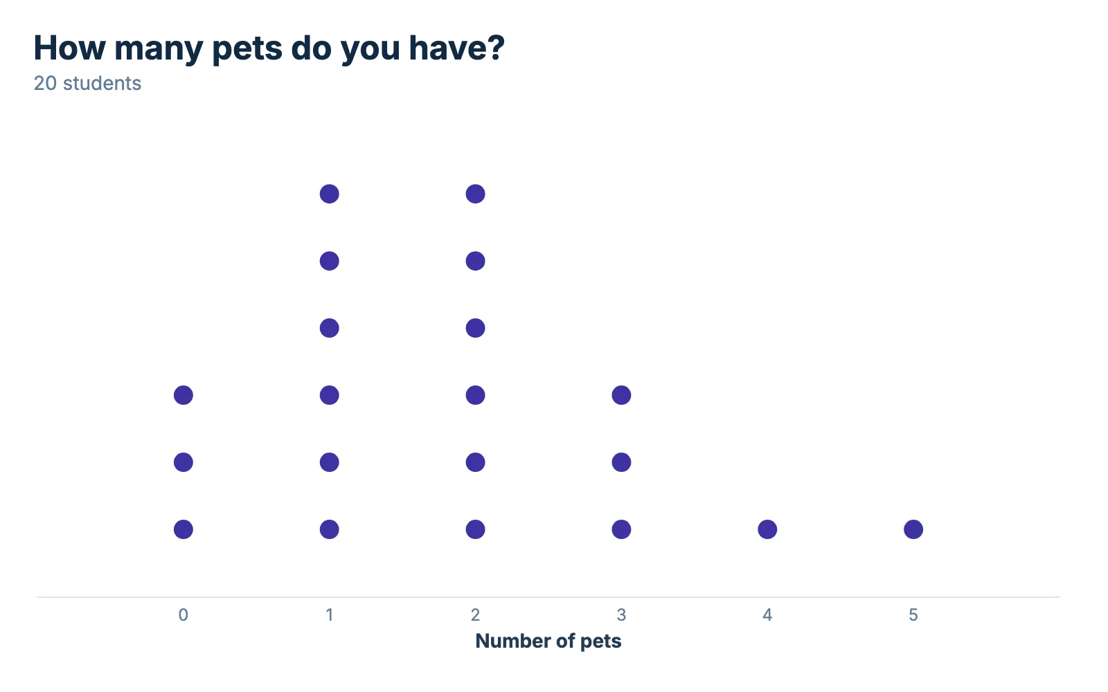
A dot plot puts one mark for each value above its spot on a number line. When two values match, the marks stack. The height of a stack is the number of times that value showed up, so you can see the whole data set at a glance and still read every individual value.
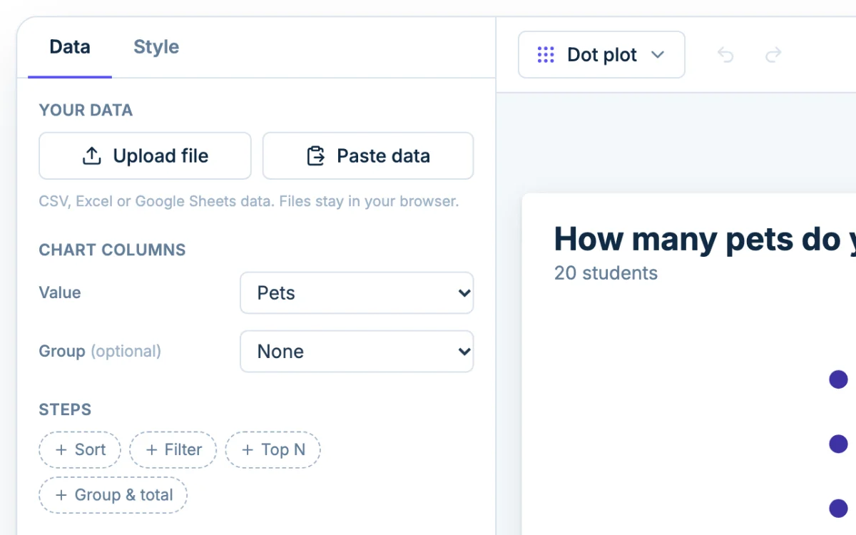
That makes it a good fit for small data sets: a class survey, a set of quiz scores, the number of books each student read this month. The example above asks 20 students how many pets they have. Most students have one or two, a few have none, and one student has five.
Dot plot vs line plot vs line graph
These three names cause most of the mix-ups.
A line plot in elementary math is a dot plot
In US elementary school, a line plot is a number line with an X above each value in the data. That is a dot plot with X marks instead of dots. Middle school and statistics classes call the same chart a dot plot. The only real difference is the marker.
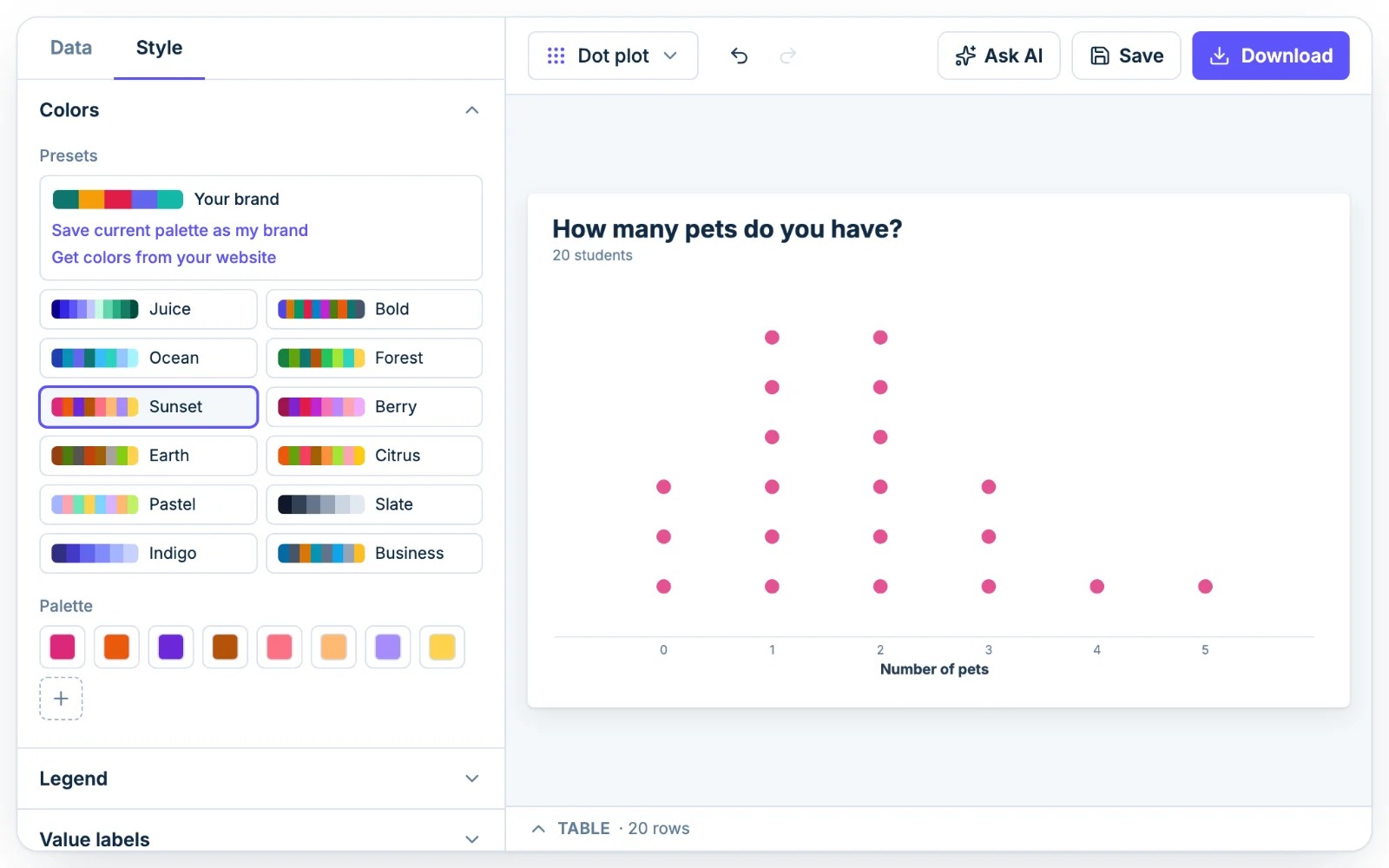
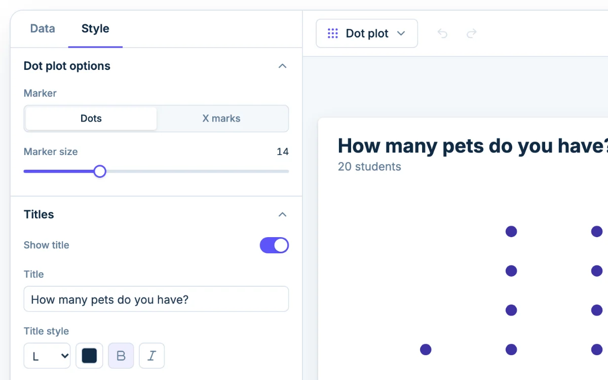
To get the textbook look, set Marker to X marks in the Style tab. Switch back to Dots whenever you like. Your data and every other setting stay as they are. The line plot maker opens with X marks already set and covers line plots with fractions.
Why a line graph is a different chart
A line graph connects points with a line to show how something changes, usually over time: temperature by hour, sales by month. It has a value on both axes. A line plot has a value on one axis only and counts how often each value appears. If your data is a trend, make a line graph instead.
Find the mean, median and mode from a dot plot
Here are the 20 answers behind the pets chart: 0, 0, 1, 1, 1, 1, 2, 2, 2, 2, 2, 1, 3, 3, 0, 2, 4, 1, 3, 5. Count the marks in each stack and you get:
- 0 pets: 3 students
- 1 pet: 6 students
- 2 pets: 6 students
- 3 pets: 3 students
- 4 pets: 1 student
- 5 pets: 1 student
The counts add up to 20, which is a good first check. Then read the three averages straight off the plot.
Mode: the tallest stack
The mode is the value with the most marks. Here the stacks at 1 and 2 are both six marks tall, so this data set has two modes, 1 and 2. A plot with two equally tall peaks is called bimodal. If every stack were the same height, you would say there is no mode.
Median: count in to the middle mark
The median is the middle value when the data is in order. Reading left to right, the stacks give you this ordered list:
0, 0, 0, 1, 1, 1, 1, 1, 1, 2, 2, 2, 2, 2, 2, 3, 3, 3, 4, 5
There are 20 values, an even number, so the middle sits between the 10th and 11th values. Both are 2, so the median is 2. With an odd number of values you would just take the single middle one. With an even number whose two middle values differ, add them and divide by 2.
A common mistake is to find the middle of the number line (2.5 for 0 to 5) or the middle stack. The median depends on counting marks, not on where the stacks sit.
Mean: multiply each value by its stack
The mean is the total divided by the number of values. Multiply each value by the number of marks above it, add those up, then divide by 20:
- (0 × 3) + (1 × 6) + (2 × 6) + (3 × 3) + (4 × 1) + (5 × 1)
- 0 + 6 + 12 + 9 + 4 + 5 = 36
- 36 ÷ 20 = 1.8
The class has 1.8 pets per student on average. Nobody has 1.8 pets, which is fine. The mean describes the balance point of the data and doesn't have to be a value in it.
Read the shape of the data
When a worksheet says "describe the distribution," look for four things in the same plot:
- Clusters. Most of the pets data sits at 1 and 2.
- Gaps. There are none here, since every value from 0 to 5 has at least one mark. A gap would show up as an empty spot on the number line.
- Spread. The values run from 0 to 5, a range of 5.
- Outliers. The lone mark at 5 is far from the pile. With textbook quartiles (Q1 = 1, Q3 = 2.5), the 1.5 × IQR rule puts the upper fence at 4.75, so 5 counts as a mild outlier. You can check this on a box plot.
Dot plot vs histogram
A dot plot keeps every value, which is why you can count marks to find the median. The cost is space: each value needs its own mark. Once you have a few dozen values, or measurements with many decimal places, the stacks turn into a smear or run off the page.
At that point, switch to a histogram. It groups values into bins and draws a bar for each, so a data set of hundreds of rows stays readable. You lose the individual values and keep the shape. As a rough rule, use a dot plot for up to about 30 values that repeat, and a histogram for anything bigger or more continuous.
Dot plots for worksheets and answer keys
If you make plots for class, a few settings help:
- Set the Horizontal axis min and max to the range your students need, so the number line looks the same on the worksheet and the key.
- Choose X marks for elementary classes and Dots for stats classes.
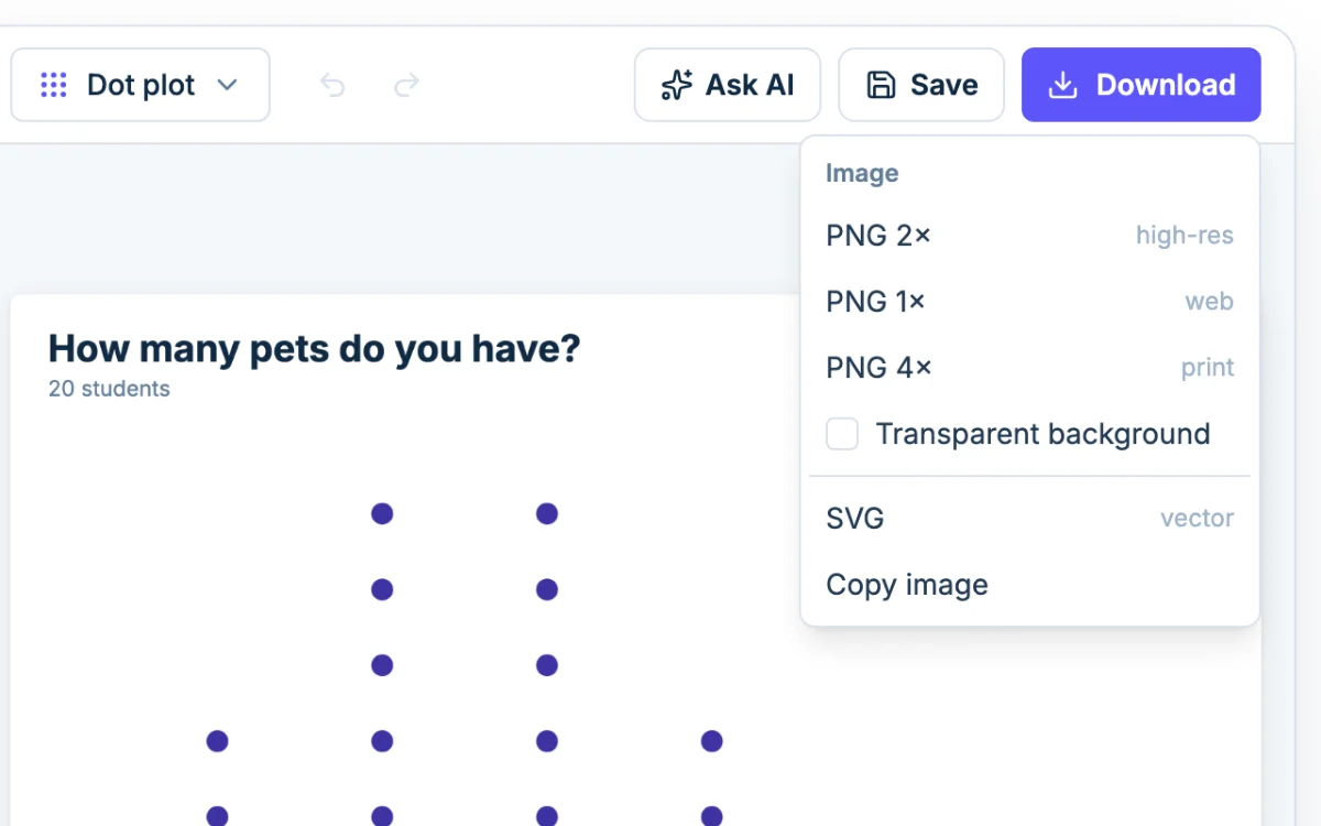
- Download a 4x PNG for crisp printing. Tick the transparent background option if the plot will sit on a colored slide.
- Make two versions: one with the data filled in for the answer key, and one where you clear the table to hand out as practice.
- To compare two classes, put all the values in one column and the class names in another, then set that column as Group.
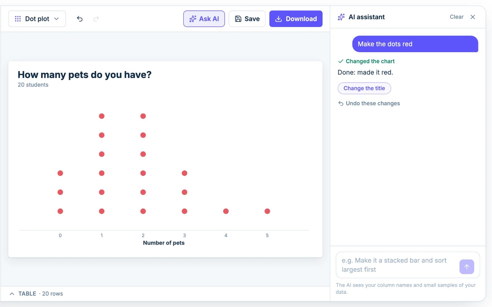
If you'd rather describe the change than click through it, open Ask AI and type something like "use X marks and make the markers bigger."