What this heatmap generator makes (and what it doesn't)
A data heatmap is a grid. One category runs down the side, another runs across the top, and each cell is colored by a number. Visits by weekday and hour, or scores by grade and subject, both fit.
This tool makes that kind of chart, from a table you give it. It does not make website click-tracking or scroll heatmaps, which need a script running on a live site. It also does not draw geographic or GPS heat maps over a map.
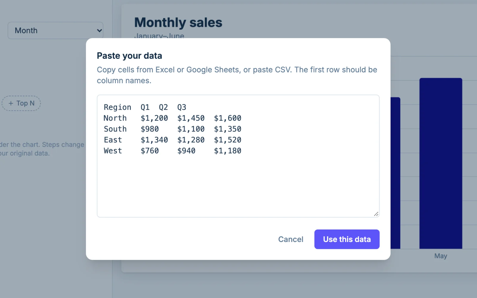
Formatting your data: matrix or long table
The heatmap generator reads your table in one of two shapes.
Matrix format
A matrix looks like the spreadsheet grid you already have. Row labels go down the first column, column labels go across the top, and every cell holds a number.
For example, a header row of Region, Q1, Q2, Q3, Q4, then North, 42, 51, 58, 64, then South, 38, 40, 47, 55.
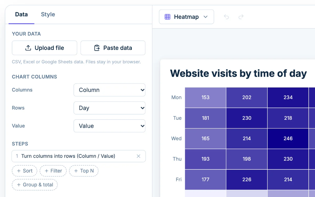
When your table has one label column followed by two or more number columns, Chartjuice treats it as a matrix and fills in Chart columns for you. The first column becomes the rows, and the headers become the columns.
Long format: x, y, value
A long table has one row per cell and three columns: the column label, the row label and the number.
For example, Grade 6, Math, 71, then Grade 6, Reading, 76, then Grade 7, Math, 75. This is the shape you get from a database export or a survey tool. In Chart columns, set Columns to Grade, Rows to Subject and Value to Average score.
Which one to use, and fixing messy data
Use a matrix if you are copying a finished grid. Use a long table if your data is a list of records. The limit is 5,000 rows by 50 columns per chart.
A few things trip people up:
- Blank cells. A combination with no number is left empty rather than colored as zero. If zero is the real answer, type 0.
- Repeated pairs. If the same column and row appear twice in a long table, the values are added together and a notice tells you.
- Numbers that won't color. If a column came in as text, open its header in the table and set its kind to Number.
- Headers in the wrong row. Delete any title rows above your headers so the first row holds the column names.
Choosing a color scale
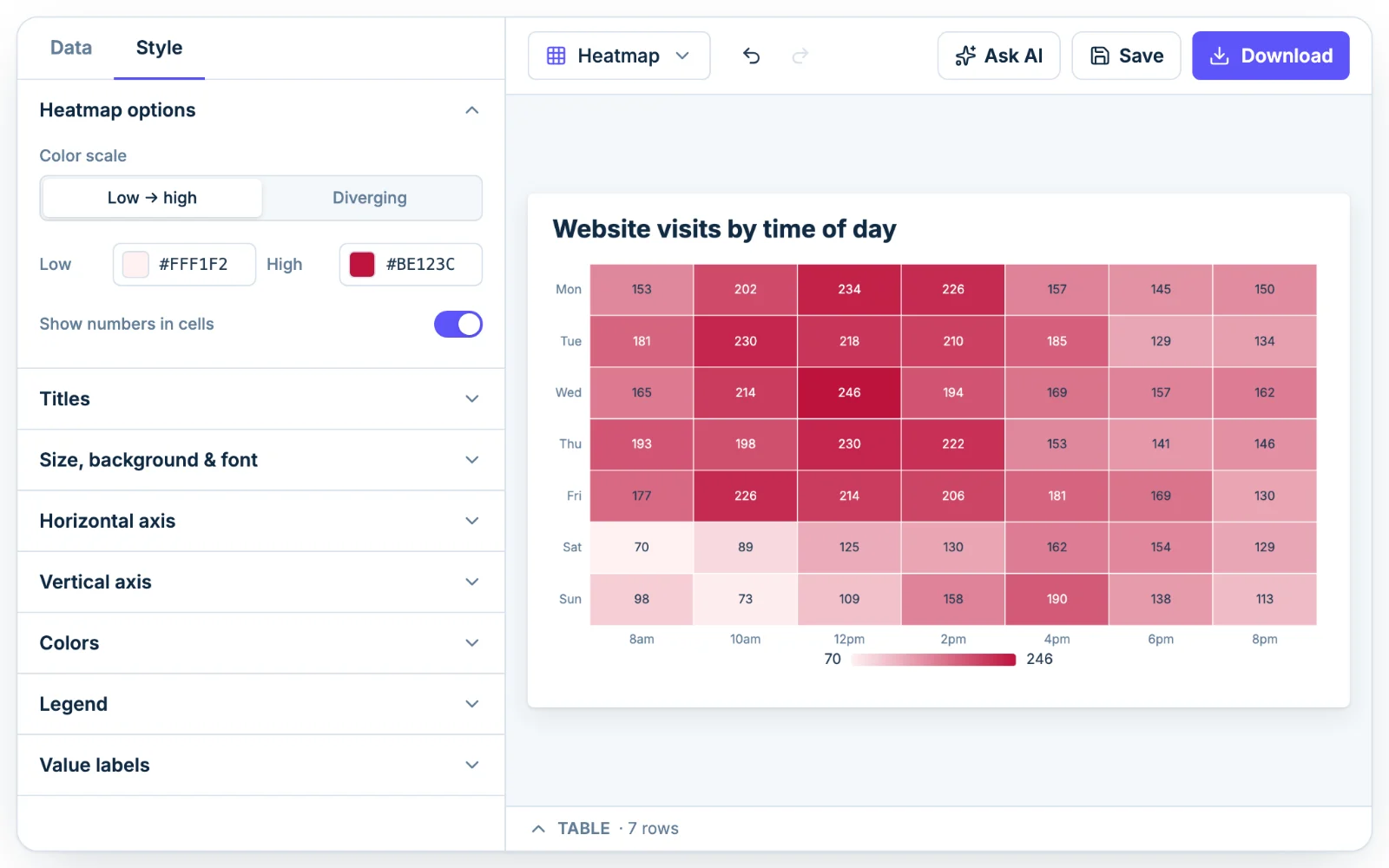
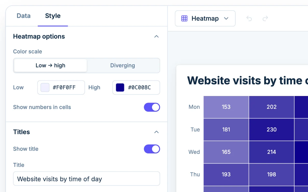
The Color scale setting decides what the colors mean.
Low → high
Use Low → high when the numbers only go one way: counts, totals, minutes, dollars. Pale cells are small and dark cells are large.
Diverging
Use Diverging when the numbers cross a point that matters, usually zero. Change from last year or profit and loss are typical. The scale runs blue to white to red and is centered on zero, so white means no change, blue means below and red means above. You can recolor the Low, Middle and High stops in the Style tab. If your data never goes negative, a diverging scale wastes half its range.
Colors that stay readable
- Stick to one hue, or a simple two-color blend. Rainbow scales make it hard to tell which color is bigger.
- Keep the light end light and the dark end dark. Colors that differ only in hue are hard to read for people with color-blindness.
- Watch for one huge value. One day with 5,000 visits among days of 100 to 200 turns every other cell the same pale shade. Filter it out in the Data tab with a Filter step, or turn on Show numbers in cells so small differences stay readable.
Reading a heatmap
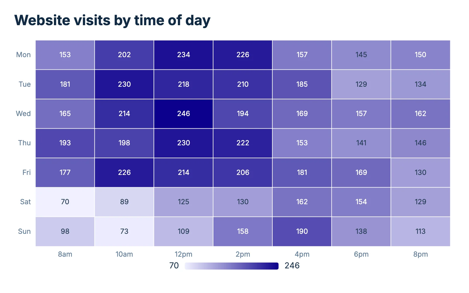
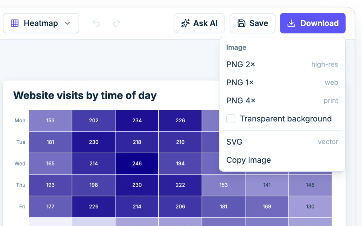
Start with the legend bar, which tells you which end is high. Then find the darkest and lightest cells, and scan along rows and down columns. In the website visits grid above, the darkest cells sit around 12pm on weekdays and around 4pm on Saturday and Sunday, so weekend traffic peaks later.
Color shows rank and rough size, not exact values. When the exact number matters, turn on Show numbers in cells. If you only need to compare a handful of values, a bar chart is easier to read. If your two axes are both numbers, such as hours studied and test score, a scatter plot shows the relationship more directly.
Let the AI draft it
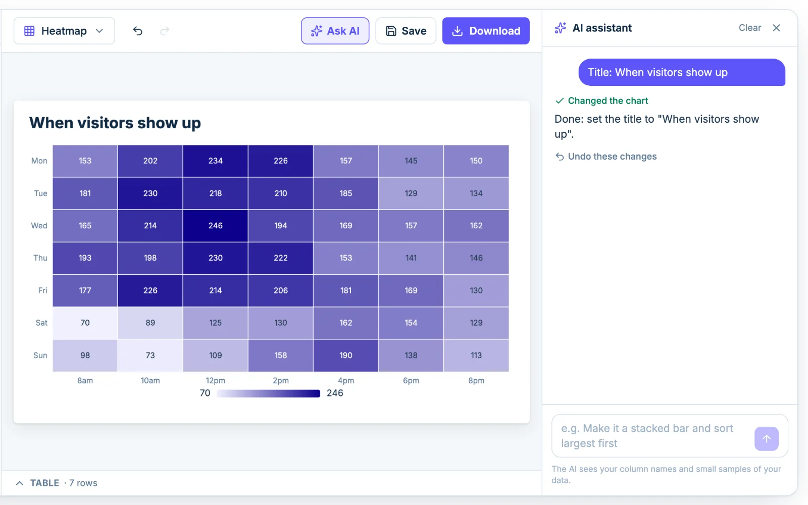
Click Ask AI and describe what you want, such as "use the diverging scale and show numbers in the cells". You can adjust or undo the result, and the assistant sees your column names and small samples of the data, not the whole file.