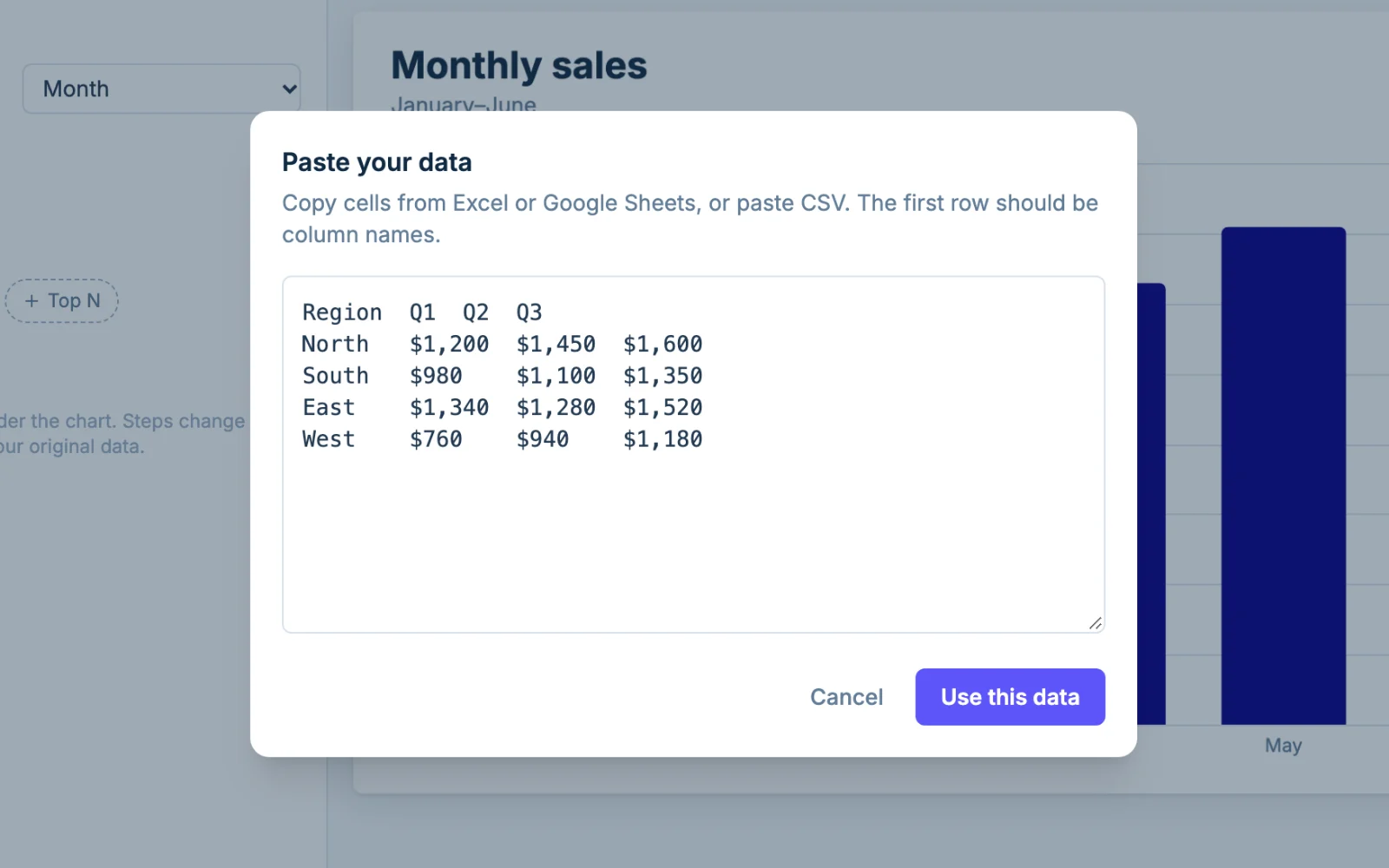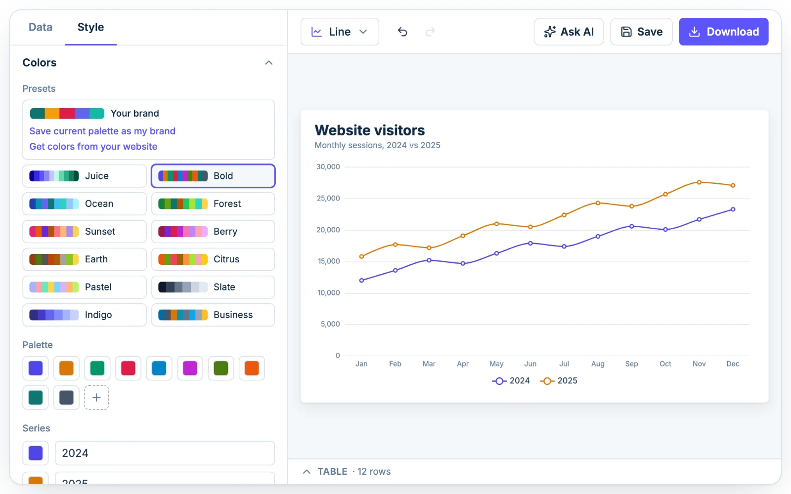
Date columns are read automatically
If your first column holds dates or months, Chartjuice plots them in row order, so keep them oldest first. It recognizes most US and ISO formats, such as 1/15/2025 and 2025-01-15, and reads a column as day-first when the data is clearly day-first. If a date shows up as plain text, set the column's kind to Date from its header.
A table like this works:
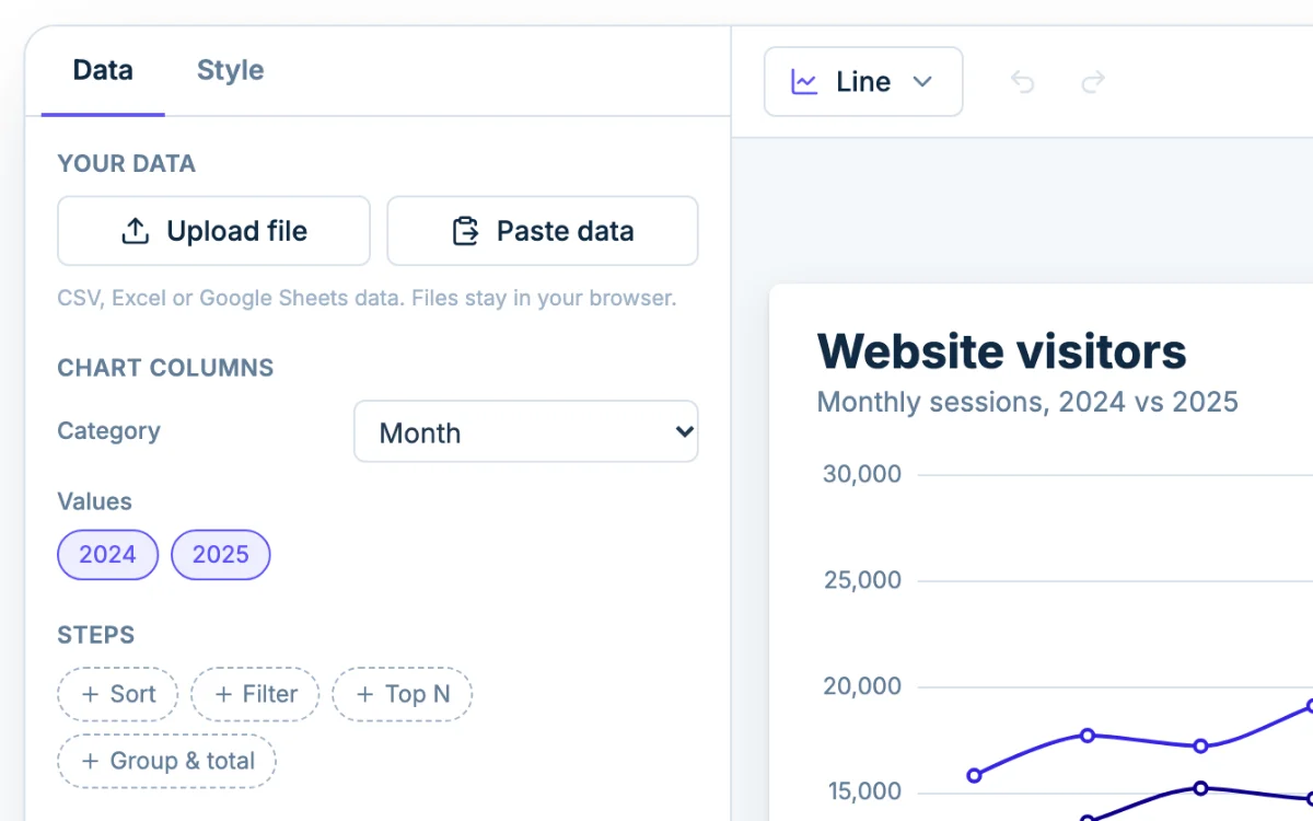
| Month | 2024 | 2025 |
|---|---|---|
| Jan | 8,200 | 9,600 |
| Feb | 7,900 | 9,100 |
| Mar | 9,400 | 11,300 |
Under Chart columns, the first column is the Category and the number columns are the Values.
A line graph maker for multiple lines
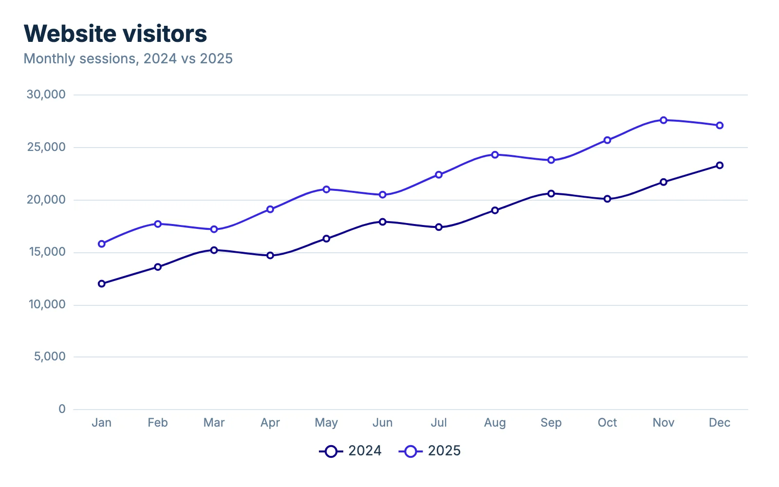
Each numeric column becomes its own line, with a legend. One date column plus three score columns gives you three lines: say Class A, Class B and Class C across ten weekly quizzes.
How many lines are too many
Past four or five lines the chart turns into spaghetti, especially when lines cross. Keep the lines that carry the story by picking only those columns under Chart columns, or give one line a strong color under Colors and let the others stay muted. To compare many groups at one moment, a bar chart is easier to read.
Smooth or straight lines
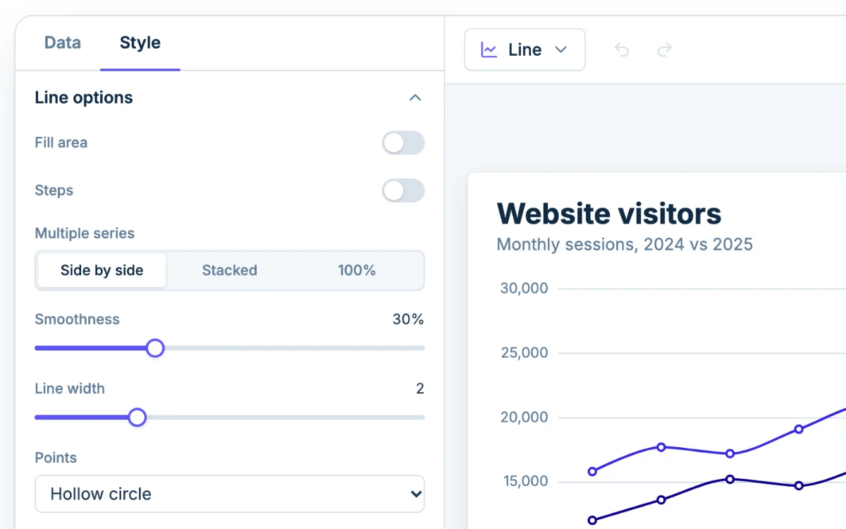
Straight segments connect your actual measurements and nothing else. A smooth line (set with Smoothness under Line options) rounds the corners, which looks nicer but can suggest a curve that never happened.
Use straight lines for sparse data and anything a teacher will grade. Use smoothing for dense data like daily traffic, where you want the general trend. If a value changes on one date and then stays flat, such as a price, turn on Steps.
Line, area or stacked area
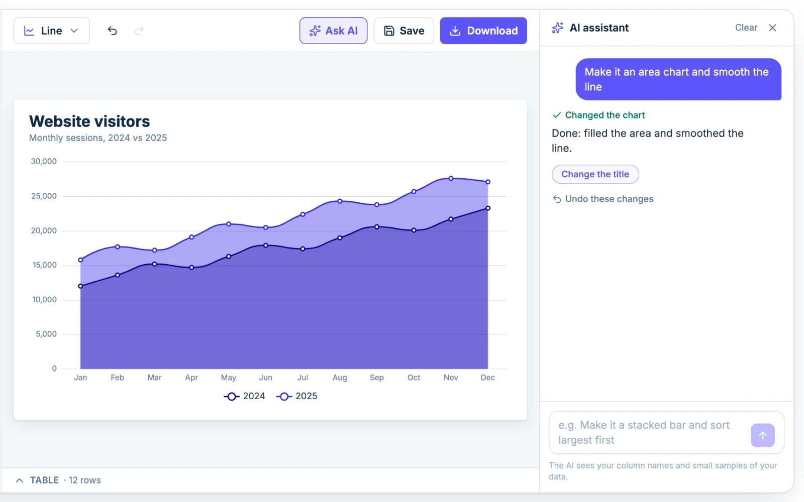
Turn on Fill area and the line becomes an area chart. The fill makes the size of the values visible, so it suits totals such as monthly sessions. Lines are better when several series cross, because filled areas hide each other. If you fill several, adjust Area opacity so the lower ones show through.
Stacked area for parts of a total
Set Multiple series to Stacked and each series is added on top of the one below. Use it when the parts add up to something meaningful, such as visits by source that sum to total visits. Only the bottom layer sits on a flat baseline, so the upper layers are hard to compare by eye. If the question is which source is growing fastest, plain lines answer it better. 100% shows each series as a share of the total instead.
Should the y-axis start at zero?
For bar charts and filled areas, yes: readers judge the size of the shape, so cutting off the bottom exaggerates differences. A line graph is different, because the reader follows the position and slope of the line.
- Zero hides the story when changes are small next to the values. A temperature moving from 68 to 72 degrees looks flat on a 0 to 100 axis.
- A cropped axis exaggerates when readers assume it starts at zero. Sales going from 980 to 1,020 look like a surge on an axis running from 975 to 1,025.
Crop only when the change really is the point, and label the axis clearly. To set the range, open Vertical axis in the Style tab and enter Min and Max.
Line graph or bar graph
Use a line graph when the x-axis is continuous, usually time, and the connection between points means something. Use a bar graph for separate categories, such as sales by region, or for two or three time points where a line would imply a trend you do not have.
In US classrooms, "line plot" is a different chart: X marks stacked above a number line. For that, use the dot plot maker. If both variables are measurements rather than a sequence in time, a scatter plot fits better.
Titles, axis labels and legend
A graph for a grade or a report needs a title, labeled axes and units. In the Style tab, open Titles for the chart title, then Horizontal axis and Vertical axis for axis titles, number format and gridlines. Legend moves or hides the key.
A shortcut: ask the AI
Click Ask AI and type something like "show monthly sales by region as lines and start the y-axis at zero." Undo reverses anything it changes. The assistant sees your column names and small samples of the data, not the whole file.