X Y Graph Maker: Plot X and Y Points Online

This free x y graph maker plots a point for every pair of numbers in your table. Replace the sample values, name the axes and download a PNG or SVG, with no signup needed.

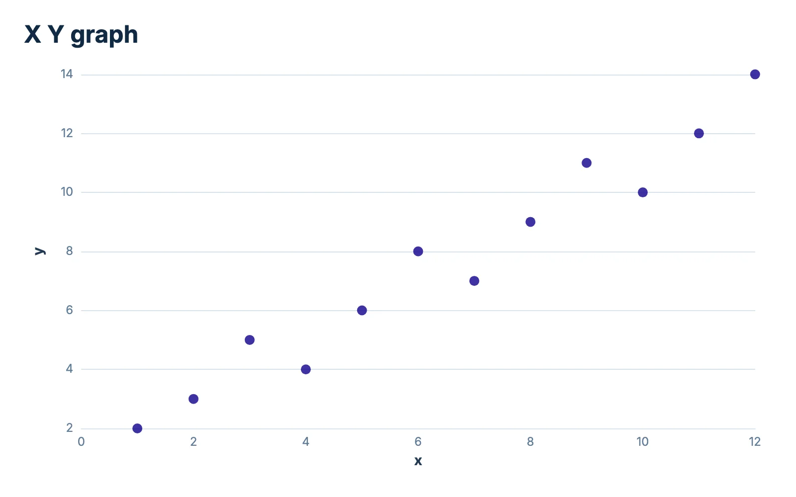
X Y graph of 12 points on axes titled x and y. The points rise from (1, 2) at the lower left to (12, 14) at the upper right. y x 2 4 6 8 10 12 14 0 2 4 6 8 10 12 X Y graph chartjuice.com

How to use this x y graph maker in 3 steps

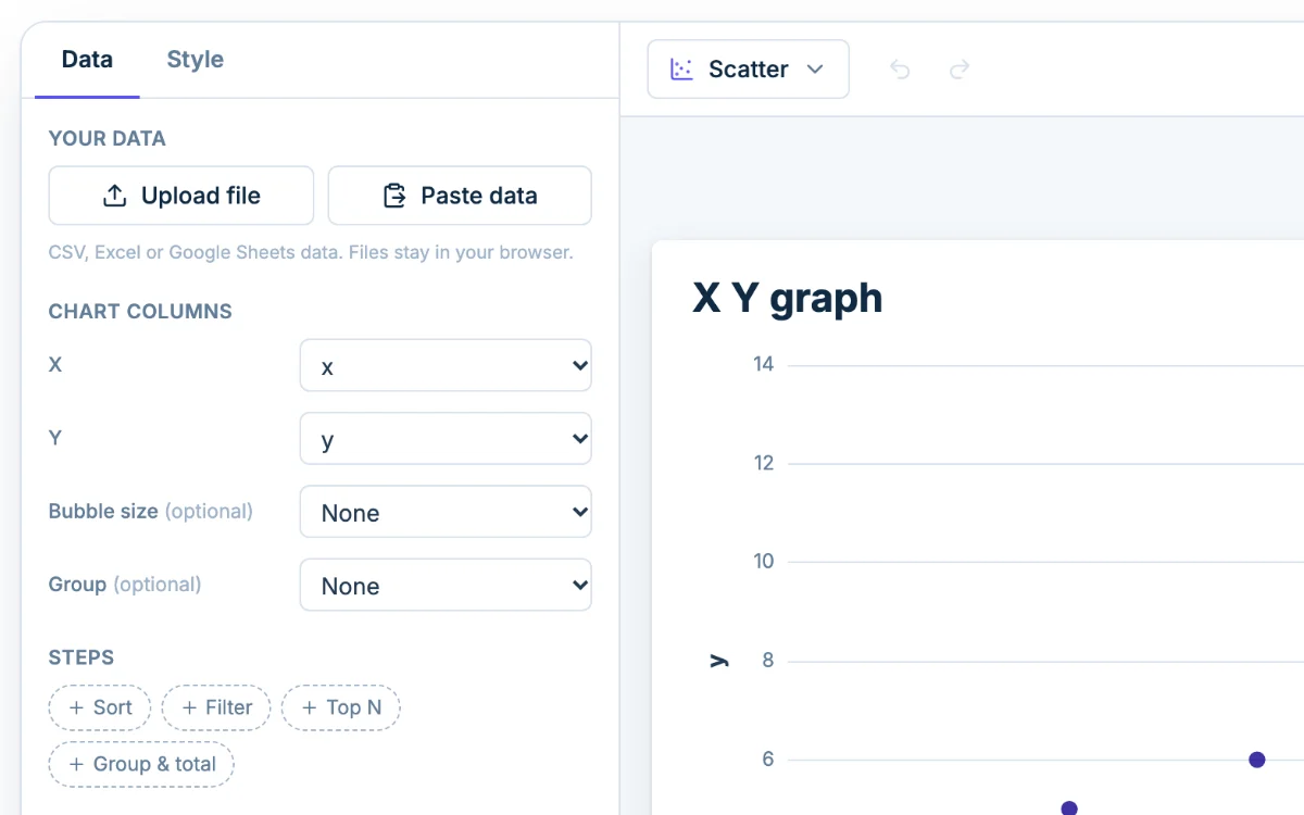
  1. The Data tab in Chartjuice, with Upload file and Paste data beside a x y graph
    1

    Enter your x and y values

    Type over the sample in the table under the chart, or click Paste data or Upload file. Put the x values in one column and the y values in the next, one pair per row. Chart columns shows which column is X and which is Y.

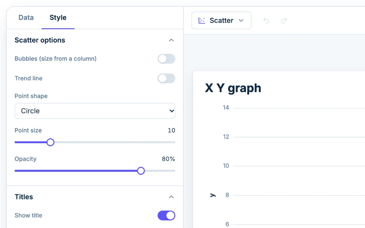
  2. The Style tab in Chartjuice, open beside a x y graph
    2

    Name the axes

    Open the Style tab. Under Horizontal axis and Vertical axis, replace "x" and "y" in Title text with what you measured and its unit. Min and Max set where each axis starts and ends.

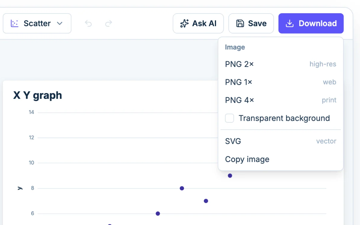
  3. The Download menu in Chartjuice: PNG at 1x, 2x or 4x, SVG and Copy image
    3

    Download it

    Click Download and pick PNG at 1x, 2x or 4x, or SVG. Copy image puts the graph on your clipboard for a lab report or slide.

What an x y graph shows

An x y graph has two number lines: x runs across and y runs up. Every row of your table is one point. Its x value sets how far right the point sits, and its y value sets how high. The sample graph plots 12 pairs, from (1, 2) up to (12, 14).

Put the value you choose or control on x, and the value you measure on y. Minutes of heating go on x and temperature on y. Ad spend goes on x and signups on y.

Is an xy graph the same as a scatter plot?

Yes. An x y graph, an xy graph and a scatter plot all place points by two numbers, so an xy graph maker and a scatter plot maker are the same kind of tool. This page is the plain version of the Chartjuice scatter plot maker: the same designer, opened on a bare two-column table with no trend line. Go there for correlation and colored groups, or to the bubble chart maker to size each point by a third number.

Points only, or points joined by a line?

This graph draws points only. The designer's Scatter chart has no setting that joins the points, so you can't turn it into a connect-the-dots line here.

For joined points, use the line graph maker. It draws a line through your rows in order. It treats the x column as labels and spaces them evenly, which is right when x goes up in equal steps (1, 2, 3 or Jan, Feb, Mar). If your x values are uneven, such as 1, 2 and 10, the line graph still spaces them evenly, and only the x y graph puts each point where its number says.

Graph an equation from a table of values

To graph an equation, build a table of values and plot the pairs. Take y = 2x + 1. Choose x values, work out y for each, and you get:

x y
-3 -5
-2 -3
-1 -1
0 1
1 3
2 5
3 7

Paste the two columns and the seven points fall on a straight line. For a curve such as y = x², use more x values, closer together, so the shape shows.

Negative values plot where they belong. The axes sit along the bottom and left edges of the graph, though, not through the origin, so you won't get a four-quadrant grid with the axes crossing at (0, 0). To add vertical gridlines, turn on Gridlines under Horizontal axis.

Add a trend line

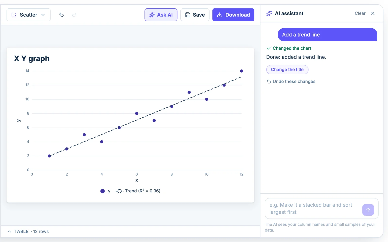
Open the Style tab, expand Scatter options and turn on Trend line. Chartjuice draws a dashed straight line through the middle of the points. Turn on Show R² and the legend says how closely the points follow it, from 0 to 1.

Plot the y = 2x + 1 table above and the line runs through all seven points, with R² at 1.00. Plot y = x² for x from -3 to 3 and R² drops to 0.00: the points make a clear U, but no straight line follows a U.

Read a trend line with care. One point far from the rest can tilt it, and a line that fits well still doesn't say that x causes y.

Make the points easier to read

Under Scatter options, Point size makes the dots bigger and Point shape swaps circles for squares, triangles or diamonds. Lower Opacity when points overlap, so a pile of them looks darker than a single point.

Both axes fit your data, so they may not start at zero. Set Min to 0 under Horizontal axis or Vertical axis when the graph should include the origin.

Ask AI to set it up

Click Ask AI and type something like "add a trend line and title the axes Time and Distance". The assistant changes the same settings you would by hand, so you can adjust anything afterward. It sees your column names and a small sample of the rows, not the whole file.
Everything you need to make an x y graph

  • Upload or paste your data

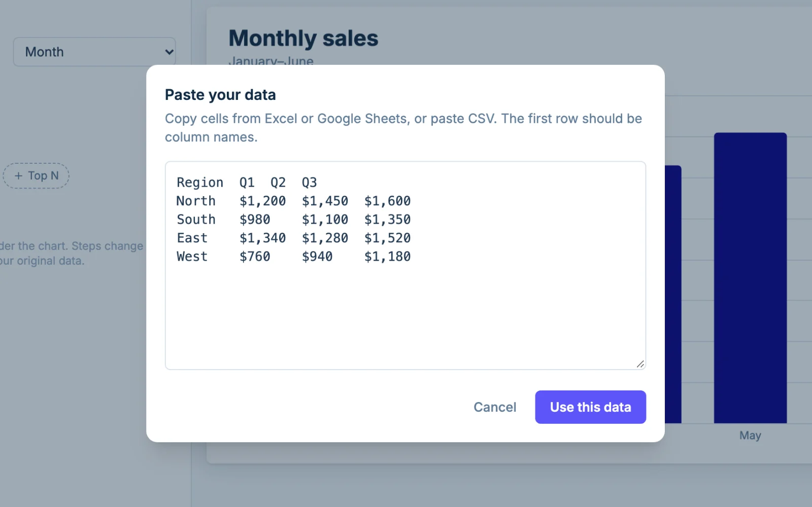
    Drop in a CSV, TSV, XLSX, XLS or ODS file, or paste two columns from Excel or Google Sheets. The file is read in your browser and never uploaded. One graph takes up to 5,000 rows.

    The Paste data dialog in Chartjuice with a table pasted from a spreadsheet
  • Looks good out of the box

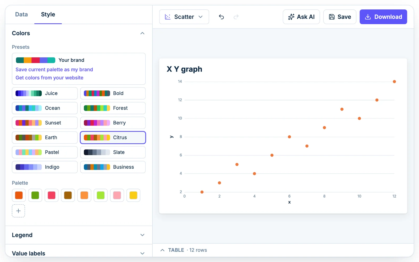
    Points sit over light gridlines with both axes titled. Change the point color under Colors, pick a preset palette, or save your brand colors with Pro.

    The Colors section in Chartjuice with preset palettes, open beside a x y graph
  • Design with AI

    Ask for a trend line, bigger points or new axis titles in plain English, then fix anything by hand. A free account gets 3 tries, and Pro gets 50 messages a day.

    See what the AI graph maker can do

    The Chartjuice AI assistant editing a x y graph from a plain-English request
  • Download PNG or SVG

    Download a PNG at 1x, 2x or 4x, optionally transparent, or an SVG. Free downloads carry a small, faint "chartjuice.com" in the bottom-right corner, and Pro removes it.

    A x y graph downloaded from Chartjuice as a PNG

Frequently asked questions

How do I make an x y graph?

Put your x values in one column and your y values in the next, one pair per row. Paste them into the table under the chart or upload the file. Check that Chart columns has the right column as X and as Y, then download the graph.

Which value goes on the x axis?

The one you choose or control, such as time, dose or price. The value you measure as a result goes on the y axis. If neither depends on the other, either order works.

Can I connect the points with a line?

Not on this graph. It draws points, plus a straight trend line if you turn one on. To join the points in order, use the line graph maker, which spaces the x values evenly.

Can I graph an equation?

Yes, from a table of values. Pick x values, work out y for each one, and paste the two columns. Chartjuice plots the pairs. It does not take an equation such as y = 2x + 1 and draw it for you.

Can Claude or ChatGPT make an x y graph?

Yes. Connect an AI assistant to Chartjuice once, then paste your x and y values and ask in plain words for a scatter plot. It is saved to your account and opens in the editor.

Is the x y graph maker free?

Yes. Making and downloading graphs is free and needs no account. A free account saves up to 5 charts. Pro, at $12 a month or $120 a year, removes the chartjuice.com mark and saves your brand colors (see pricing).

Want the full tour? Read how Chartjuice works.

Keep your x y graphs in a free account

You can make and download an x y graph without signing up. A free account saves your graphs so you can come back and change the data.