What a line plot shows
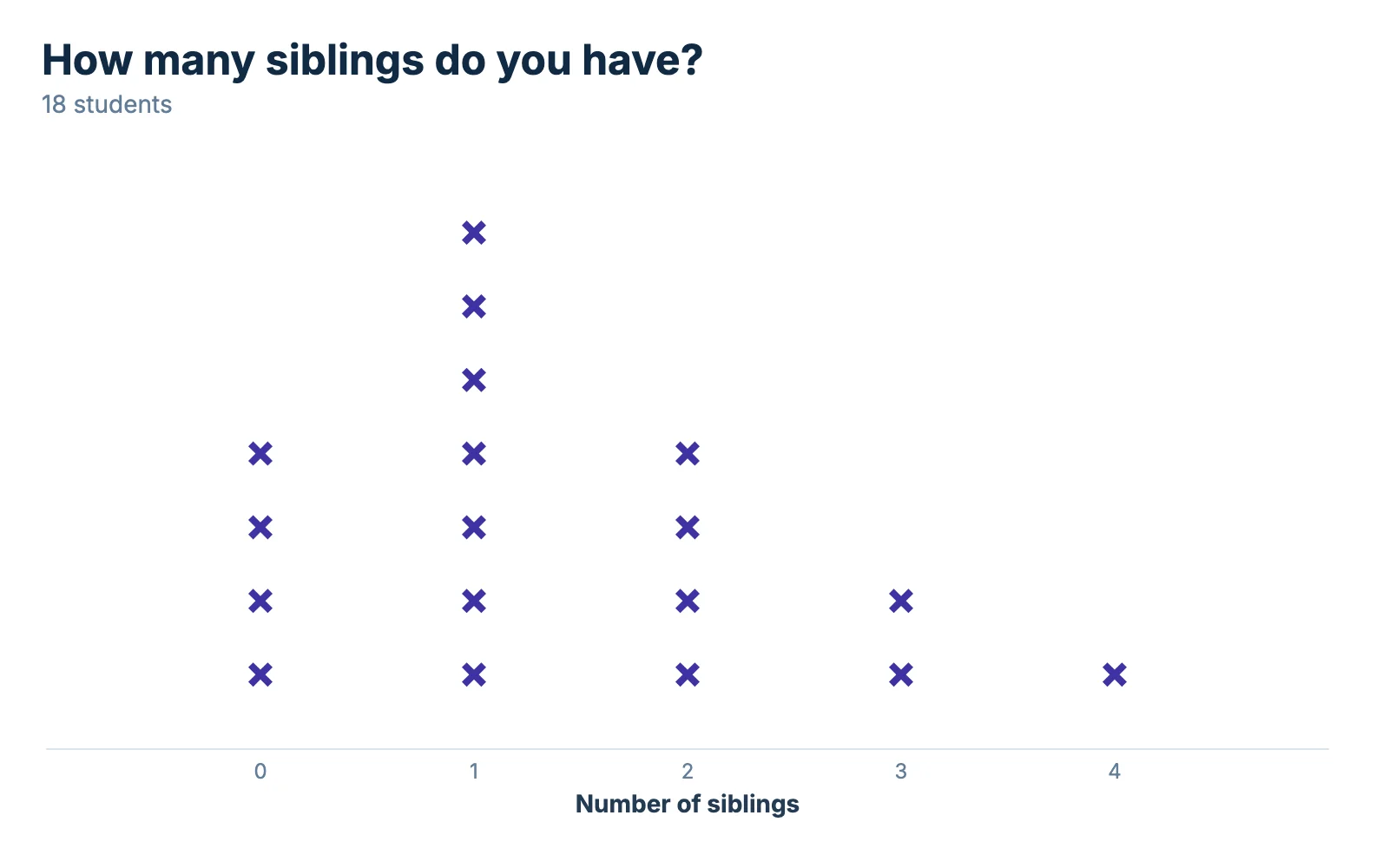
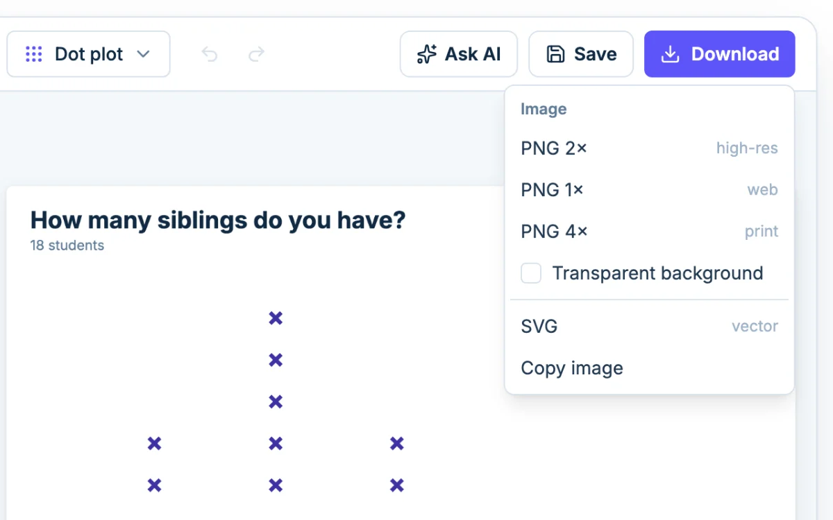
A line plot is a number line with an X above it for every value in the data. Matching values stack, so the height of a stack is how many times that value came up. The sample plot asks 18 students how many siblings they have. Four said 0, seven said 1, four said 2, two said 3 and one said 4.
How to read a line plot
Most worksheet questions come down to counting Xs. On the siblings plot:
- How many students were asked? Count every X: 4 + 7 + 4 + 2 + 1 = 18.
- How many have exactly 2 siblings? Read the stack above 2. It has four Xs.
- How many have 2 or more? Add the stacks at 2, 3 and 4: 4 + 2 + 1 = 7.
- Which answer is most common? The tallest stack, at 1. That value is the mode.
- What is the range? The largest value minus the smallest: 4 - 0 = 4.
Clusters, gaps and outliers
A cluster is a group of stacks close together: here 15 of the 18 Xs sit at 0, 1 or 2. A gap is a number with no X above it and Xs on both sides. This plot has none. An outlier is an X far from the rest. The lone X at 4 is only one step past 3, so it is not much of one.
For the mean and the median, the dot plot maker page works through both on a similar chart.
Line plots with fractions
The Common Core math standards ask 4th and 5th graders to make line plots of measurements in halves, quarters and eighths of a unit (4.MD.B.4 and 5.MD.B.2), such as pencil lengths to the nearest quarter inch.
Type each fraction as a decimal. Chartjuice reads a cell like 1/2 as text, and the Value column needs numbers.
| Fraction | Type this |
|---|---|
| 1/2 | 0.5 |
| 1/4, 3/4 | 0.25, 0.75 |
| 1/8, 3/8, 5/8, 7/8 | 0.125, 0.375, 0.625, 0.875 |
A pencil that measures 4 3/8 inches goes in as 4.375.
Halves and quarters
When your values are a half or a quarter apart, the number line gets a label on every step: 1, 1.25, 1.5, 1.75, 2. A quarter that nobody measured shows as an empty place on the line.
Eighths
Eighths work the same way: twelve pencil lengths from 4.125 to 5 inches get a label on every eighth, including 4.875, where no pencil landed. The number line holds up to 14 labels like this, about an inch and a half of eighths. A longer one is labeled at round numbers.
The labels are decimals, not fractions. For a worksheet, name the unit in the axis title, such as "Length in inches, to the nearest 1/8".
Line plot vs dot plot vs line graph
| Chart | What it looks like | What it is for |
|---|---|---|
| Line plot | X marks stacked over a number line | Counting how often each value comes up. The name used in elementary math. |
| Dot plot | The same chart drawn with dots | The same job. The name used in middle school and statistics. |
| Line graph | Points joined by a line, with a value on both axes | Change over time, like temperature by hour. |
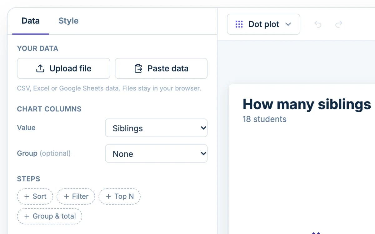
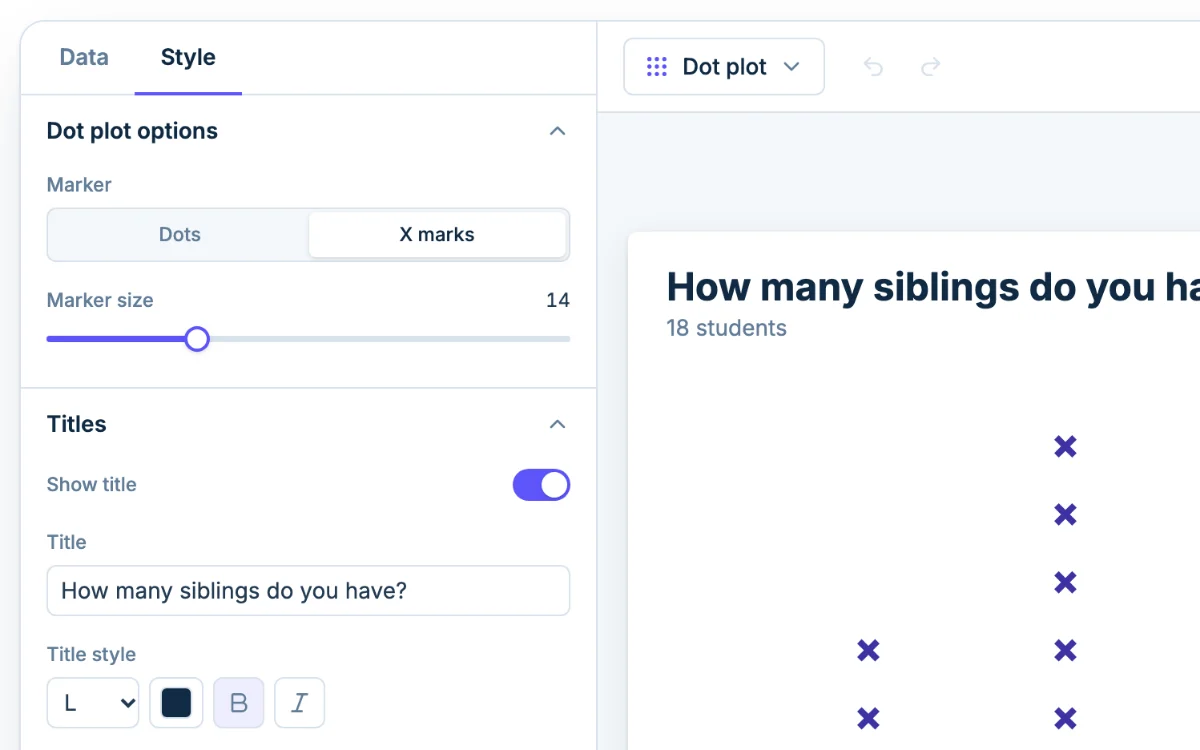
This page is the X mark version of the Chartjuice dot plot maker: the same designer, opened on X marks. To switch, set Marker to Dots under Dot plot options.
A line graph is a different chart. If your data is two columns, a time and a value, make it with the line graph maker.
Change the look of a line plot
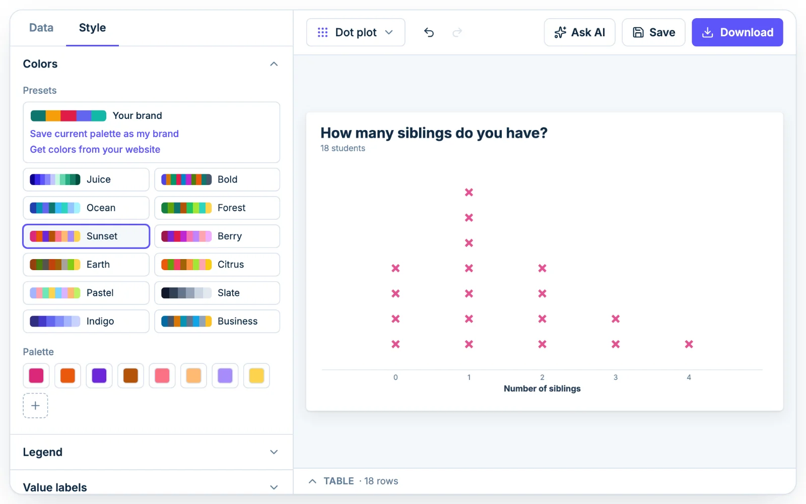
- Mark color: under Colors, pick a preset palette or change the first palette color.
- Number line: under Horizontal axis, Min and Max set the scale, Axis title names it, and Gridlines draws a faint line up from each label.
- Two groups: set a Group column under Chart columns and each group gets its own color. The Legend section shows, hides or moves the key.
Ask AI to set it up
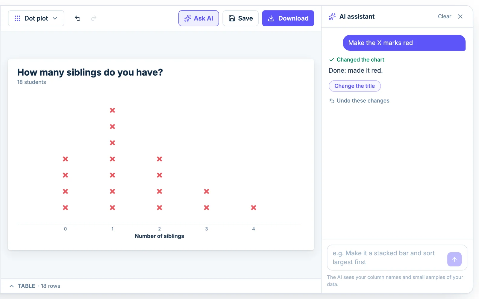
Click Ask AI and type something like "make the X marks bigger and title it Siblings per student". The assistant changes the same settings you would by hand, so you can adjust anything afterward. It sees your column names and a small sample of the rows, not the whole file.