Radar chart vs spider chart: the same chart
A radar chart and a spider chart are the same chart. You will also see it called a web chart or a star chart. "Spider chart" comes from the look: one spoke per attribute, with rings joining the spokes like a web.
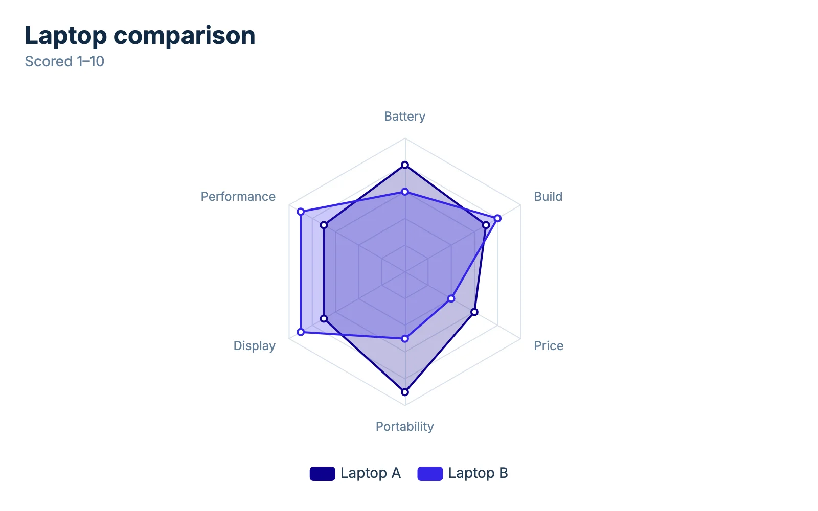
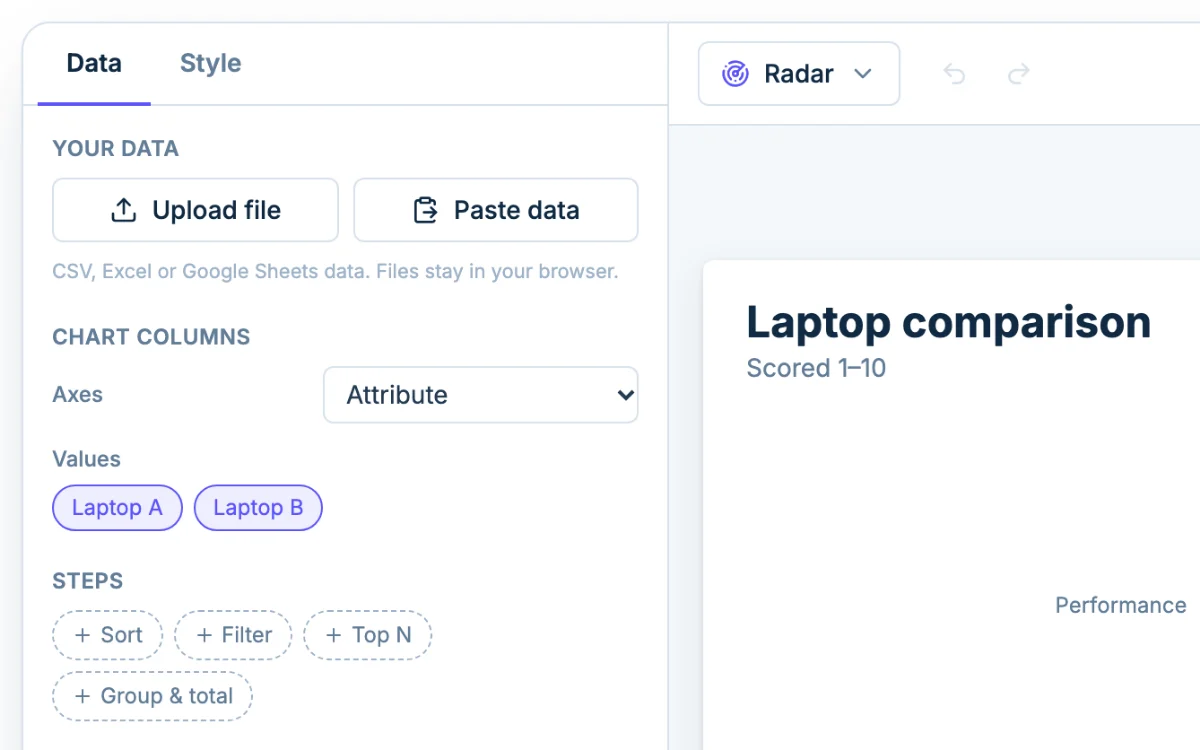
Each row of your table becomes a spoke, and each value column becomes a shape joining that item's scores. The center is zero and the outer ring is the top of the scale. A big, even shape means strong across the board. A lopsided one means strong in some places and weak in others.
When a radar chart works for comparing profiles
Use a spider chart when you care about the shape of each item, not the exact numbers.
Product and feature comparisons
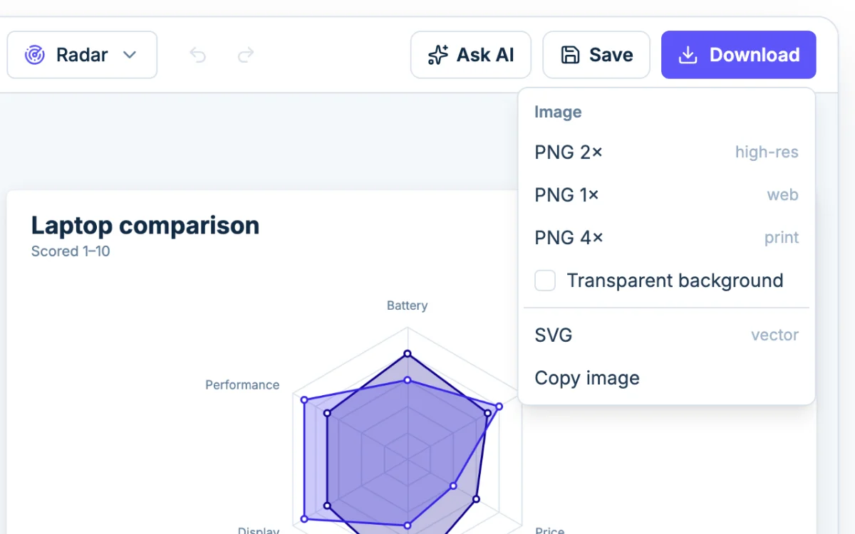
Take two laptops scored from 1 to 10. Laptop A reaches toward Battery and Portability. Laptop B stretches toward Performance and Display. You see "travel laptop" and "workhorse" at a glance.
Skills assessments and player stats
A self-review against a manager's review on five skills fits the same way, as do two players rated out of 100 on speed, shooting, passing, defense and stamina.
How many axes and series work
Three axes is the minimum for a real shape. As a rule of thumb, five to eight read best, and around ten the labels start to collide. Chartjuice adds a suggestion under the chart past twelve. With more attributes, split related ones into separate charts.
For series, two or three shapes stay readable, and four is the limit when they are filled.
Radar chart maker options: shape, scale and fill
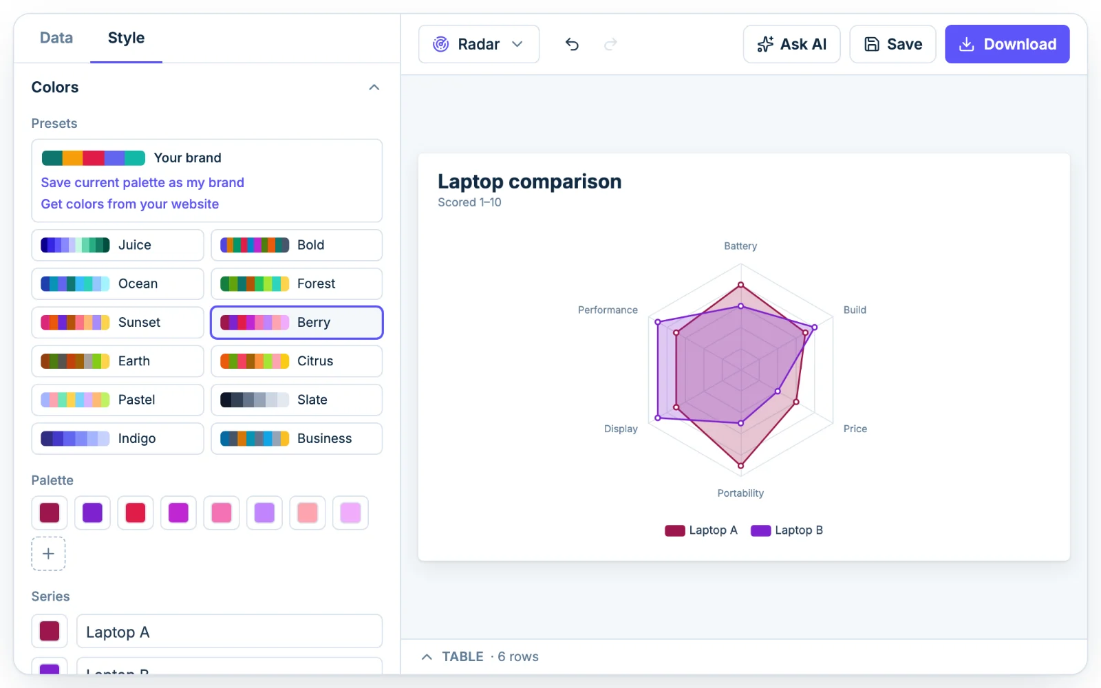
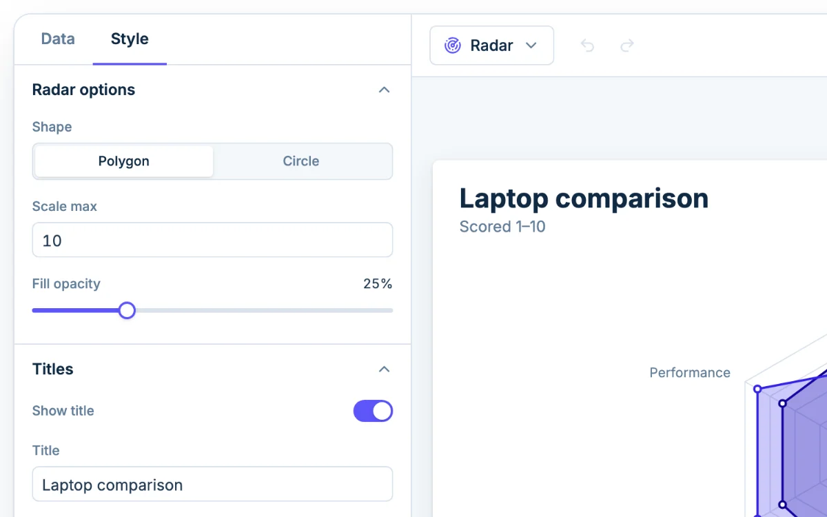
In the Style tab, expand Radar options.
- Shape: Polygon draws straight lines between spokes, the classic spider chart look. Circle draws round rings.
- Scale max: blank rounds up from your highest value. Set it when the scale has a real ceiling, such as 10 for a 1 to 10 rating or 100 for percentages. Otherwise scores that top out at 7 look like a full chart.
- Fill opacity: lower it when shapes overlap.
Normalize values on different scales first
Every spoke shares one scale that starts at zero, and Scale max is one number for the whole chart. If one attribute is a 1 to 5 rating and another is monthly users in the thousands, the rating hugs the center and the users spike out, so the shape tells you nothing.
Rescale every attribute to 0 to 100 before you chart it, then set Scale max to 100. Min-max rescaling does it: (value − lowest possible) ÷ (highest possible − lowest possible) × 100. Worked examples:
- A rating from 1 to 5: (4.2 − 1) ÷ (5 − 1) × 100 = 80.
- A count with a known ceiling: 18,000 monthly users against a target of 25,000 is 18,000 ÷ 25,000 × 100 = 72.
Do the math in your spreadsheet and paste the results. Add a note under Titles, such as "All scores rescaled to 0 to 100", so nobody reads 72 as a raw count.
When a radar chart misleads
- Axis order changes the shape. The same data in a different order gives a different outline. Put related attributes together and keep one order across charts you compare.
- Area grows faster than the values. Double every score and the area quadruples. Compare along the spokes, not by how much ink a shape uses.
- Lower is better on some axes. A shape that reaches far on "delivery time" looks good but is bad news. Flip it so higher is always better: chart delivery speed, or use 100 minus the scaled value. The preset does this with Price, where a higher score means cheaper.
- Filled shapes hide each other. Lower the Fill opacity or cut a series.
When to use a grouped bar chart instead
Radar charts show overall shape. A grouped bar chart shows exact values. Switch when readers need the actual numbers, you have more than three or four items, your attributes use different units, or no order of attributes is more natural than another.
Switch types with the chart type picker in the toolbar, which keeps your data, or make a grouped bar chart directly. If only two attributes matter and you have many items, a scatter plot gives each item its own dot.
Start the chart with the AI assistant
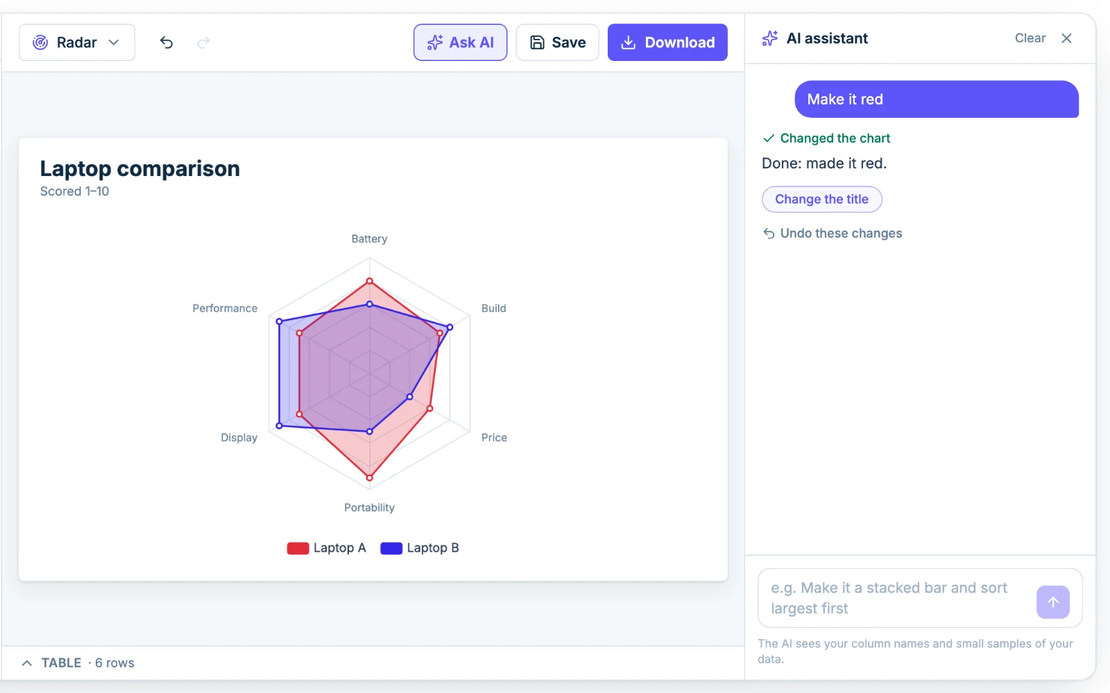
To describe the chart instead of building it, click Ask AI and type something like "make this a radar chart with the scale max at 10". The assistant sees column names and small samples of the data, not the whole file, and every change stays editable by hand.