How to make a graph online in six steps
Chartjuice works the same way on every page. Open the graph maker (or any of the chart makers), then:
- Add your data on the Data tab: upload a file, paste cells, or type into the table.
- Check which columns the chart uses under Chart columns.
- Shape the data with Steps if you need to: sort, filter, keep the top rows or add up groups.
- Pick a chart type from the toolbar.
- Style it on the Style tab, or click Ask AI and describe what you want.
- Click Download for a PNG or SVG, or use Copy image.
Each page opens with an example chart already drawn, so you can see how it works before you add anything.
Step 1: Add your data
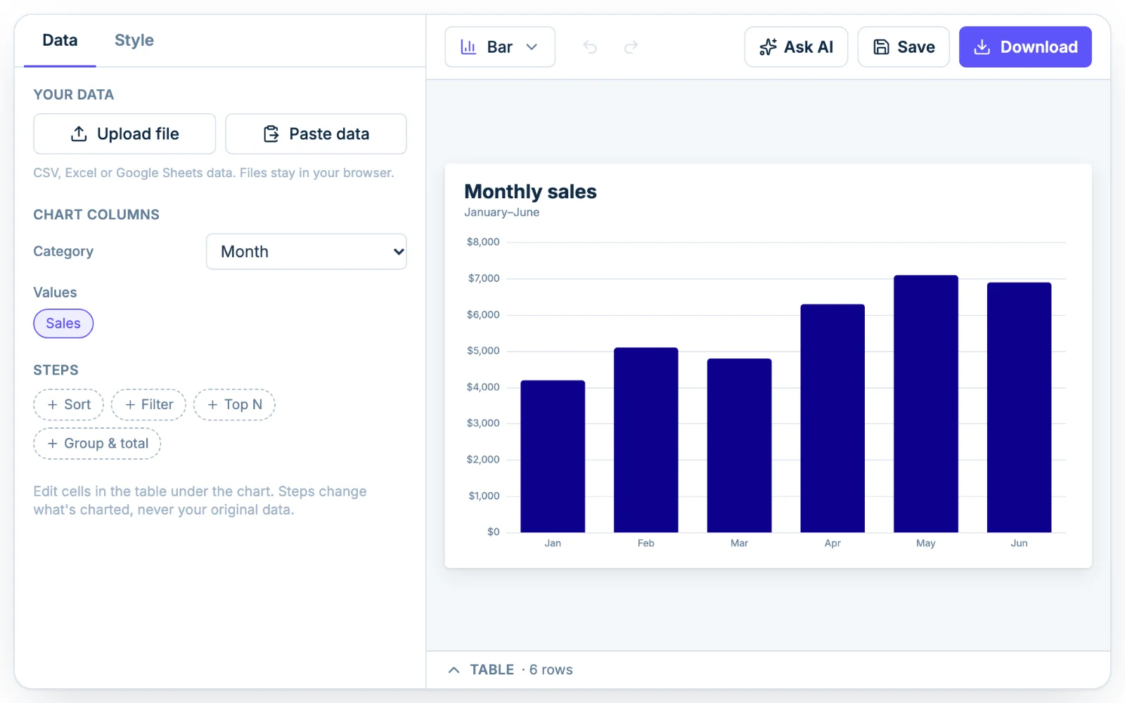
The Data tab on the left has two buttons at the top, Upload file and Paste data. You can also type straight into the table under the chart.
Upload a CSV or Excel file
Click Upload file and choose a CSV, TSV, TXT, XLSX, XLS or ODS file, up to 20 MB. You can also drag a file anywhere onto the designer and drop it. If a workbook has more than one sheet, a Sheet menu appears so you can pick the one you want.
Your file is read in your browser and isn't uploaded to a server.
Paste from Excel or Google Sheets
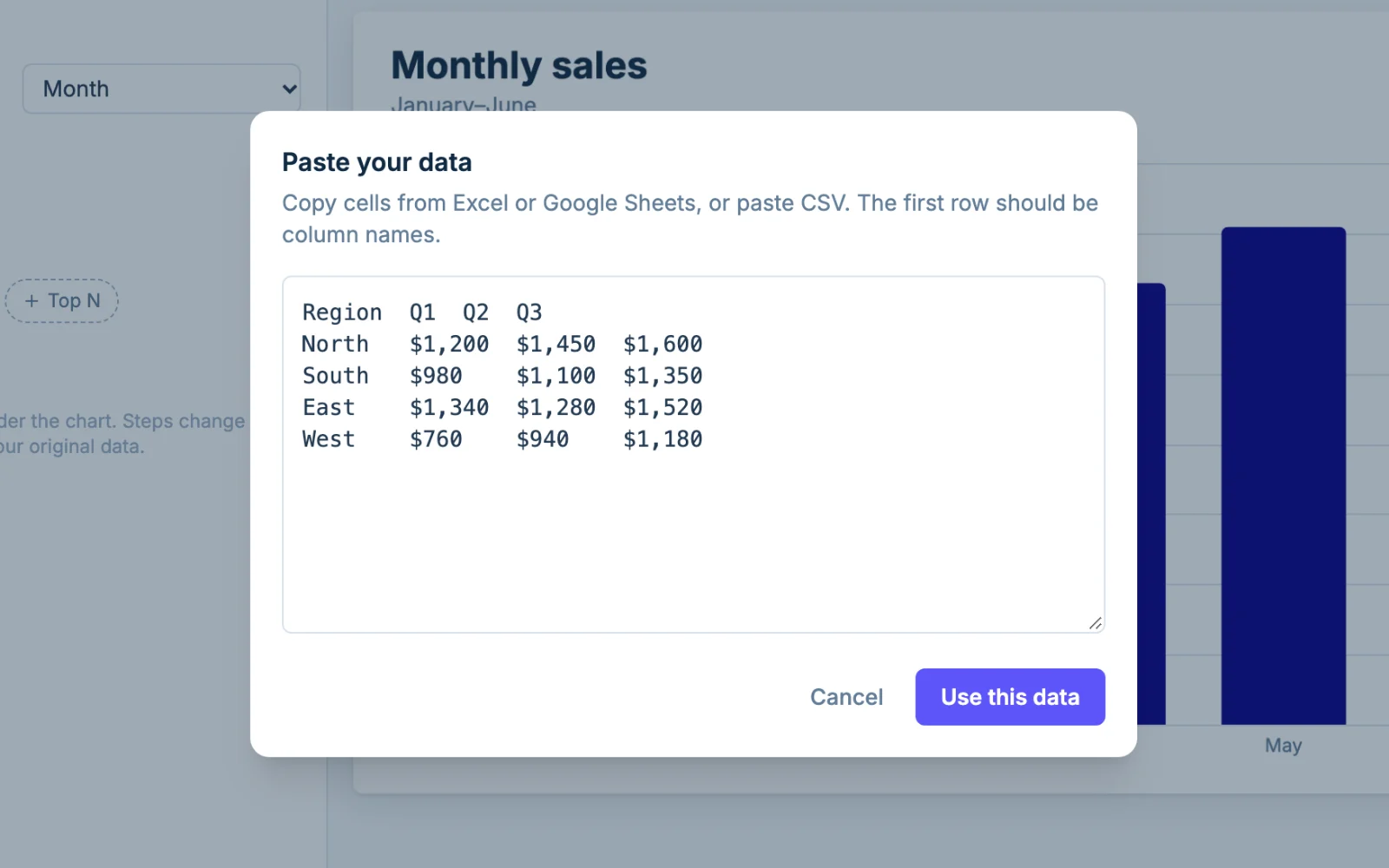
Select the cells in your spreadsheet, including the header row, and copy them. Click Paste data, paste into the box, then click Use this data. The first row becomes the column names. Pasted CSV text works too.
Type or edit in the table
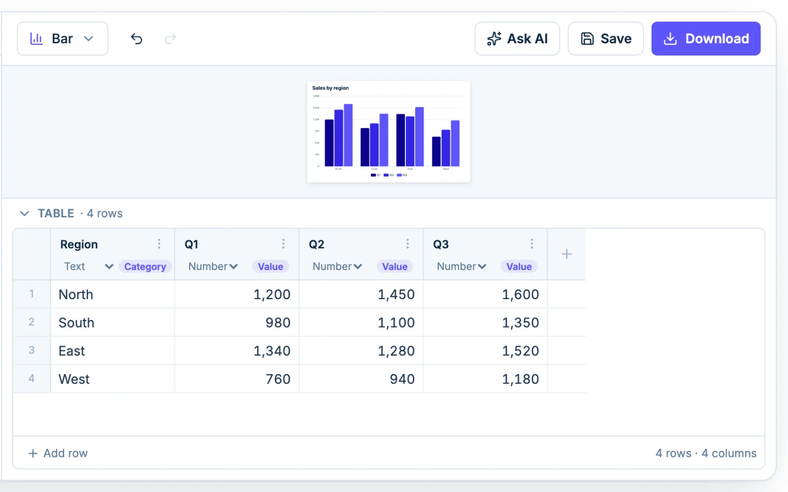
The table under the chart holds the data the chart is drawn from. Double-click a cell to edit it, click Add row at the bottom, or use the menu on a column header to insert or delete columns. Each column has a type (Text, Number or Date) that you can change if Chartjuice guessed wrong.
How Chartjuice reads messy spreadsheets
Real exports are rarely clean, so the importer does some tidying for you:
- Numbers like "$1,234.50", "12%" and "(500)" are read as 1234.5, 12 and -500.
- European numbers such as "1.234,5" are detected. If a column could go either way, a note lets you switch with Read as European or Read as US.
- Title or note rows above the table are skipped, and you get a note saying how many.
- If the file has no header row, the columns are named Column 1, Column 2 and so on.
A chart holds up to 5,000 rows and 50 columns. A bigger file still imports: Chartjuice keeps the first 5,000 rows and 50 columns and tells you what it left out.
Step 2: Choose which columns to chart
When your data comes in, Chartjuice picks columns for the chart on its own. You can check and change them under Chart columns on the Data tab.
Each chart type asks for different columns:
- Bar and line charts need a Category (the labels along the axis) and one or more Values columns. Two number columns give you two series.
- A pie chart needs Slices (the labels) and one Value column.
- A scatter plot needs an X and a Y column, plus an optional Bubble size and Group.
- Histograms, box plots and dot plots need one Value column, with an optional Group to compare several sets.
- A sankey diagram needs From, To and Amount.
- A radar chart needs Axes (the attributes) and Values. A heatmap needs Columns, Rows and Value.
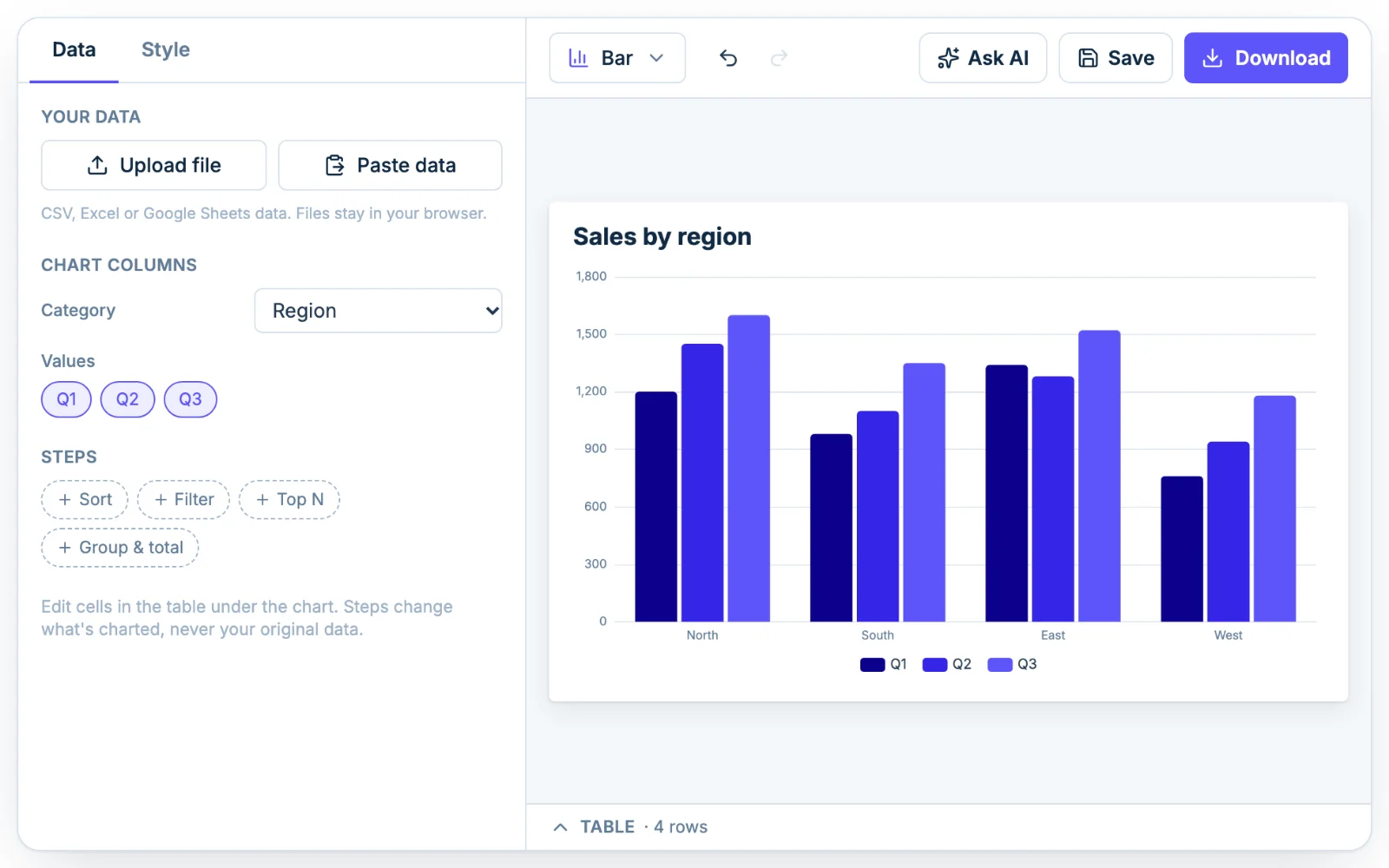
For example, a sheet with a Region column and Q1, Q2 and Q3 columns becomes a bar chart with three bars per region, one for each quarter. Click Q1 under Values to turn it off and you're left with two bars per region.
Step 3: Shape the data with Steps
Sometimes the data is right but the shape is wrong: too many rows, the wrong order, or one row per sale when you want one bar per month. The Steps section on the Data tab fixes that without touching your original data. Steps change what's charted, not what's in the table.
There are four kinds of step:
- Sort orders rows by a column, high to low or low to high.
- Filter keeps only the rows that match a rule, such as Sales > 1000, Region is East, or Name is not empty. If a survey export has blank answers, a Filter step with Answer is not empty drops them before they reach the chart.
- Top N keeps the largest rows by a column and adds up the rest as one "Other" row. It's the quickest fix for a pie chart with too many slices.
- Group & total combines rows that share a value and totals a column, with sum, avg, count, min, max or median.
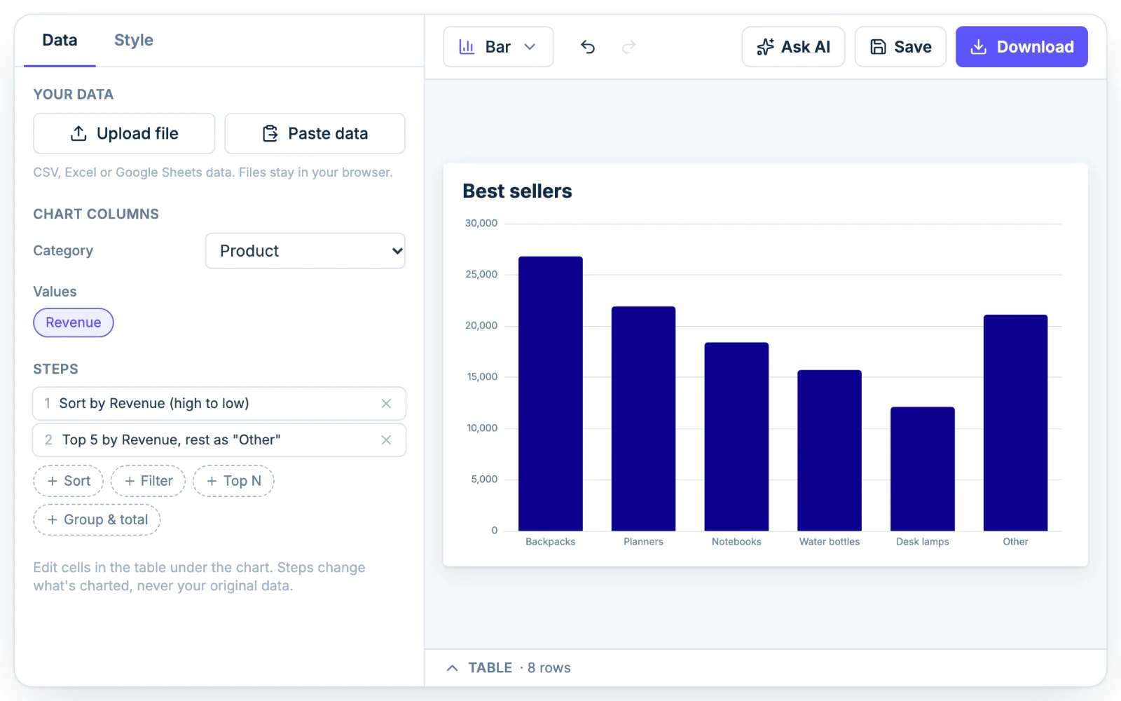
Steps run in order, from top to bottom, and each one is listed in plain words, like "Top 5 by Revenue, rest as Other". Click the x on a step to remove it.
Here's an example. Say you have a list of 400 orders with a Product and a Revenue column, and you want the five best sellers. Add a Group & total step (sum of Revenue by Product) to get one row per product, then a Top N step (top 5 by the new Revenue (sum) column). You get five bars, sorted from highest to lowest, plus an Other bar for everything else.
Step 4: Pick a chart type
Click the chart type menu at the left of the toolbar to switch between the 10 types: bar, line, pie, scatter, histogram, box plot, dot plot, sankey, radar and heatmap. Switching keeps your data and your settings, so you can try a bar graph, then a line graph, and keep the one that reads best.
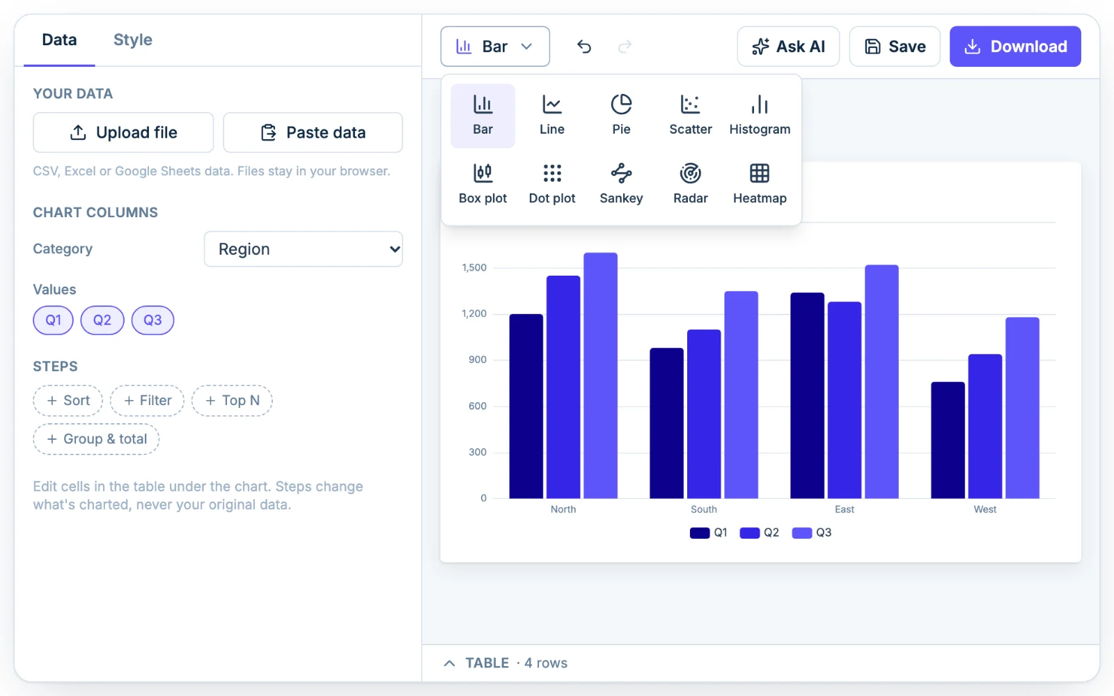
If you're not sure which to use, start from what you want the reader to notice. Comparing amounts across categories is a job for a bar graph. Change over time suits a line graph. Shares of a whole can be a pie chart, and two numbers that might move together belong on a scatter plot.
Under the chart, Chartjuice also points out things that tend to read badly: a pie with too many slices, a bar chart whose axis doesn't start at zero, or a chart with no title. If your data doesn't fit the chart type you picked, a Use example data button loads sample data for that type so you can see what it expects.
Step 5: Style the chart
Open the Style tab to change how the chart looks. It's split into sections you can open and close:
- Options for the chart type, like Donut for a pie chart, Stacked or 100% for bars, or a Trend line for a scatter plot.
- Titles for the chart title and subtitle, with their font size, alignment and position.
- Size, background & font, with presets like Wide 16:9, Square and Slide, a background color (or transparent), and three fonts: Modern, Classic and Technical.
- Horizontal axis and Vertical axis for axis titles, labels, number format, gridlines and the min and max.
- Colors for the palette and each series. Pick a preset palette or set colors by hand. Pro adds your brand palette.
- Legend for whether it shows, where it sits and how it's laid out.
- Value labels to print the numbers on the chart, with their own number format.
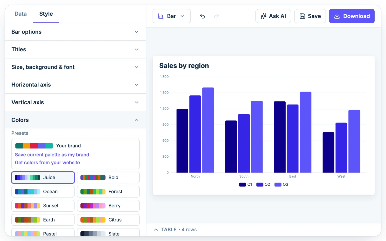
Number formats cover prefixes and suffixes like $ and %, decimals, thousands separators and short forms like 1.2K. Say the chart is going into a slide deck: choose the Slide size (1600×900), add a $ prefix to the vertical axis, and turn on Value labels so each bar shows its number. Undo and Redo in the toolbar (Ctrl+Z or Cmd+Z) step back through your edits.
Optional: describe the chart and let AI build it
Click Ask AI in the toolbar and type what you want in plain English, such as "make it a stacked bar and sort largest first" or "title it Q3 revenue and show values on the bars". The assistant makes the change on the chart in front of you.
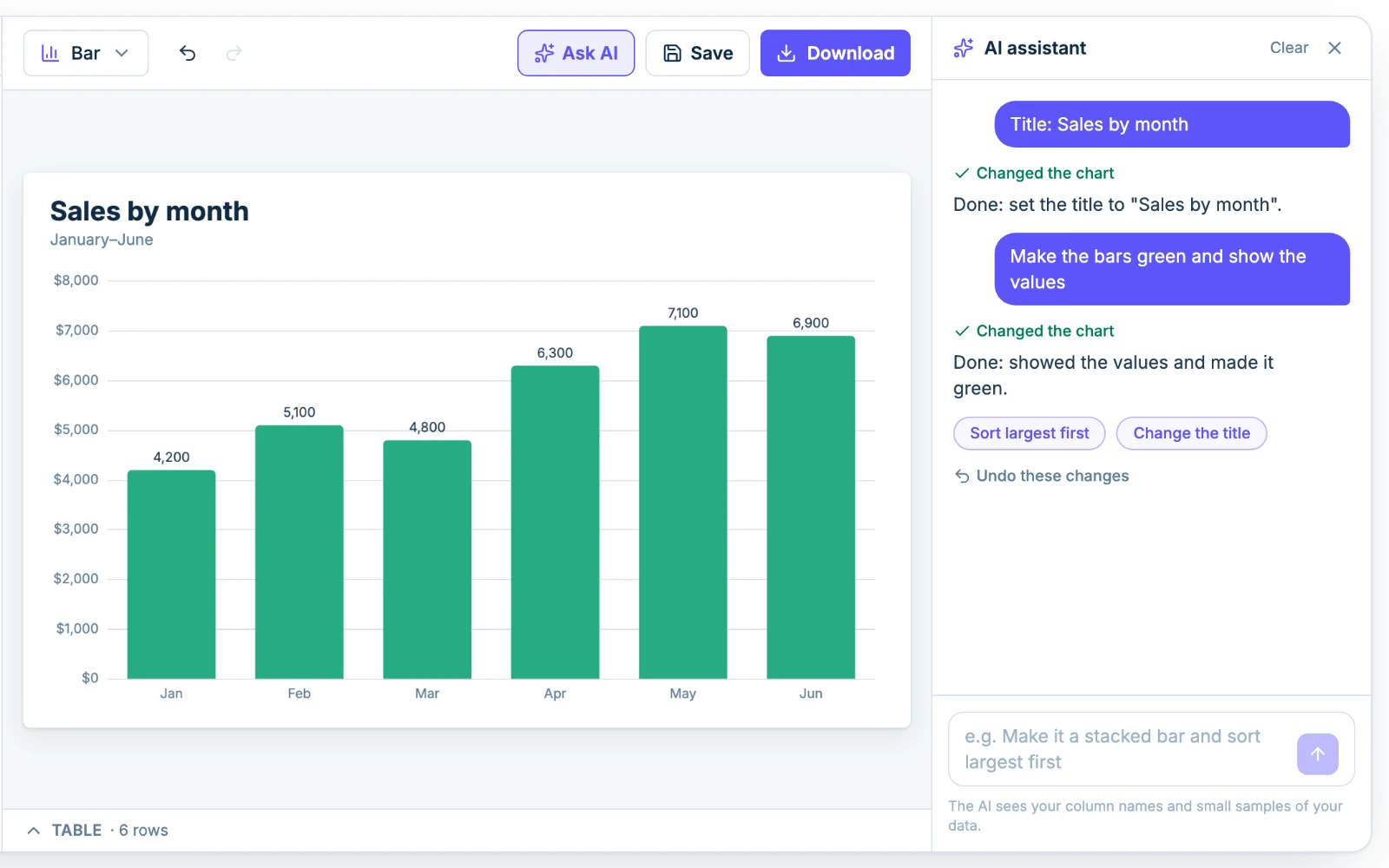
Everything the AI changes is a normal setting. You can open the Style tab afterwards and adjust anything by hand, and each request undoes in one step.
The assistant works from your column names, the first 20 rows (after your steps) and short summaries of each column, such as the minimum, maximum and average. It can look up a few more rows when it needs to check its work, but it never receives your file.
You need to sign in to use the assistant. A free account gets 3 tries in total, and Pro gives you 50 messages a day.
Step 6: Download or copy your chart
Click Download in the toolbar to get your chart as an image:
- PNG 1× for web pages.
- PNG 2× for slides and documents. It's twice the chart's size in pixels, so the default 800 × 500 chart comes out at 1600 × 1000.
- PNG 4× for print.
- Transparent background, a checkbox that applies to the PNGs and Copy image, for charts that sit on a colored slide or page.
- SVG for a vector file that stays sharp at any size and opens in design tools.
- Copy image puts a 2× PNG on your clipboard, ready to paste into a document, slide or chat.
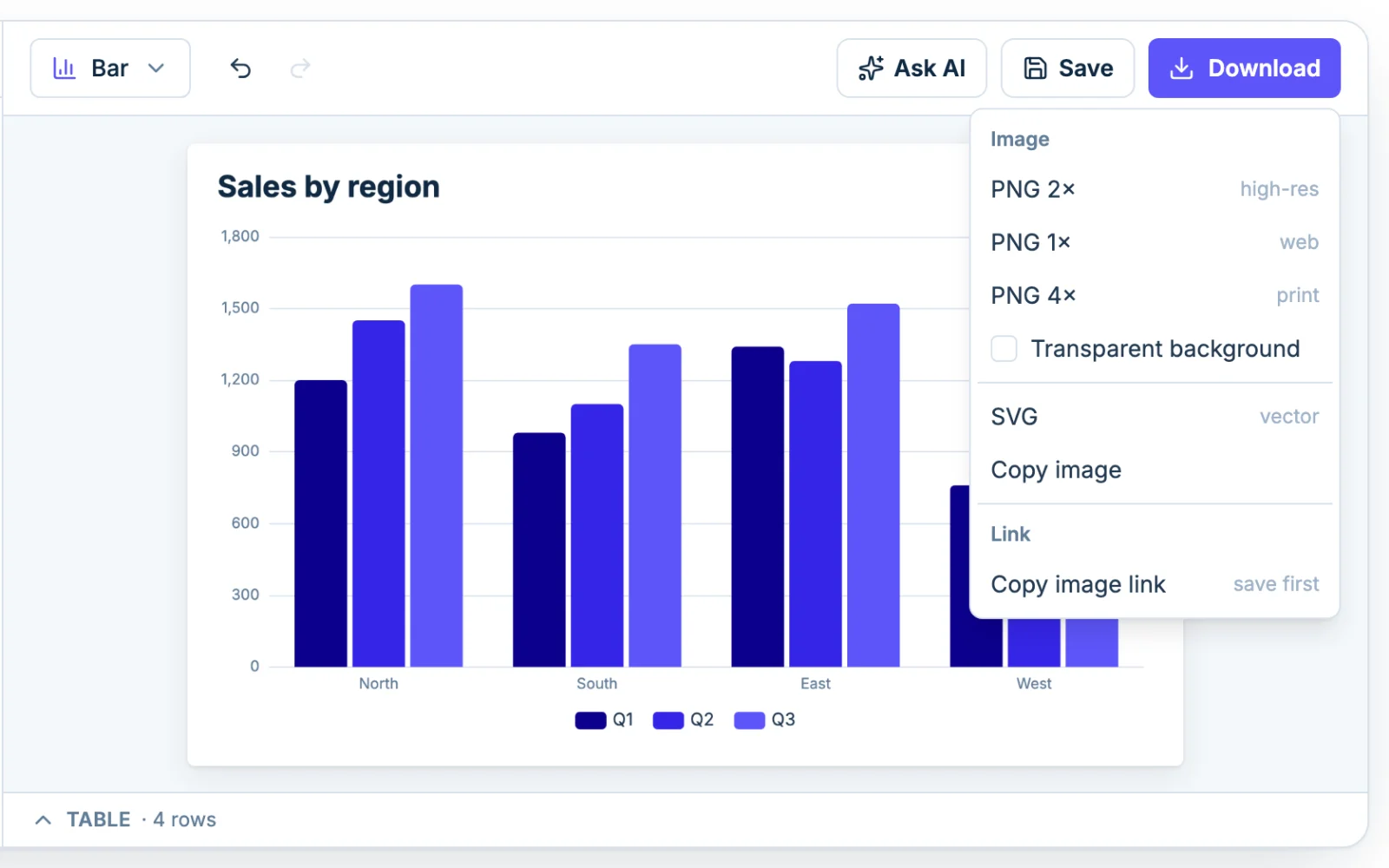
The same menu has Copy image link, for a chart saved to your account. It copies a web address that shows the chart as a picture. Paste it into an email, a Notion page or a website and the picture follows your edits. Chart images explains how.
A downloaded file is named after your chart title, so a chart titled "Q3 revenue" downloads as q3-revenue.png. On the free plan, every PNG, SVG and copied image carries a small, faint "chartjuice.com" in the bottom-right corner. Pro removes it. The charts are yours to use anywhere, including commercial work, with no other credit needed.
Save your charts with a free account
You don't need an account to make or download a chart. Each chart maker page also remembers your latest chart in this browser, so it's still there if you reload.
To keep charts and come back to them from anywhere, click Save and create a free account. There's no password: you sign in with Google or with a code sent to your email. After the first save, your changes save to your account as you work. Your saved charts live on the My charts page, where you can open, rename, duplicate or delete them. A free account saves up to 5 charts, and Pro saves as many as you like. A saved chart, data included, can be up to 4 MB, which fits a full 5,000-row, 50-column table.
Limits worth knowing
A few limits to keep in mind:
- 5,000 rows and 50 columns per chart, from files up to 20 MB.
- Saved charts up to 4 MB each.
- 5 saved charts on a free account, with no cap on Pro.
- 3 AI tries in total on a free account, and 50 AI messages a day on Pro.
- Very large PNG exports can hit your browser's size limit. If that happens, Chartjuice downloads the largest size your browser allows and tells you.
The editor doesn't connect to a database or follow your spreadsheet, so when your numbers change, paste or upload the new data. A downloaded image is a copy, so download it again. A picture shown by an image link updates by itself.
Make charts without opening the editor
Everything above happens in the editor. Two other ways to make and change your charts are on every plan: connect an AI assistant such as Claude or ChatGPT and ask in plain words, or use the API from your own code. Charts made either way are saved to your account and open in the editor like any other. The docs show how to set up both.