Bubble Chart Maker: Size Each Point by a Third Number

This free bubble chart maker places a point by two numbers and sizes it by a third. Replace the sample cities with your own rows and download a PNG or SVG, with no signup needed.

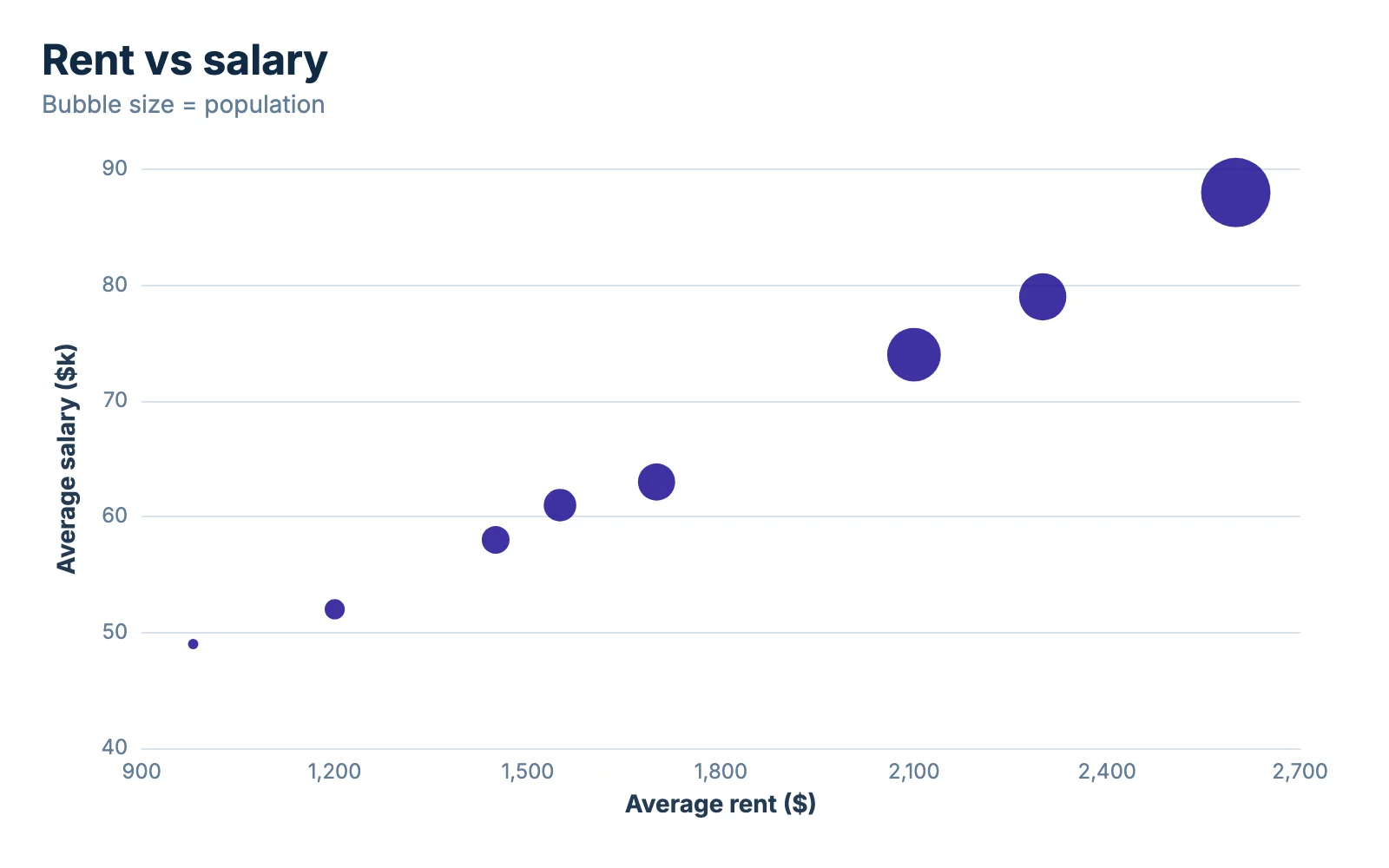
Bubble chart titled Rent vs salary, showing eight cities. Average rent runs along the x-axis and average salary up the y-axis, and each bubble is sized by population. City D, the largest, sits at the top right. Average salary ($k) Average rent ($) 40 50 60 70 80 90 900 1,200 1,500 1,800 2,100 2,400 2,700 Rent vs salary Bubble size = population chartjuice.com

How to use this bubble chart maker in 3 steps

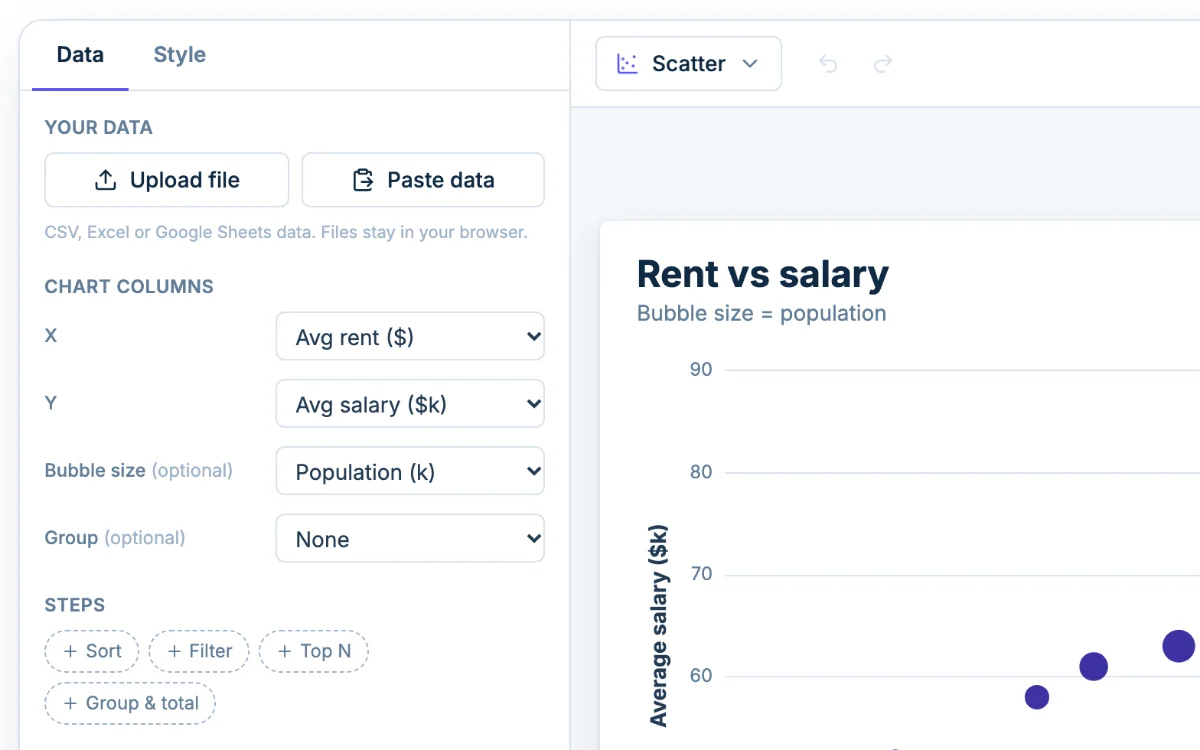
  1. The Data tab in Chartjuice, with Upload file and Paste data beside a bubble chart
    1

    Add a table with three number columns

    Type over the sample in the table under the chart, or click Paste data or Upload file. Each row is one bubble: a name, then the numbers for x, y and size.

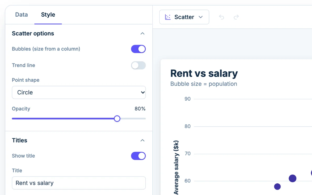
  2. The Style tab in Chartjuice, open beside a bubble chart
    2

    Set X, Y and Bubble size

    On the Data tab, Chart columns has a menu for X, for Y and for Bubble size (optional). In the Style tab, under Scatter options, Bubbles (size from a column) is already on. Turn it off and every point goes back to one size.

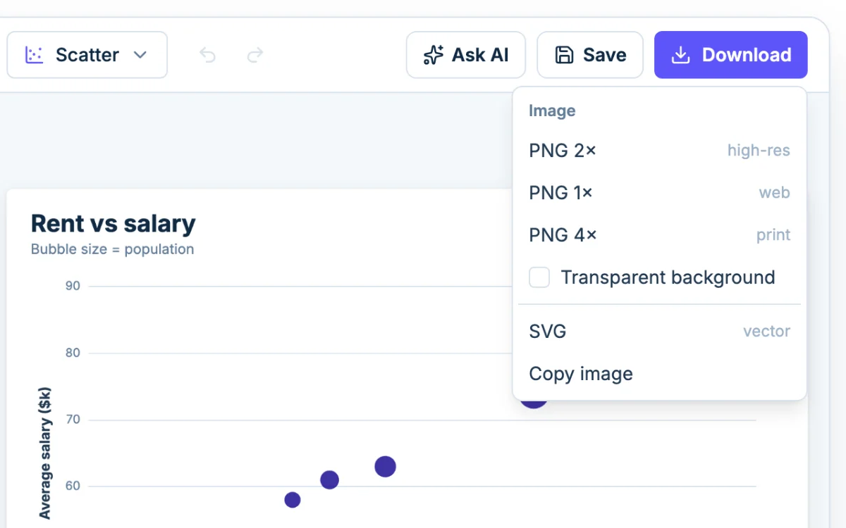
  3. The Download menu in Chartjuice: PNG at 1x, 2x or 4x, SVG and Copy image
    3

    Download it

    Click Download for a PNG at 1x, 2x or 4x, or an SVG. Copy image puts the chart on your clipboard for a slide or report.

What a bubble chart shows

A bubble chart is a scatter plot with a third number. Where a bubble sits gives two values, and how big it is gives the third. The sample plots eight cities: average rent across, average salary up, and population as size. Rent and salary rise together, and the big cities sit at the top right. City D, with 2.1 million people, has both the highest rent ($2,600) and the highest salary ($88k).

This page is the Chartjuice scatter plot maker opened with bubbles on. If you have two number columns and no third, start there.

Choose the size column

Size reads as "how much", so the best size column is a count or an amount: population, units sold, number of survey responses. Before you pick one:

  • Sizes are relative to your own data. The smallest value in the column gets the smallest bubble, whatever that value is.
  • A blank cell is drawn at the smallest size. Fill the gaps or filter those rows out, or a missing number will look like a small one.
  • The chart has no key for size. Say what size means in the subtitle, as the sample does: "Bubble size = population".

When a bubble chart misleads: area and width

The usual rule is that a bubble's area, not its width, should follow the value. Double the width of a circle and its area is four times as large, so sizing by width exaggerates.

Chartjuice starts from the area approach: a bubble's width grows with a square root, not with the value itself. But it measures each value from the smallest one in the column and fits the bubbles between two fixed sizes. The smallest value is drawn 6 pixels wide and the largest 40. The order is always right, and big differences look big. The areas are not exact ratios, though. In the sample, City D has about 8 times the population of City C (2,100 thousand against 260 thousand), and its bubble has about 44 times the area. City A has one fifth of City D's population and a bubble about one sixth the area.

So use bubble size for more and less, not for reading off numbers. When readers need the third number exactly, put it in a table or a bar chart.

Read overlapping bubbles

Big bubbles cover small ones. What helps:

  • Opacity. Bubbles start at 80%. Lower Opacity under Scatter options and an overlap shows as a darker patch.
  • Draw order. Bubbles are drawn in row order, so later rows land on top. On the Data tab, add a Sort step on the size column, high to low, and the small bubbles end up on top of the big ones.
  • Fewer bubbles. A few dozen is plenty. Past that, the chart turns into a pile.

The download does not print a name on each bubble. In the designer, pointing at a bubble shows its numbers, but a reader of the image can't do that, so name the bubbles that matter in your caption. To color bubbles by category, set a Group column under Chart columns.

Bubble chart, scatter plot or heatmap?

  • Two numbers per row, and no third: the x y graph maker plots plain points.
  • Hundreds of rows over two sets of categories: a heatmap shows the third number as color, and nothing overlaps.

Ask AI to set it up

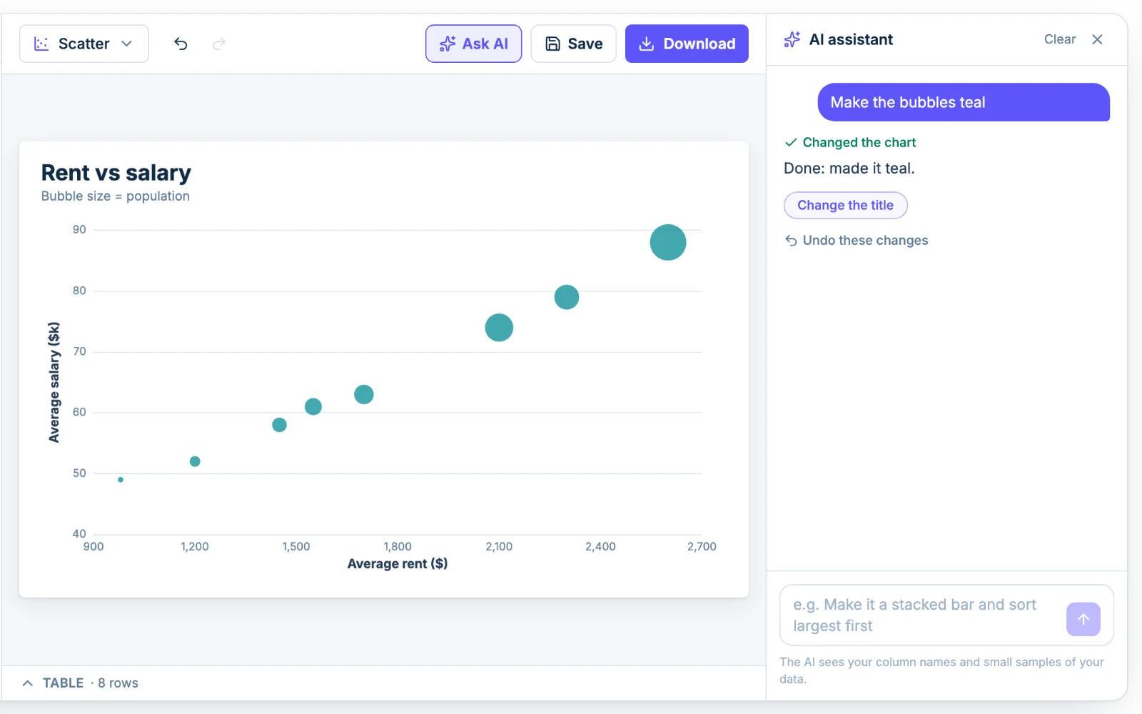
Click Ask AI and type something like "size the bubbles by population and make them more see-through". The assistant changes the same settings you would by hand, so you can adjust anything afterward. It sees your column names and a small sample of the rows, not the whole file.
Everything you need to make a bubble chart

  • Upload a file

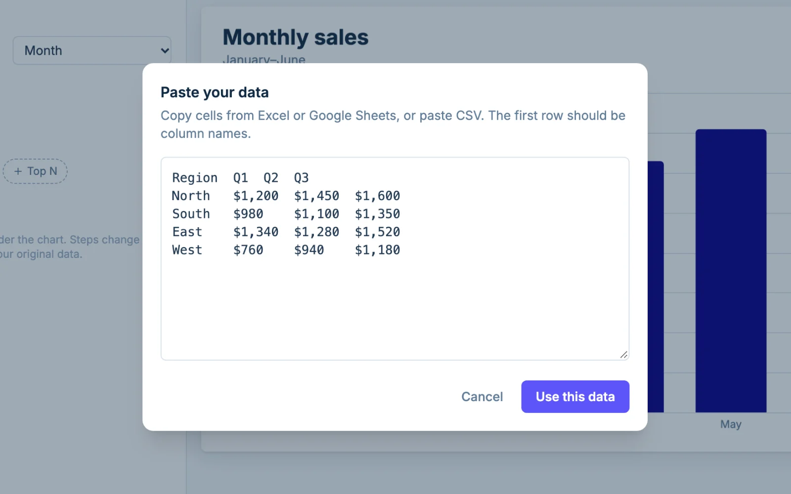
    Drop in a CSV, TSV, XLSX, XLS or ODS file, or paste four columns from Excel or Google Sheets. The file is read in your browser and never uploaded.

    The Paste data dialog in Chartjuice with a table pasted from a spreadsheet
  • Looks good out of the box

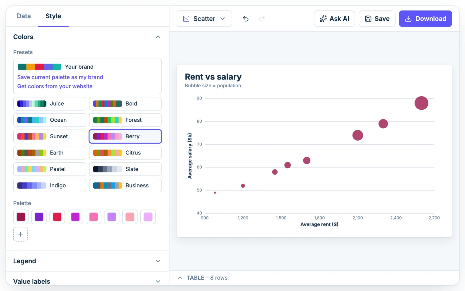
    Bubbles start slightly see-through over light gridlines, with both axes titled. Change the color under Colors, or save your brand colors with Pro.

    The Colors section in Chartjuice with preset palettes, open beside a bubble chart
  • Design with AI

    Ask for a different size column, fainter bubbles or new axis titles in plain English, then fix anything by hand. A free account gets 3 tries, and Pro gets 50 messages a day.

    See what the AI graph maker can do

    The Chartjuice AI assistant editing a bubble chart from a plain-English request
  • Download PNG or SVG

    Download a PNG at 1x, 2x or 4x, optionally transparent, or an SVG. Free downloads carry a small, faint "chartjuice.com" in the bottom-right corner, and Pro removes it.

    A bubble chart downloaded from Chartjuice as a PNG

Frequently asked questions

What is a bubble chart?

A scatter plot where each point is a circle sized by a third number. The position shows two values and the size shows one more, such as rent, salary and population for a set of cities.

How do I make a bubble chart from a spreadsheet?

Paste a table with a name column and three number columns. Under Chart columns, choose the columns for X, Y and Bubble size. In the Style tab, keep Bubbles (size from a column) turned on under Scatter options.

Is bubble size based on area or width?

Width grows with a square root, the way area-based sizing does. But Chartjuice measures from the smallest value and fits all bubbles between 6 and 40 pixels wide, so the order is right and two areas are not an exact ratio of their values.

Why are my bubbles all the same size?

Either Bubbles (size from a column) is off under Scatter options, or no column is chosen for Bubble size under Chart columns. Both are needed. Bubbles also come out equal when every value in the size column is the same.

Can I use Claude or ChatGPT to make a bubble chart?

Yes. Connect an AI assistant to Chartjuice once, then paste your table and say in plain words which columns set X, Y and bubble size. The chart is saved to your account and opens in the editor, where you can adjust it by hand.

Is the bubble chart maker free?

Yes. Making and downloading bubble charts is free and needs no account. A free account saves up to 5 charts. Pro, at $12 a month or $120 a year, removes the chartjuice.com mark and saves your brand colors (see pricing).

Want the full tour? Read how Chartjuice works.

Keep your bubble charts in a free account

You can make and download a bubble chart without signing up. A free account saves your charts so you can come back and change the data.