Scatter plot generator: make a scatter graph with a line of best fit

This free scatter graph maker plots two columns of numbers as points, with a trend line and R² if you want them. You don't need to sign up to make or download a chart.

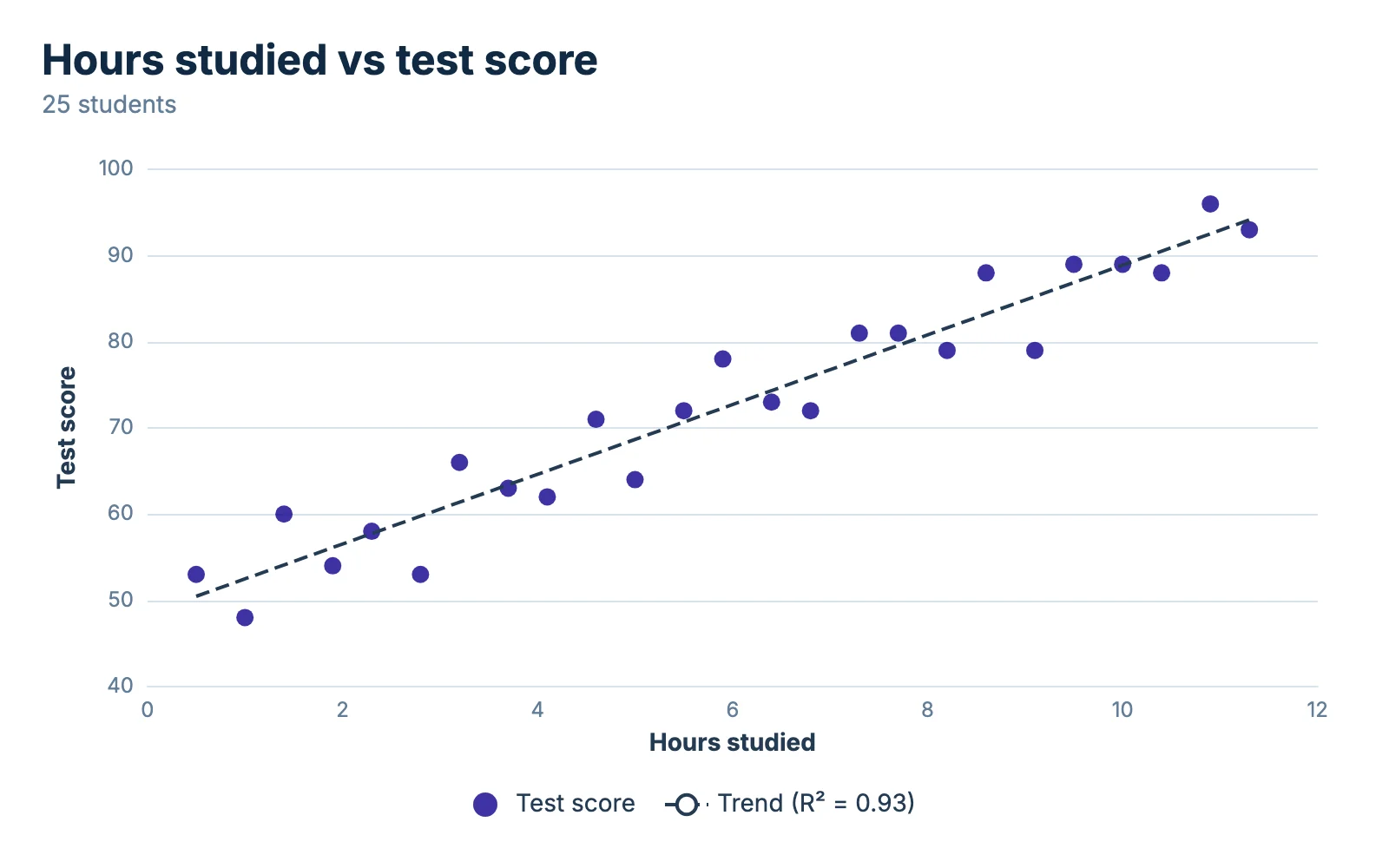
Scatter plot titled "Hours studied vs test score" showing 25 students. Points rise from the lower left to the upper right, with a trend line and R² drawn through them. Test score Hours studied 40 50 60 70 80 90 100 0 2 4 6 8 10 12 Test score Trend (R² = 0.93) Hours studied vs test score 25 students chartjuice.com

How to use the scatter plot generator in 3 steps

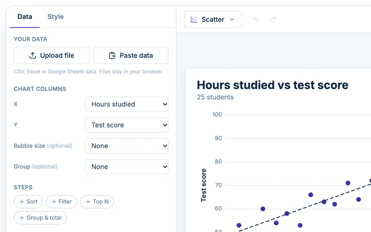
  1. The Data tab in Chartjuice, with Upload file and Paste data beside a scatter plot
    1

    Add your data

    Click Upload file, or Paste data and then Use this data. Under Chart columns, pick which column is X and which is Y.

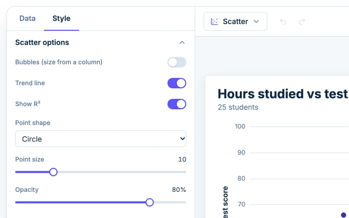
  2. The Style tab in Chartjuice, open beside a scatter plot
    2

    Style it

    Open the Style tab. Turn on Trend line and Show R² in the Scatter options, then set titles, axis labels, colors and point size.

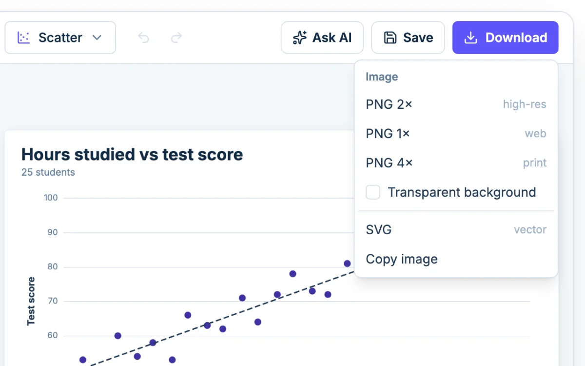
  3. The Download menu in Chartjuice: PNG at 1x, 2x or 4x, SVG and Copy image
    3

    Download

    Click Download and choose PNG or SVG, or use Copy image to paste the chart straight into a doc or slide.

Which variable goes on the x-axis and which on the y-axis

Every point on a scatter plot is one row of your data. The X column sets how far right it sits and the Y column sets how high. You assign both under Chart columns in the Data tab.

Ask which one you could change on purpose to see what happens to the other. In the preset, a student could study more hours and then see whether the score moves. Hours studied is X and test score is Y. The variable doing the influencing goes on the x-axis, and the one that responds goes on the y-axis. If neither drives the other, like height and arm span, either order is fine.

Swapping the axes does not change the pattern, but it changes the story. Put score on X and hours on Y and the chart quietly suggests that scores cause studying.

Add a line of best fit and R²

A line of best fit is a straight line through the middle of your points that shows the overall direction.

To add one, open the Style tab, expand Scatter options, and turn on Trend line. Chartjuice draws a least-squares line: the one that makes the squared vertical distances from the points as small as possible. Tick Show R² to print the R² value on the chart.

What R² tells you

R² runs from 0 to 1. It is the share of the variation in Y that the line accounts for.

  • Near 1, say 0.90: the points hug the line, and X predicts Y well.
  • Around 0.5: a clear trend with plenty of scatter around it.
  • Near 0: the line explains almost nothing.

R² does not say which way the line slopes. Look at the line for the direction.

Using the line well

One point far from the rest can tilt the line, so check outliers first. Reading a value off the line within your X range is reasonable, but stretching it far past the last point is a guess. If the points bend, R² will be low even though there is a clear pattern, so look at the chart before you trust the number. A line worked out in class or on a graphing calculator uses least squares too, so the two should agree.

Reading a scatter plot: positive, negative, and no correlation

  • Positive correlation: points climb from lower left to upper right, like hours studied and test score.
  • Negative correlation: points fall from upper left to lower right, like the age of a car and its resale value.
  • No correlation: a shapeless blob with no tilt. Knowing X tells you nothing about Y.

A tight band is a strong relationship and a wide, loose band is a weak one.

Far-off points deserve a second look. A typo, a one-off or the most interesting row in your data all look the same here. Two separate clumps often mean two groups mixed together, and one line across both describes neither well.

Correlation isn't causation

Two things moving together does not mean one causes the other. Ice cream sales and sunburns both rise in July, but a cone does not burn anyone. Hot weather drives both. A scatter plot shows that a relationship exists and how strong it is. It cannot show why.

Bubble charts: add a third value with point size

A bubble chart is a scatter plot where each point's size shows a third number. Say each point is a region, X is average income, Y is average rent, and the bubble is the number of survey respondents.

Set the Bubble size column under Chart columns, then turn on Bubbles (size from a column) in the Scatter options. Lower the Opacity so overlapping bubbles stay visible, and try to stay under a few dozen. The bubble chart maker opens with bubbles already turned on.

Color points by group

Put a category in the Group role and each group, such as a class period, gets its own color and a legend entry. Groups take the palette's colors in order; change them in the Colors section of the Style tab.

When a scatter plot is the wrong chart

Everything you need in a scatter graph maker

  • Upload or paste your data

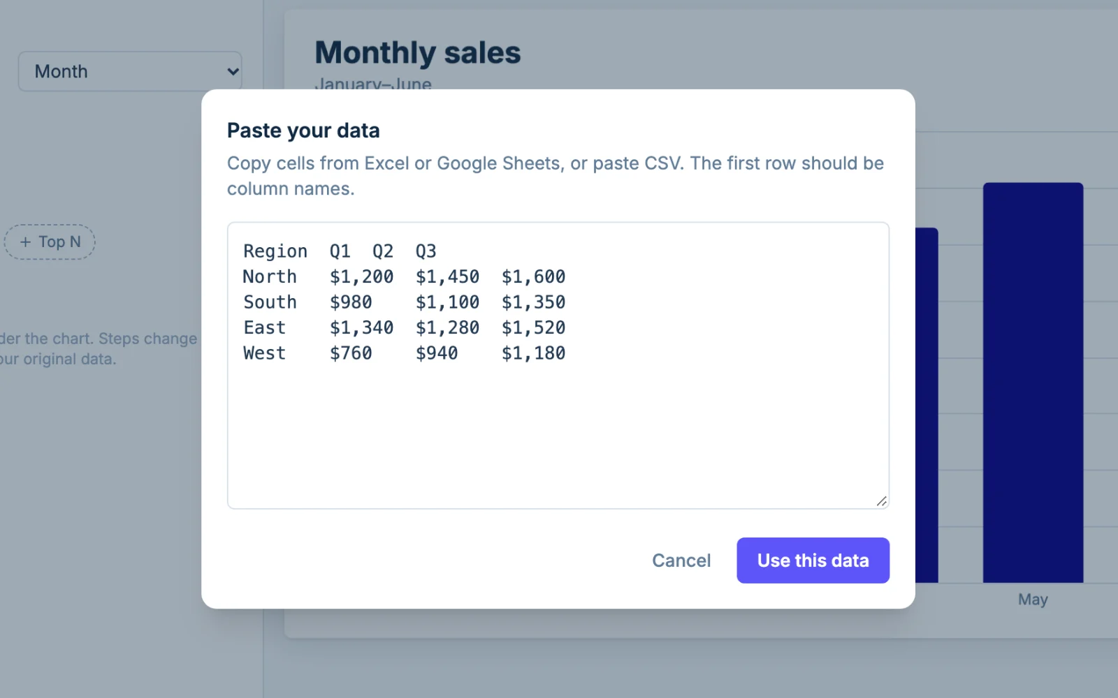
    Upload a CSV, TSV, XLSX, XLS or ODS file, or paste from Excel or Google Sheets. Files are read in your browser and never uploaded. Up to 5,000 rows and 50 columns.

    The Paste data dialog in Chartjuice with a table pasted from a spreadsheet
  • Looks good out of the box

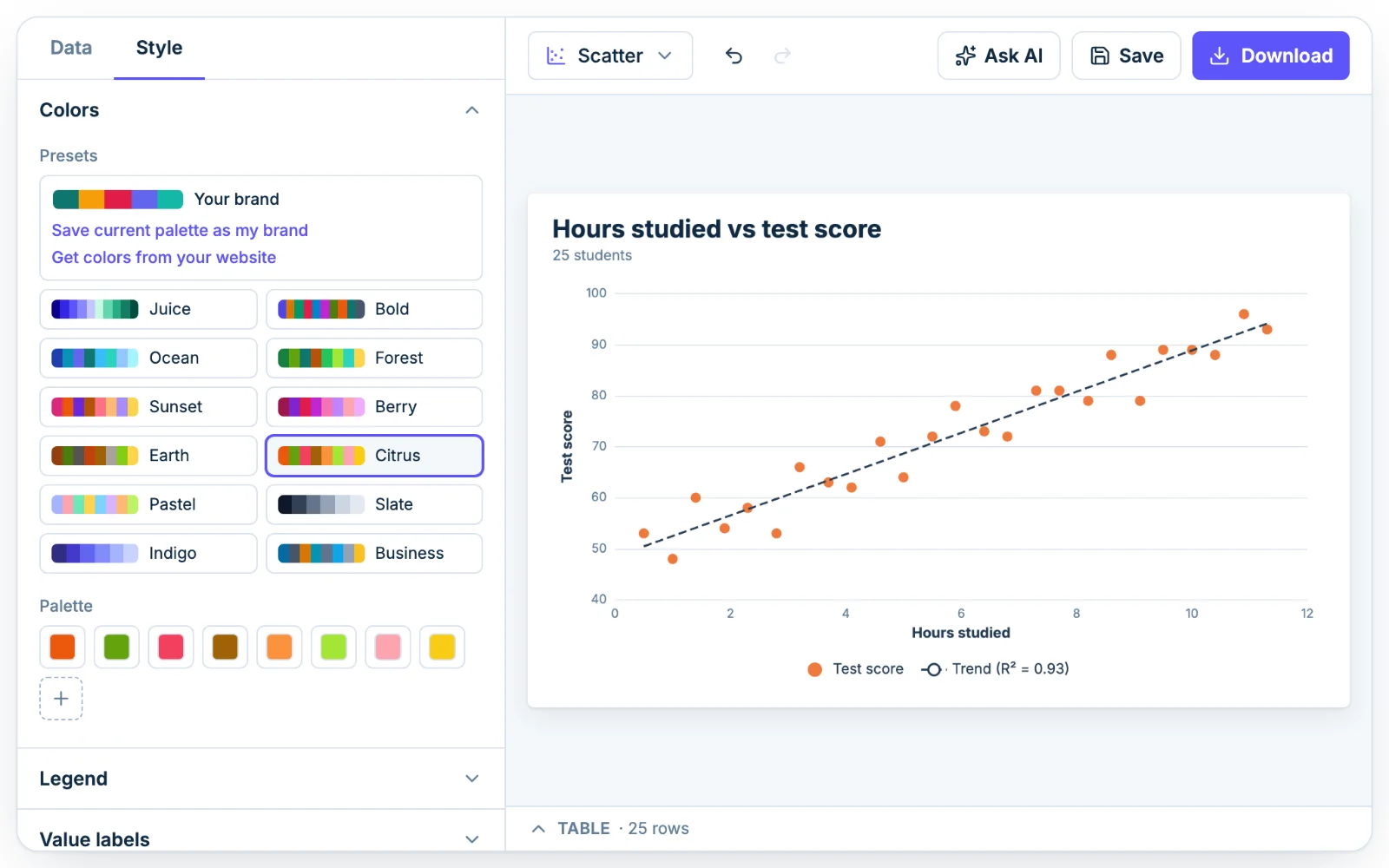
    Points start in a clean palette over light gridlines, so a pattern stands out before you touch a setting. Color your groups with a preset palette, or with your saved brand colors on Pro.

    The Colors section in Chartjuice with preset palettes, open beside a scatter plot
  • Design with AI

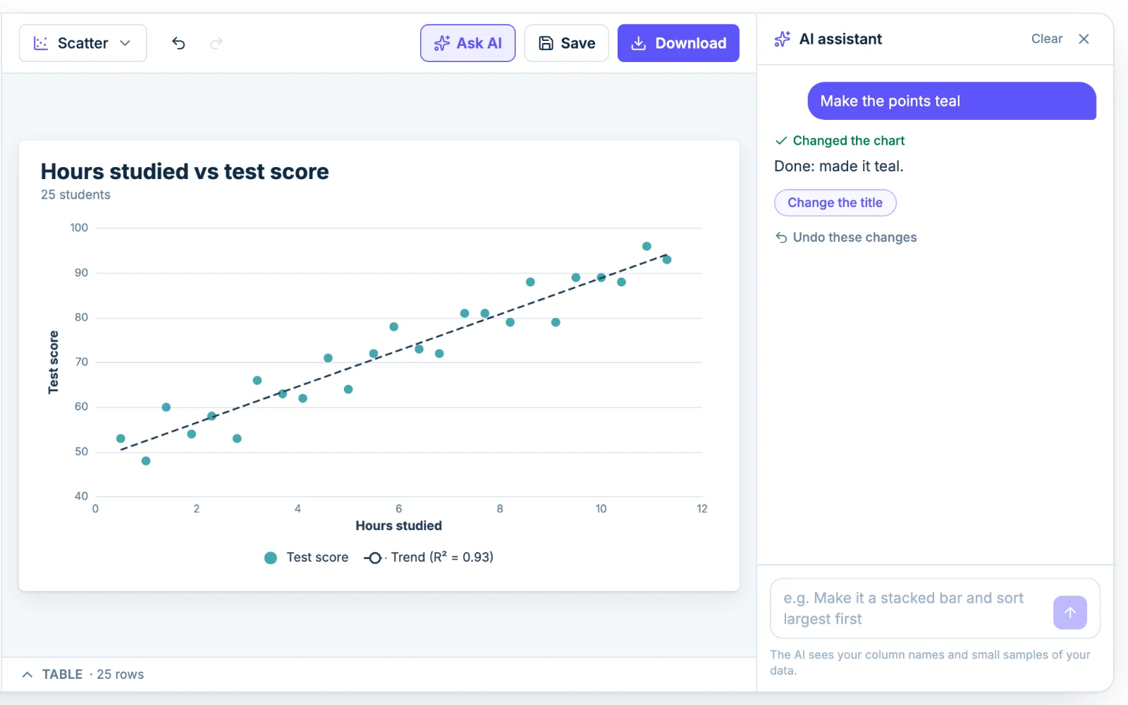
    Ask for a trend line, colored groups or bigger points in plain English, and adjust anything it does by hand. Sign in to try it 3 times for free, or get 50 messages a day with Pro.

    See what the AI graph maker can do

    The Chartjuice AI assistant editing a scatter plot from a plain-English request
  • Download PNG or SVG

    Export a PNG at 1x, 2x or 4x with an optional transparent background, or an SVG, or copy the image. Free downloads have a small, faint "chartjuice.com" in the bottom-right corner, and Pro removes it. You can use it anywhere, including commercial work.

    A scatter plot downloaded from Chartjuice as a PNG

Frequently asked questions

Is a scatter graph the same as a scatter plot?

Yes. Scatter graph, scatter plot and scatter chart are three names for one chart: points placed by two numbers. Use this scatter graph maker whichever name your class or textbook uses.

What does a scatter plot show?

It shows how two numeric variables relate. Each point is one row of data, placed by its X and Y values. The overall pattern tells you whether the variables rise together, move in opposite directions, or have no link.

Which variable goes on the x-axis?

Put the variable you change or think is doing the influencing on X, and the one that responds on Y. Hours studied goes on X and test score on Y. If neither drives the other, either order works.

Can I add a line of best fit?

Yes. Open the Style tab, expand Scatter options and turn on Trend line. It draws a least-squares line of best fit through your points. Turn on Show R² to print the R² value on the chart.

Can Claude or ChatGPT make a scatter plot?

Yes. Connect an AI assistant to Chartjuice once, then paste your data and ask in plain words for a scatter plot with a trend line. It is saved to your account and opens in the editor.

Is my data private?

In the editor, files are read in your browser and never uploaded. The AI sees column names and small samples of the data, not the whole file. Your data is stored only if you are signed in and save the chart.

Want the full tour? Read how Chartjuice works.

Save your scatter plots with a free account

The scatter plot generator is free, with no signup needed to make or download a chart. Sign up free to save your charts, rename or duplicate them.