Formatting your data for a sankey diagram maker
A sankey diagram is a list of flows. Each row of your table is one flow, and it needs three columns:
- From: where the flow starts.
- To: where it ends.
- Amount: how much moves, as a plain number. The bigger the number, the thicker the band.
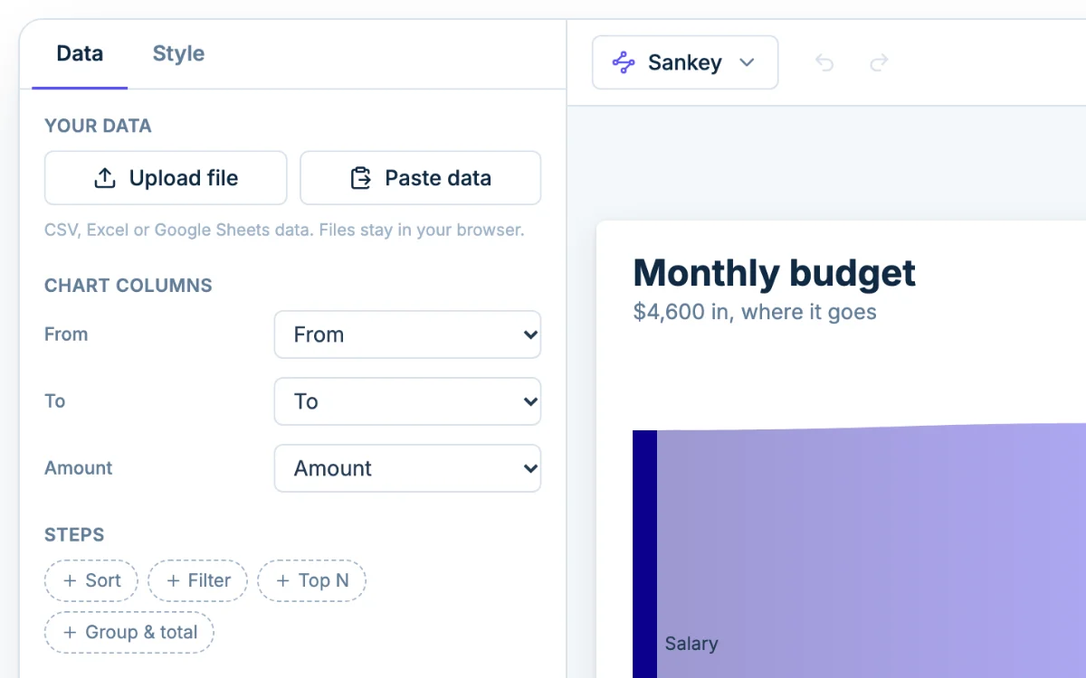
There is no code to write and no node list to set up. Chartjuice builds the nodes from the names in From and To. If your columns have other headings, use Chart columns in the Data tab to say which is which.
Four rules keep the diagram clean:
- Spell each node the same way every time. "Rent" and "rent" are two different nodes.
- Use plain numbers in Amount. No currency symbols, commas or "k". Put the unit in the chart title.
- One row per flow. If a From and To pair repeats, Chartjuice adds the amounts together.
- Expect blanks and zeros to be skipped. A row with a missing name, a text amount or an amount of zero or less is left out, and a notice under the chart says how many.
Copy this sample table
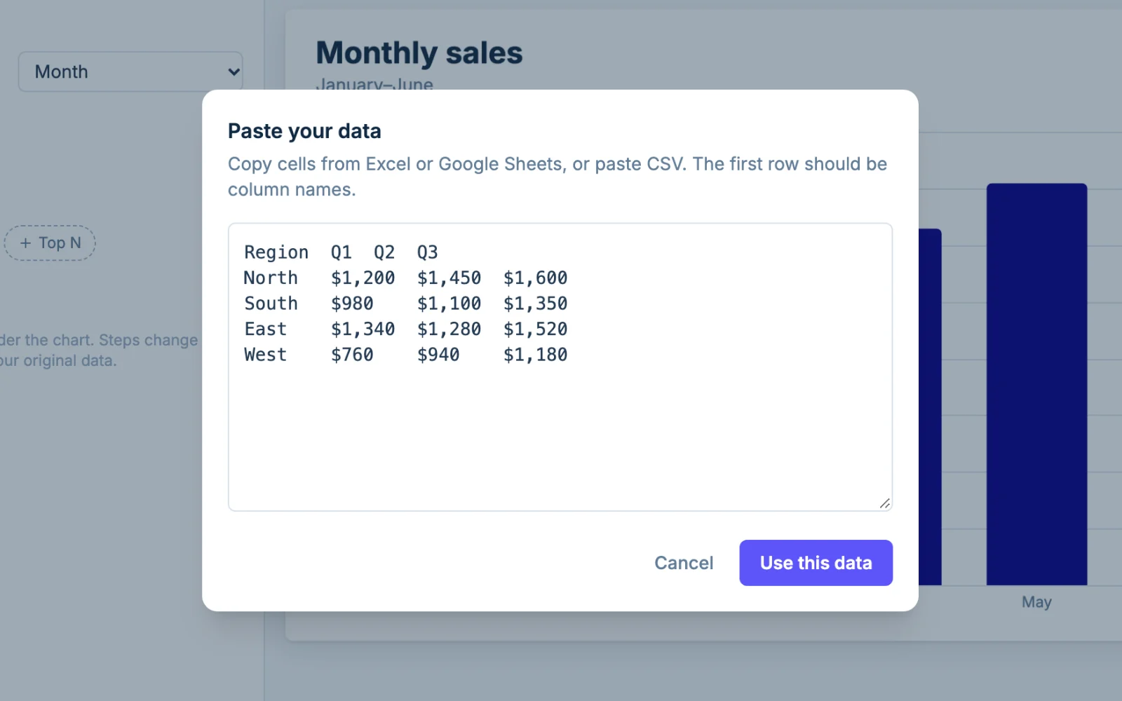
Select the table, copy it, click Paste data, paste, and click Use this data. Or paste it straight into the table under the chart.
| From | To | Amount |
|---|---|---|
| Paycheck | Budget | 3000 |
| Budget | Housing | 1100 |
| Budget | Food | 450 |
| Budget | Transport | 250 |
| Budget | Savings | 600 |
| Budget | Fun | 300 |
| Budget | Other | 300 |
| Food | Groceries | 350 |
| Food | Eating out | 100 |
Chaining stages into multilevel flows
A name can be a To in one row and a From in another. In the sample, Budget receives 3,000 from Paycheck and sends it to six places, and Food passes its 450 on to Groceries and Eating out. That makes three stages. Add rows for more stages, as long as everything keeps moving forward.
Common uses for a sankey diagram
The same three columns cover most of what people draw.
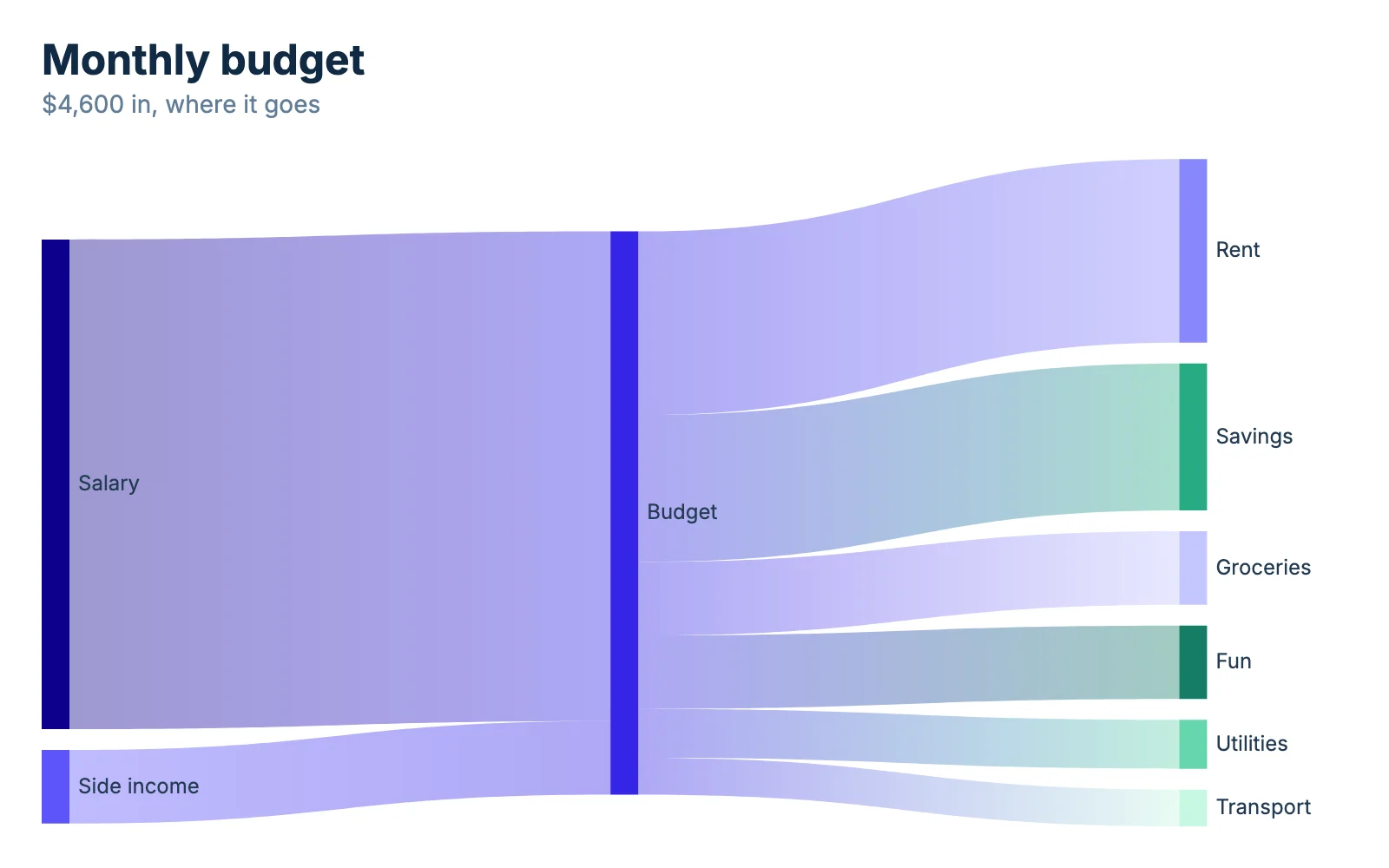
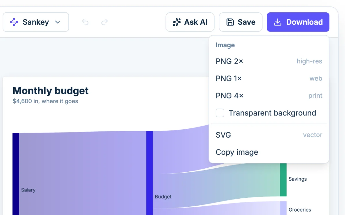
Personal budgets. Income on the left, spending on the right, with Savings as its own band. The preset above is a monthly budget.
Income statements. Revenue splits into cost of goods and gross profit, and gross profit splits again down to net profit. A row looks like Revenue, Gross profit, 590.
Marketing funnels. Traffic sources feed Visitors, and Visitors split into Signed up and Left. Give drop-off its own node so the loss is visible instead of implied.
Energy flows. Sources (gas, coal, solar and wind, nuclear) flow into Electricity, then out to Homes, Businesses and Industry. Add a "Lost" node to show losses, so what goes into a node matches what comes out.
If you only need to compare totals across a few categories, a stacked bar chart is simpler. A sankey is the better choice when you want to show where amounts go and how they split. For other kinds of data, see the full set of chart makers.
Tips for readable flows
- Keep each stage to about five to eight nodes. More than that and the bands tangle.
- Group small flows. Add the tiny ones into one "Other" row. Thin slivers can't be read.
- Use short names. "Rent" beats "Monthly rent payment". If long labels crowd the last stage, try Direction: Top to bottom.
- Show the numbers. Open Value labels in the Style tab and turn on Show values on the chart.
- Keep one unit, not a mix of dollars and visits.
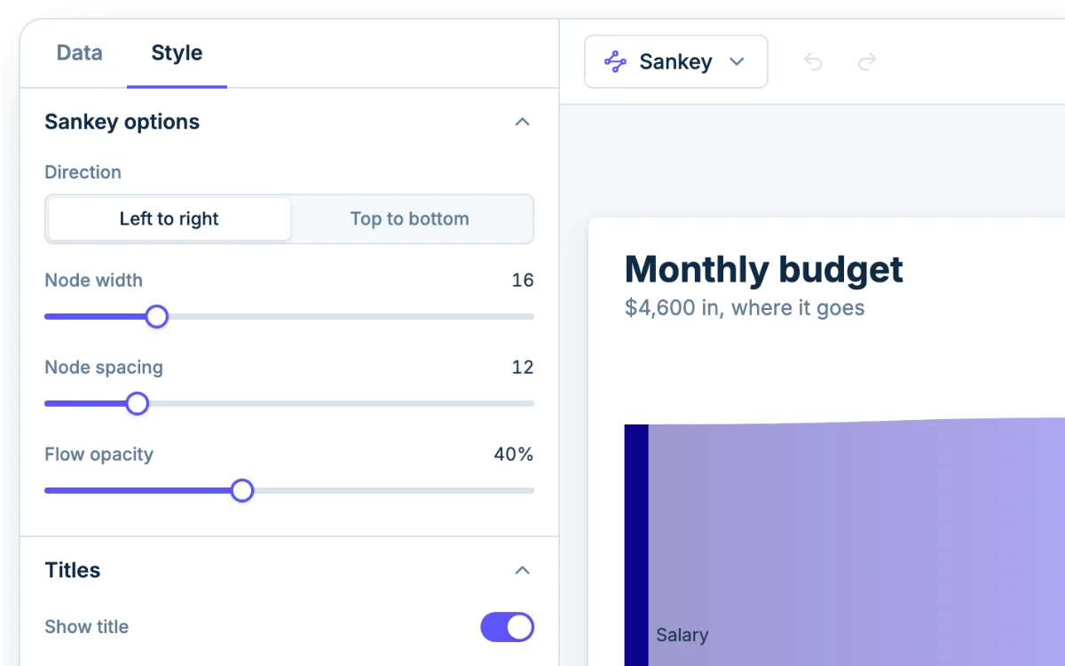
- Give crowded stages more room. Raise Node spacing, or lower Flow opacity, under Sankey options.
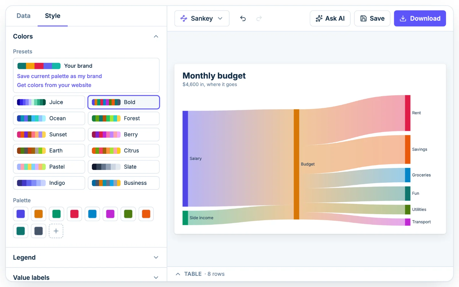
Each node gets a color from the palette you choose under Colors, and each flow fades from its source node's color to its target's.
Fix a sankey diagram that looks wrong
- A node appears twice. The names don't match exactly. Check spelling and capitalization, and fix the cell in the table under the chart.
- A flow is missing. Its amount is probably text, blank or zero. The notice under the chart says how many rows were skipped. Retype the amount as a plain number.
- The chart shows an error instead of a diagram. Look for a loop. A flow can't return to an earlier node, so Savings can't feed back into Budget. Chartjuice names the loop it found and won't draw the diagram. Loops aren't supported.