Column chart or bar chart: which one do you need?
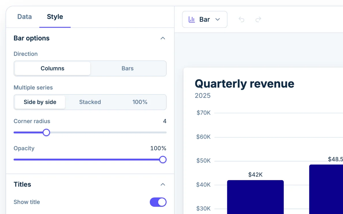
A column chart is a bar chart turned upright: the bars stand on the horizontal axis, and the height of each one is its value. In Chartjuice both are one chart type, Bar, with Direction set to Columns or Bars.
This page is the column version of the Chartjuice bar chart maker: the same designer, opened on vertical bars. If you want the sideways kind, start there, or switch Direction to Bars in the Style tab.
Use columns when the order runs left to right
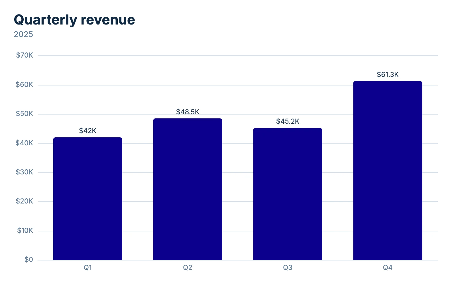
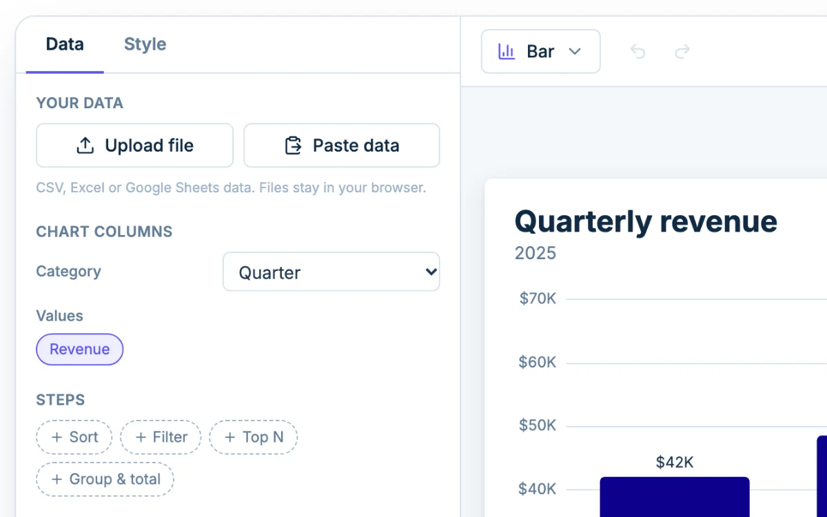
Columns suit a handful of short-named categories that come in a set order, and time most of all: months, quarters, school years. People read left to right as earlier to later, so a row of columns that climbs reads as growth. In the sample chart, Q1 to Q4 run along the bottom and Q4 stands tallest at $61.3K.
Switch to horizontal bars for long names or long lists
A label gets only as much room as its column is wide. In a test with ten survey answers of about 28 characters each, at the default chart size, only three of the ten labels were drawn under the columns, because Chartjuice leaves out labels that would overlap. With Direction set to Bars, all ten were drawn.
Go horizontal when:
- the category names run past two or three words;
- you have more than about eight categories;
- the chart is a ranking, and the longest bar belongs at the top.
Clustered column charts: compare two or three series
A clustered column chart, also called a grouped column chart, draws one column per series side by side in each category. Use it to compare the series inside each category, such as fall and spring test scores for each of four classes.
To make one, give each series its own number column. Each number column gets its own color, and its heading becomes the legend entry. Leave Multiple series on Side by side. For two series, the double bar graph maker opens with this set up.
Two or three series read well. Four quarters with five series is already twenty columns, and past eight series Chartjuice shows a warning under the chart. To hide a series without deleting its data, click its name under Chart columns.
Stacked column charts: a total and its parts
A stacked column chart piles the series on top of each other, so the full height of a column is the total and each colored segment is one part. In the stacked example further down, the Q1 column is 240 units tall: 120 Basic, 80 Plus and 40 Pro.
Set Multiple series to Stacked. Only the bottom segment sits on the axis. Every other segment starts where the one below it ends, so its height is hard to compare from column to column. The stacked bar chart maker covers stack order.
Pick 100% when the split matters more than the size: every column fills the full height and the segments show shares.
How to read a column chart without being misled
Check where the vertical axis starts. Start it at 40, and a column for 48 looks four times as tall as a column for 42, though 48 is only one seventh more. Chartjuice starts the axis at zero. If you set Min above zero under Vertical axis in the Style tab, a warning appears under the chart.
Then read the labels, not the gridlines. With Show values on the chart turned on, each column carries its exact number, and nobody has to guess between $40K and $50K. Check the units too: 60 could be dollars or percent, so put the unit in the subtitle or the axis title.
When a column chart is the wrong chart
A single list of raw numbers, such as 30 quiz scores, needs bins instead of categories: use the histogram maker. For a long run of dates, a line graph shows the trend better than dozens of thin columns.
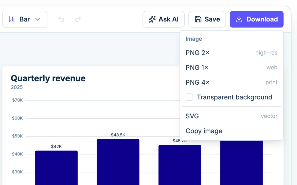
Ask AI to set up the columns
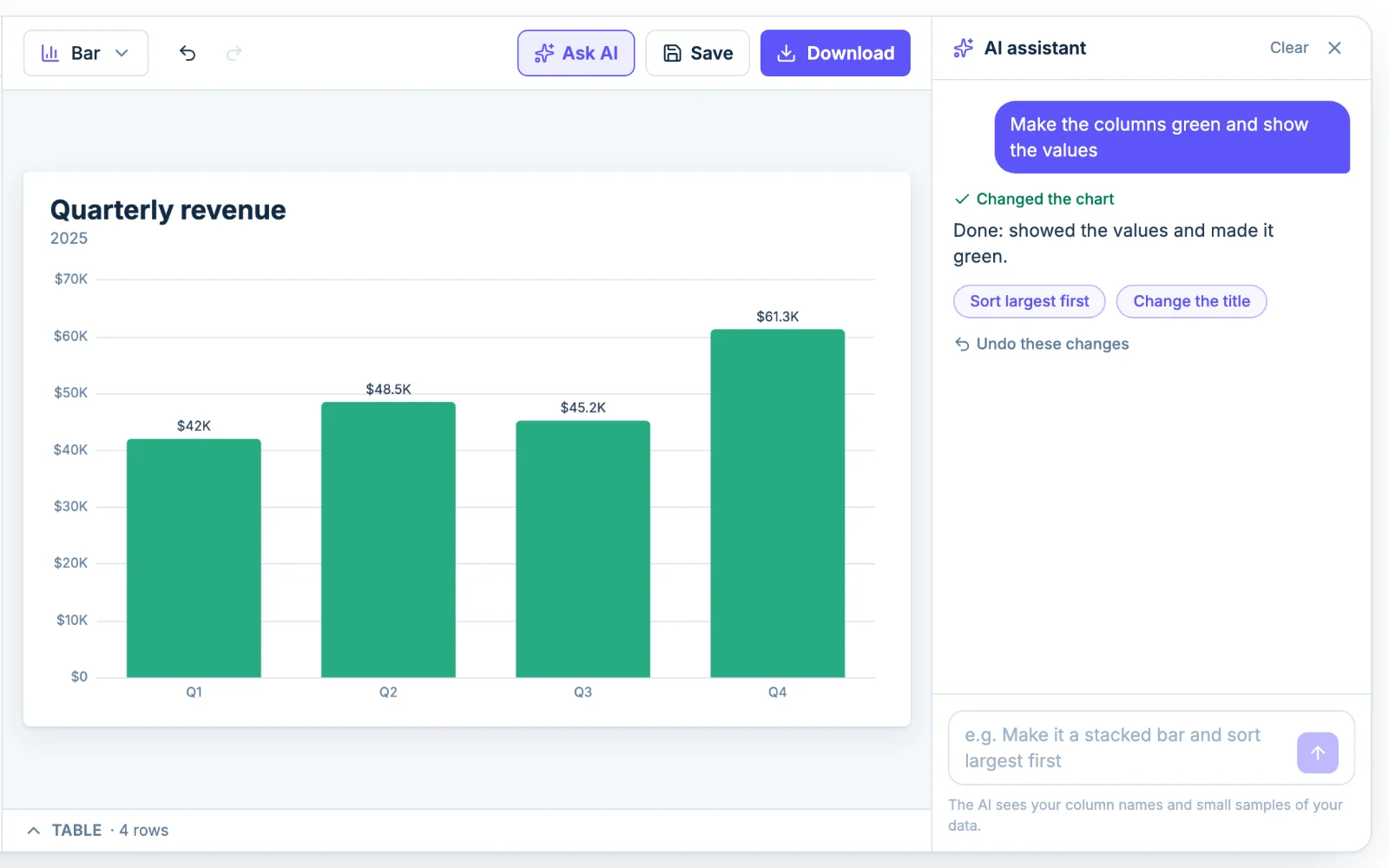
Click Ask AI and type something like "stack the columns and show the values". The assistant changes the same settings you would by hand, so you can adjust anything afterward. It sees your column names and a small sample of the rows, not the whole file.