What a double bar graph shows
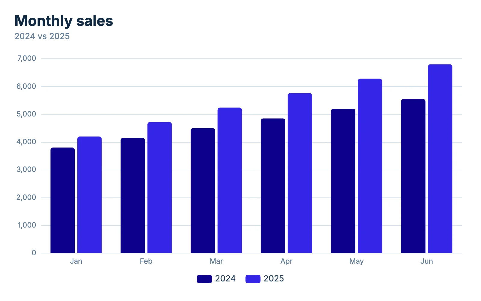
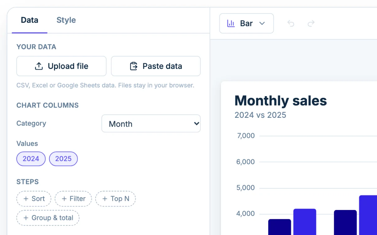
A double bar graph has two bars for each category, one for each of two groups. The sample compares monthly sales in 2024 and 2025, and you can read it two ways. Inside each pair, the 2025 bar is taller every month. Along one color, both years climb from January to June. Watch the gap between the bars: it grows from 400 in January (4,200 against 3,800) to 1,250 in June (6,800 against 5,550).
This page is the two-set version of the Chartjuice bar graph maker: the same designer, opened on two sets of bars.
Set up the table: one label column, two number columns
A double bar graph needs a table shaped like this:
| Month | 2024 | 2025 |
|---|---|---|
| Jan | 3,800 | 4,200 |
| Feb | 4,150 | 4,720 |
| Mar | 4,500 | 5,240 |
The heading of each number column becomes its name in the key, so name the columns after the groups: 2024 and 2025, Class A and Class B, Before and After.
A long table with the group in its own column (Month, Year, Sales) does not make pairs. Every row becomes its own category, so January appears twice. Rearrange it in your spreadsheet first so each group has its own column.
The key and the colors
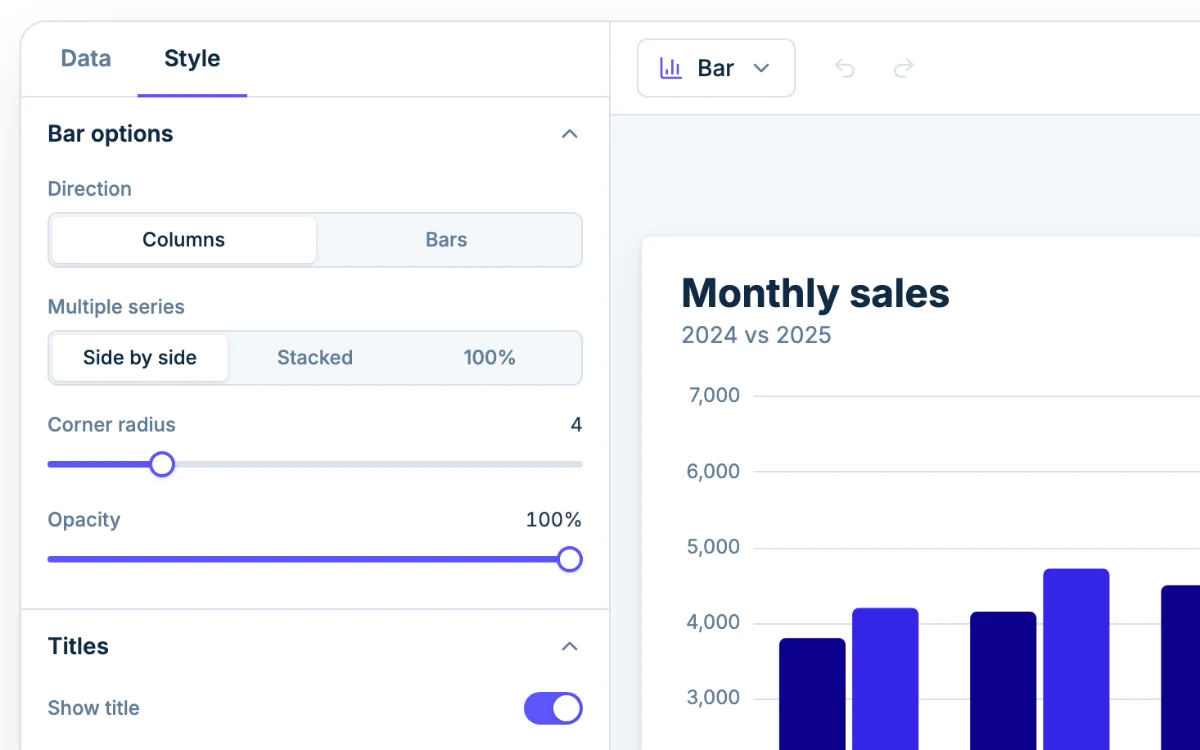
The key (the legend) appears on its own as soon as the chart has two sets of bars. In the Style tab, the Legend section moves it with Position, switches it between Row and Column, or turns it off. To change the words in it, rename the series under Colors.
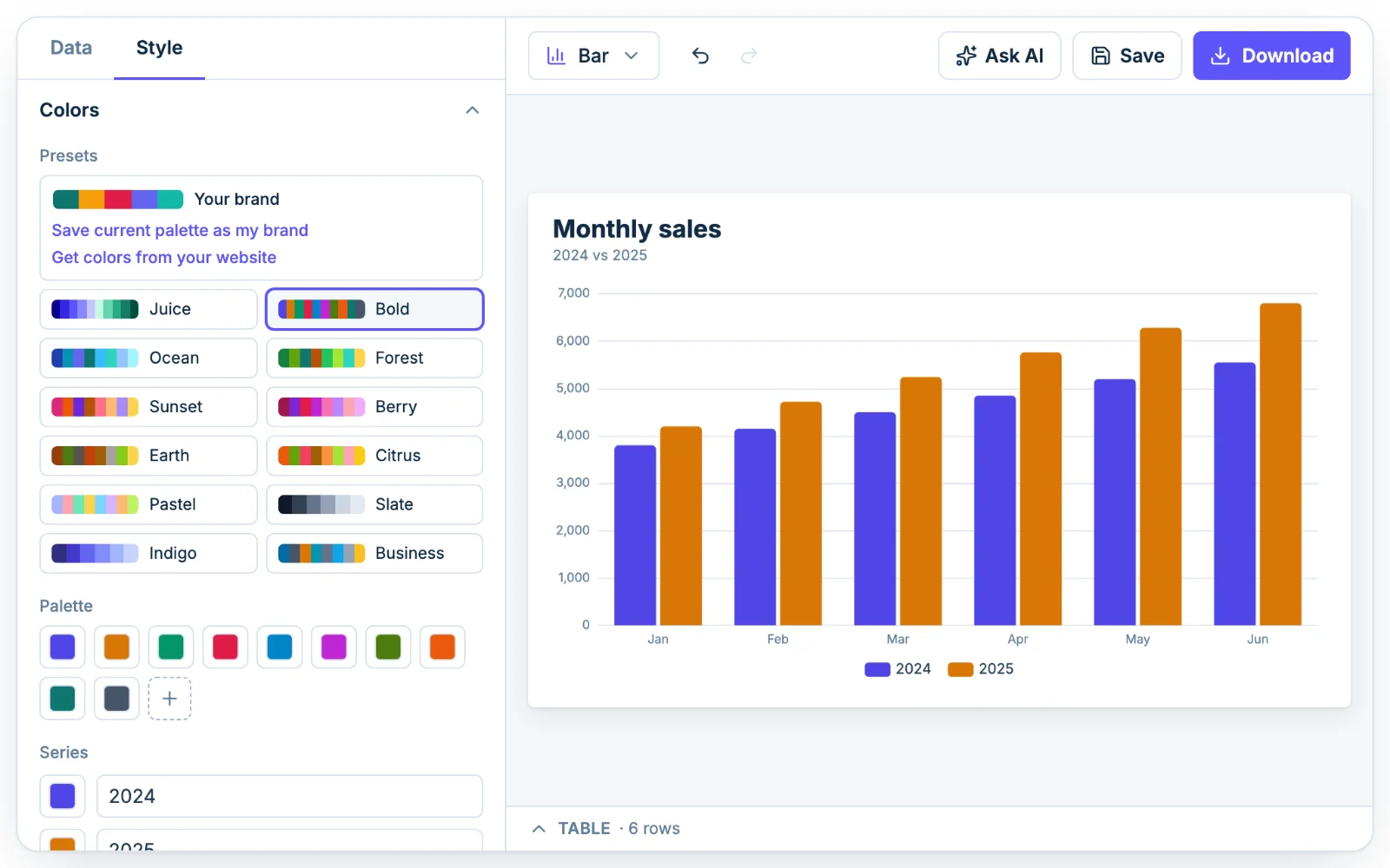
The two starting colors are a dark blue and a brighter blue. They are easy to tell apart on a screen. For a black and white printout or a dim projector, choose two colors that differ in lightness too, one dark and one pale. Click a swatch under Series to change one color, or click a preset palette to change both.
When a third set of bars is too many
Add a third number column and you get a triple bar graph. It works when there are few categories. The bar count is what hurts: six months with three sets is 18 bars, and with four sets it is 24. Past eight sets, Chartjuice shows a warning under the chart.
Before adding a set, check what the chart is for:
- If the sets are parts of one total, stack them with the stacked bar chart maker.
- If you have one set only, the column chart maker opens on single bars.
- If the category names are long, like survey answers, switch Direction to Bars under Bar options. The pairs then run sideways and every name gets its own line.
Double bar graphs for class and surveys
Two examples that suit two bars per category:
- Test scores for two classes: units down the first column, then a Class A column and a Class B column.
- A survey answered by two grades: the answer choices in the first column, then the count for each grade.
A graded graph usually needs a title, a label on each axis and a key. Set the title under Titles, and turn on Axis title under Horizontal axis and Vertical axis. Leave the vertical axis starting at zero, so the taller bar in a pair is taller by the right amount.
Ask AI to set it up
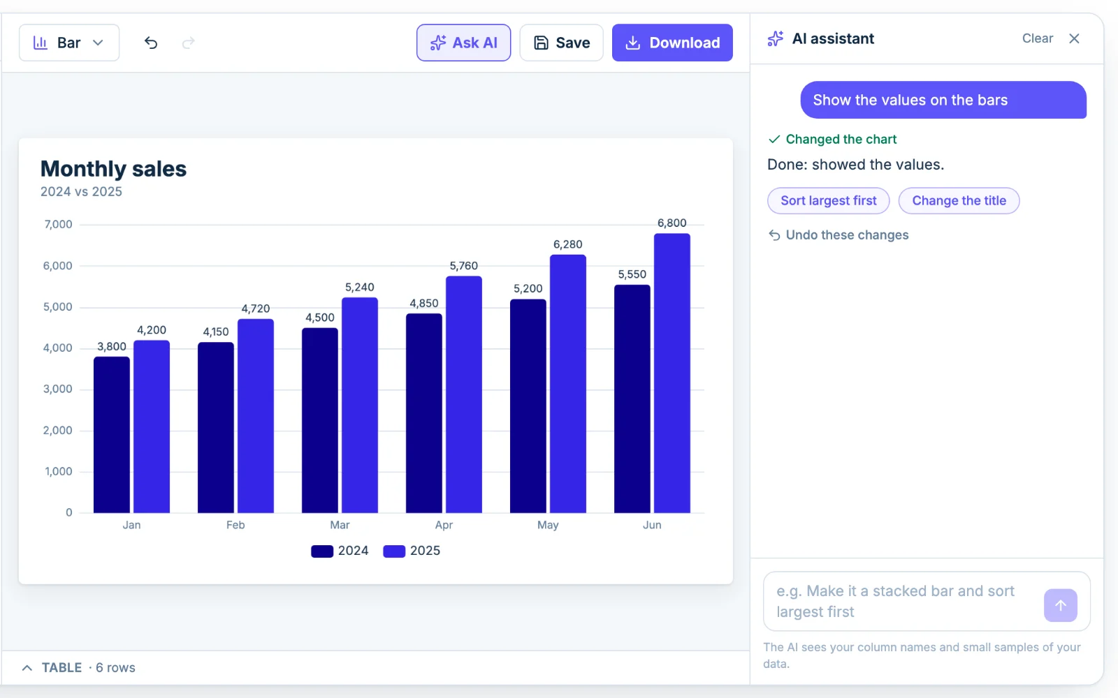
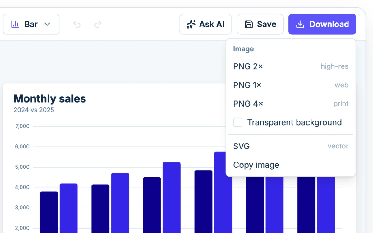
Click Ask AI and type something like "name the key Class A and Class B and make the bars green and orange". The assistant changes the same settings you would by hand, so you can adjust anything afterward. It sees your column names and a small sample of the rows, not the whole file.