Turn counts into percentages
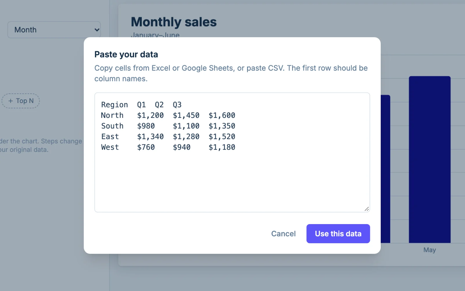
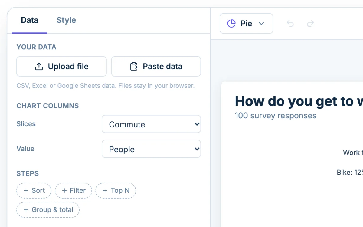
Most people start with counts, not percentages: 42 of 120 survey responses said "bike". You don't need to divide anything. Put the counts in the Value column and Chartjuice calculates each slice's share of the total.
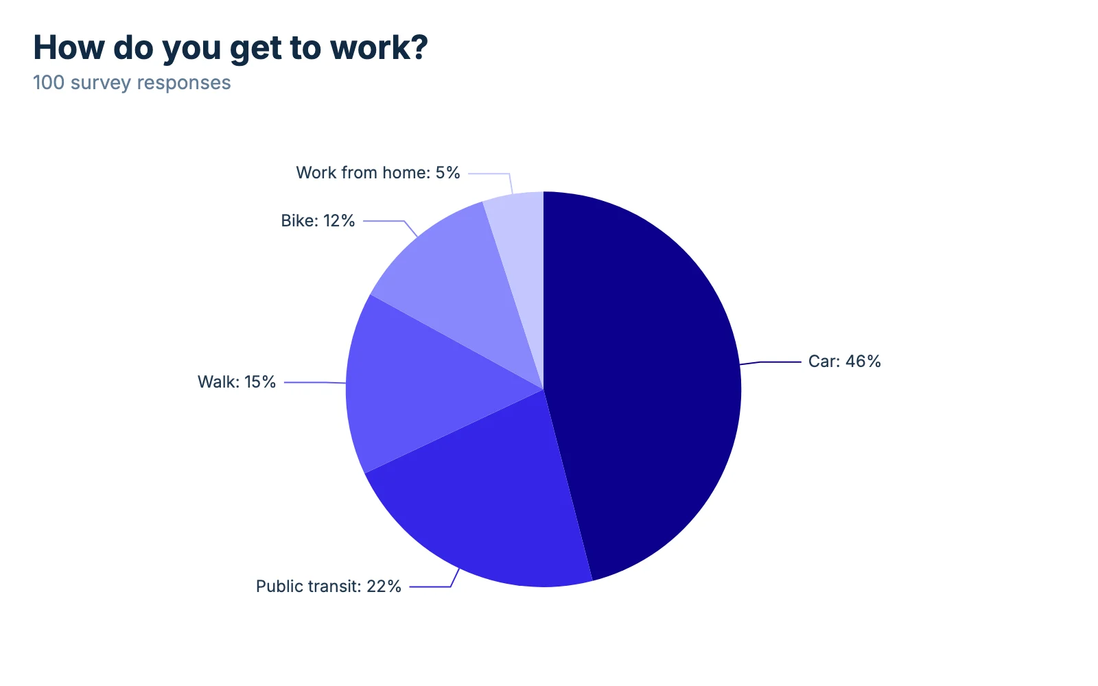
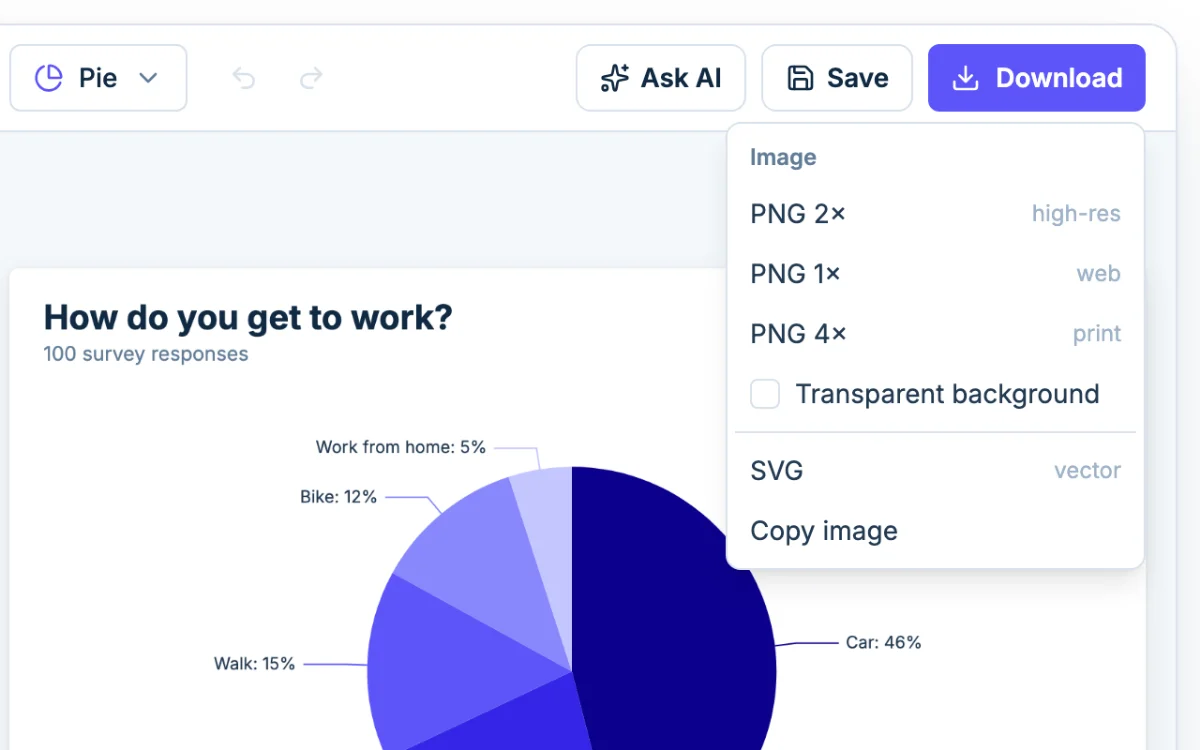
To do the math yourself, divide a slice's count by the total and multiply by 100. The example chart above has 100 responses, so Car at 46 is 46%. With 120 responses, 42 votes is 42 ÷ 120 × 100 = 35%.
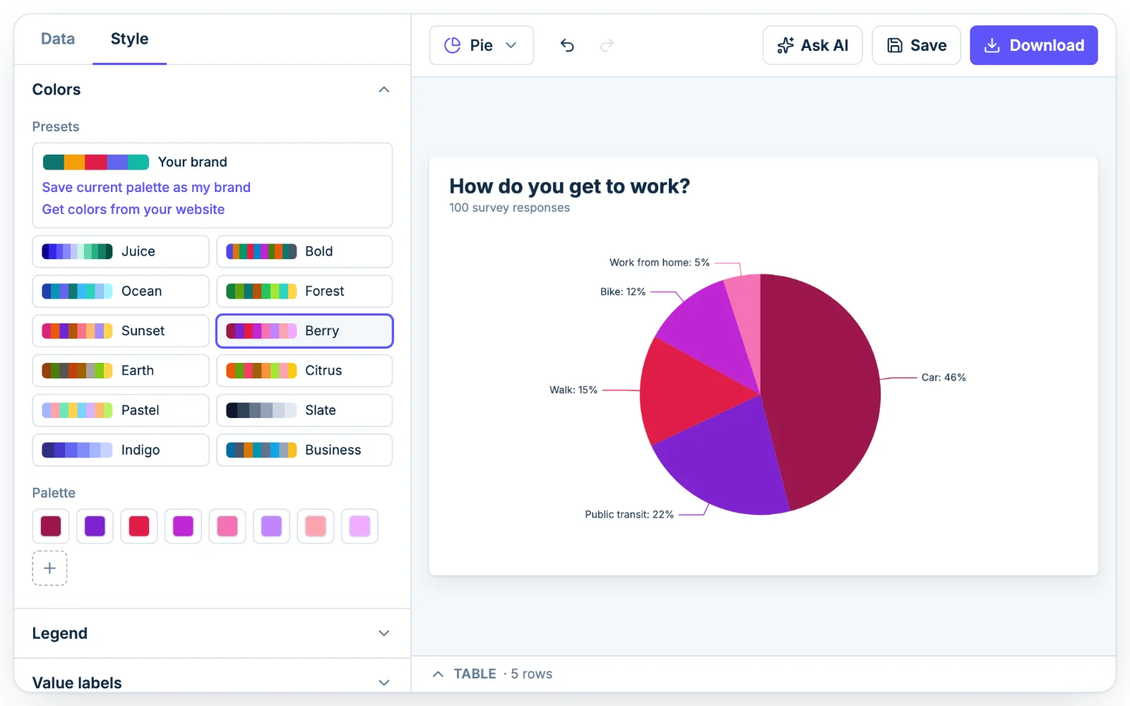
To print the numbers on the chart, open the Style tab, expand Value labels and tick "Show values on the chart". Add "Show as percentages" to show shares instead of raw counts.
If your percentages don't add up to 100
You can also type percentages straight in. Your values don't have to total 100. A set that adds up to 110 is drawn as shares of 110, so each slice comes out a little smaller than the figure you typed.
If the labels look off, add up your column. The usual causes are a row typed twice and percentages that were already rounded. Rounded figures can total 99% or 101%, and that's fine. Three slices of 33.3% show as 33% each, which adds up to 99%.
How many slices is too many?
Five or six. Past that, the slices turn into thin wedges and nobody can tell a 4% slice from a 6% one. When a pie would read badly, Chartjuice shows a suggestion under the chart.
Take visitors by browser: Chrome 6,400, Safari 1,900, Edge 520, Firefox 310, Samsung Internet 240, Opera 180 and other browsers 90. That is seven slices, and the last four together are under 10% of the total.
Group small slices into "Other"
On the Data tab, open Steps and add Top N. It keeps the largest N rows and adds the rest up as one "Other" row. Set N to 5 and the browser example becomes five named slices plus Other, which is 270 of 9,640 visitors, about 3%. Steps never change your original data, so removing the step brings every slice back.
Say what's inside "Other" in a caption or footnote. Readers shouldn't have to guess whether it hides one big surprise or fifty tiny sources.
Make a donut chart
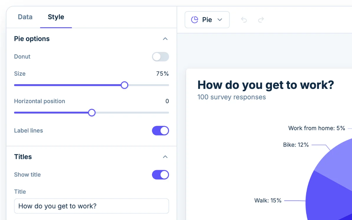
A donut chart is a pie with a hole in the middle. It shows parts of a whole and reads the same way. To make one, open the Style tab, expand Pie options and tick Donut. Then drag Hole size up for a thinner ring or down for a thicker one. The other Pie options are Size, Horizontal position and Label lines.
Pick a donut when the chart needs a number in the middle: the open center has room for a total or a label once the chart is in a slide. A full pie suits three to five slices where one is clearly biggest.
When a bar chart is better
A pie answers one question: how big is each part compared with the whole? It's weaker at comparing the parts to each other, because lengths line up side by side and angles don't. Pick a bar chart when:
- you have more than six categories;
- two or more values are close, say 24% and 26%;
- you're comparing groups, such as the same survey in three classes;
- the numbers aren't parts of one total at all.
Your data carries over. Use the chart type picker in the toolbar to switch, or paste the same table into the bar chart maker. For shares over several months, a line graph shows the trend better than a row of pies.
Ask AI for a pie chart
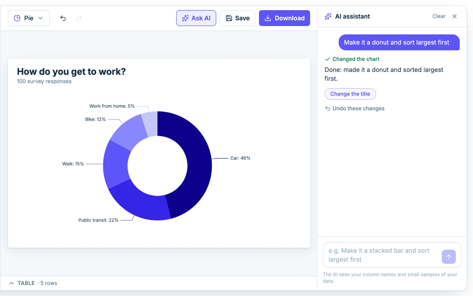
If you'd rather type than click, open Ask AI and write something like "make it a donut and sort largest first". The assistant changes the same settings you'd change by hand, and you can edit the result afterward. The AI sees your column names and small samples of the data, not the whole file.
How to read a pie graph
Each slice's angle is its share of the total: a quarter of the circle is 25%, half is 50%. Start with the biggest slice, then read the legend or labels. Check the total before you trust a comparison, because a pie of 20 responses looks just like a pie of 2,000.